June 2010
Beginner
415 pages
14h 7m
English
MAPS ARE ONE OF THE MOST BASIC DATA VISUALIZATIONS THAT WE HAVE; we've been making them for millennia. But we still haven't perfected them as a tool for understanding complex systems—and with 26 lines and 468 stations across five boroughs, the New York City subway system certainly is complex. The KickMap™ is the result of my quest to design a more effective subway map, and ultimately to encourage increased ridership.
I was born in Queens and raised in Brooklyn. The first subway map I saw was my father's, circa 1960. It made a vivid impression on me because it intimidated me. I saw a gray New York with red, green, and black lines running all over it like a grid (see Figure 5-1), and hundreds of station names attached.[29] It reminded me of a complex electrical diagram that I couldn't understand; it looked very "adult-serious" and even a little scary. I hoped I'd never have to deal with it.
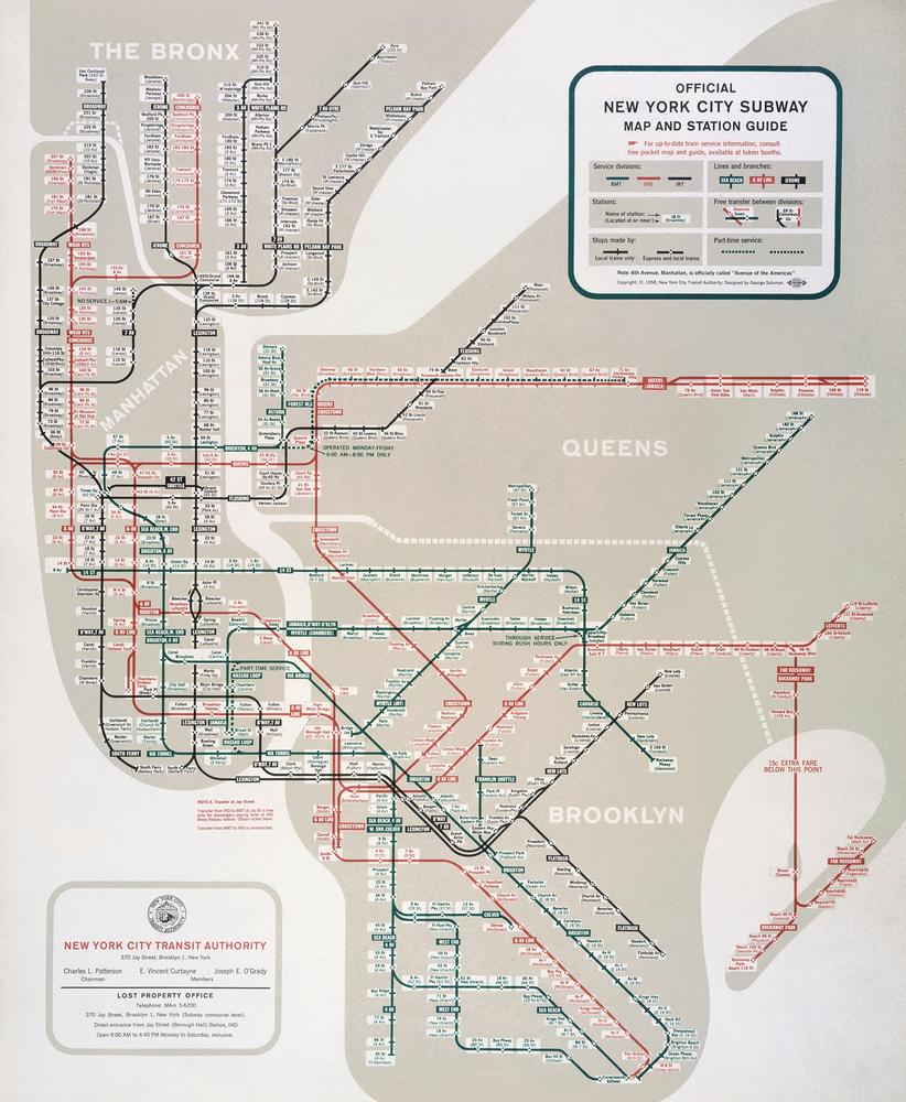
Figure 5-1. The 1958 New York City Subway map designed by George Salomon. 1958 New York City Subway Map © MTA New York City Transit. Used with permission.
In college I majored in design, and I spent half a year studying at the University of London. I was all on my own in a huge city I had never been to before. I quickly learned that the London Underground ...
Read now
Unlock full access


 O’Reilly covers everything we've got, with content to help us build a world-class technology community, upgrade the capabilities and competencies of our teams, and improve overall team performance as well as their engagement.I wanted to learn C and C++, but it didn't click for me until I picked up an O'Reilly book. When I went on the O’Reilly platform, I was astonished to find all the books there, plus live events and sandboxes so you could play around with the technology.I’ve been on the O’Reilly platform for more than eight years. I use a couple of learning platforms, but I'm on O'Reilly more than anybody else. When you're there, you start learning. I'm never disappointed.I'm always learning. So when I got on to O'Reilly, I was like a kid in a candy store. There are playlists. There are answers. There's on-demand training. It's worth its weight in gold, in terms of what it allows me to do.