Chapter 4. Monitoring and Anomaly Detection for Your Data Pipelines
Imagine that you’ve just purchased a new car. Based on the routine prepurchase check, all systems are working according to the manual, the oil and brake fluid tanks are filled nearly to the brim, and the parts are good as new—because, well, they are.
After grabbing the keys from your dealer, you hit the road. “There’s nothing like that new car smell!” you think as you pull onto the highway. Everything is fine and dandy until you hear a loud pop. Yikes. And your car starts to wobble. You pull onto the shoulder, turn on your hazard lights, and jump out of the car. After a brief investigation, you’ve identified the alleged culprit of the loud sound—a flat tire. No matter how many tests or checks your dealership could have done to validate the health of your car, there’s no accounting for unknown unknowns (i.e, nails or debris on the highway) that might affect your vehicle.
Similarly, in data, all of the testing and data quality checks under the sun can’t fully protect you from data downtime, which can manifest at all stages of the pipeline and surface for a variety of reasons that are often unaffiliated with the data itself.
When it comes to understanding when data breaks, your best course of action is to lean on monitoring, specifically anomaly detection techniques that identify when your expected thresholds for volume, freshness, distribution, and other values don’t meet expectations.
Anomaly detection refers to the identification of events or observations that deviate from the norm—for instance, fraudulent credit card behavior or a technical glitch, like a website crash. Assuming your website is normally up and running, of course.
A number of techniques, algorithms, and frameworks exist and are used (and developed) by industry giants like Meta, Google, Uber, and others. For a technical deep dive, we recommend Preetam Jinka and Baron Schwartz’s report Anomaly Detection for Monitoring (O’Reilly).
Up until recently, anomaly detection was considered a nice-to-have—not a need-to-have—for many data teams. Now, as data systems become increasingly complex and companies empower employees across functions to use data, it’s imperative that teams take both proactive and reactive approaches to solving for data quality.
While automobiles are vastly different from data pipelines, cars and other mechanical systems have their own monitoring and anomaly detection capabilities, too. Most contemporary vehicles alert you when oil, brake fluid, gas, tire pressure, and other vital entities are lower than they should be and encourage you to take action. Data monitoring and anomaly detection function in much the same way.
In this chapter, we’ll walk through how to build your own data quality monitors for a data warehouse environment to monitor and alert to the pillars of data observability: freshness, volume, distribution, and schema. In the process, we’ll introduce important concepts and terms necessary to bulk up your understanding of important anomaly detection techniques.
Knowing Your Known Unknowns and Unknown Unknowns
There are two types of data quality issues in this world: those you can predict (known unknowns) and those you can’t (unknown unknowns). Known unknowns are issues that you can easily predict, i.e., null values, specific freshness issues, or schema changes triggered by a system that updates regularly. These issues may not happen, but with a healthy dose of testing, you can often account for them before they cause issues downstream. In Figure 4-1, we highlight popular examples of both.
Unknown unknowns refer to data downtime that even the most comprehensive testing can’t account for, issues that arise across your entire data pipeline, not just the sections covered by specific tests. Unknown unknowns might include:
-
A distribution anomaly in a critical field that causes your Tableau dashboard to malfunction
-
A JSON schema change made by another team that turns 6 columns into 600
-
An unintended change to ETL (or reverse ETL, if you fancy) leading to tests not running and bad data being missed
-
Incomplete or stale data that goes unnoticed until several weeks later, affecting key marketing metrics
-
A code change that causes an API to stop collecting data feeding an important new product
-
Data drift over time, which can be challenging to catch, particularly if your tests look only at the data being written at the time of your ETL jobs, which don’t normally take into account data that is already in a given table
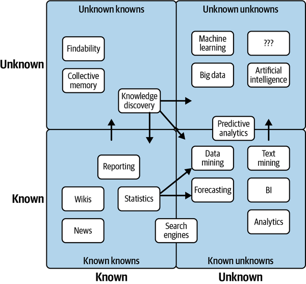
Figure 4-1. Examples of known unknowns and unknown unknowns
While testing and circuit breakers can handle many of your known unknowns, monitoring and anomaly detection can cover your bases when it comes to unknown unknowns.
Frequently, data teams leverage monitoring and anomaly detection to identify and alert to data behavior that deviates from what’s historically expected of a given data pipeline. By understanding what “good” data looks like, it’s easier to proactively identify “bad” data.
Now that we’ve outlined the differences between these two types of data issues, let’s dive into what anomaly detection for unknown unknowns looks like in practice.
Building an Anomaly Detection Algorithm
To crystalize how anomaly detection works, let’s walk through a real-world tutorial in building an anomaly detector for a very anomalous data set.
Keep in mind that there are any number of technologies and approaches you can use to build data quality monitors, and the choices you make will depend on your tech stack. In this example, we leverage the following languages and tools:
-
SQLite and SQL
-
Jupyter Notebooks
-
Python
Our sample data ecosystem uses mock astronomical data about habitable exoplanets. For the purpose of this exercise, we generated the data set with Python, modeling anomalies from real incidents we’ve come across in production environments. This data set is entirely free to use, and the utils folder in the repository contains the code that generated the data, if you’re interested in learning more about how it was assembled.
We’ll use SQLite 3.32.3, which should make the database accessible from either the command prompt or SQL files with minimal setup. The concepts extend to really any query language, and these implementations can be extended to MySQL, Snowflake, and other database environments with minimal changes.
In the following, we share table information about our EXOPLANETS data set, including five specific database entries:
$ sqlite3 EXOPLANETS.dbsqlite>PRAGMATABLE_INFO(EXOPLANETS);_id | TEXT | 0 | | 0distance | REAL | 0 | | 0g | REAL | 0 | | 0orbital_period | REAL | 0 | | 0avg_temp | REAL | 0 | | 0date_added | TEXT | 0 | | 0
A database entry in EXOPLANETS contains the following info:

-
_id: a UUID corresponding to the planet 
-
distance: distance from Earth, in light-years 
-
g: surface gravity as a multiple of g, the gravitational force constant 
-
orbital_period: length of a single orbital cycle in days 
-
avg_temp: average surface temperature in degrees Kelvin 
-
date_added: the date our system discovered the planet and added it automatically to our databases
Note that one or more of distance, g, orbital_period, and avg_temp may be NULL for a given planet as a result of missing or erroneous data.
If we query sqlite> SELECT * FROM EXOPLANETS LIMIT 5; we can pull five rows from our database. In Example 4-1, we share five database entries in our EXOPLANETS data set, to highlight the format and distribution of the data.
Example 4-1. Five rows from the EXOPLANETS data set
_id,distance,g,orbital_period,avg_temp,date_added
c168b188-ef0c-4d6a-8cb2-f473d4154bdb,34.6273036348341,,476.480044083599, ...
e7b56e84-41f4-4e62-b078-01b076cea369,110.196919810563,2.52507362359066, ...
a27030a0-e4b4-4bd7-8d24-5435ed86b395,26.6957950454452,10.2764970016067, ...
54f9cf85-eae9-4f29-b665-855357a14375,54.8883521129783,,173.788967912197, ...
4d06ec88-f5c8-4d03-91ef-7493a12cd89e,153.264217159834,0.922874568459221, ...
Note that this exercise is retroactive—we’re looking at historical data. In a production data environment, anomaly detection is real time and applied at each stage of the data life cycle, and thus will involve a slightly different implementation than what is done here.
For the purpose of this exercise, we’ll be building data observability algorithms for freshness and distribution, but in future articles, we’ll address the rest of our five pillars—and more.
Monitoring for Freshness
The first pillar of data observability we monitor for is freshness, which can give us a strong indicator of when critical data assets were last updated. If a report that is regularly updated on the hour suddenly looks very stale, this type of anomaly should give us a strong indication that something is inaccurate or otherwise wrong.
First, note the DATE_ADDED column. SQL doesn’t store metadata on when individual records are added. So, to visualize freshness in this retroactive setting, we need to track that information ourselves. Grouping by the DATE_ADDED column can give us insight into how EXOPLANETS updates daily. As depicted in Example 4-2, we can query for the number of new IDs added per day.
Example 4-2. A query about the number of new exoplanets added to our data set per day
SELECTDATE_ADDED,COUNT(*)ASROWS_ADDEDFROMEXOPLANETSGROUPBYDATE_ADDED;
You can run this yourself with $ sqlite3 EXOPLANETS.db < queries/freshness/rows-added.sql in the repository. We get the data in Example 4-3 back.
Example 4-3. Data pulled from Example 4-2
date_added     ROWS_ADDED
2020-01-01     84
2020-01-02     92
2020-01-03     101
2020-01-04     102
2020-01-05     100
... ...
2020-07-14     104
2020-07-15     110
2020-07-16     103
2020-07-17     89
2020-07-18     104
Based on this graphical representation of our data set, it looks like EXOPLANETS consistently updates with around 100 new entries each day, though there are gaps where no data comes in for multiple days.
Recall that with freshness, we want to ask the question “Is my data up to date?”—thus, knowing about those gaps in table updates is essential to understanding the reliability of our data. The following query, Example 4-4, operationalizes freshness (as depicted in Figure 4-2) by introducing a metric for DAYS_SINCE_LAST_UPDATE. (Note: since this tutorial uses SQLite3, the SQL syntax for calculating time differences will be different in MySQL, Snowflake, and other environments.)
Example 4-4. Query that pulls the number of days since the data set was updated
WITHUPDATESAS(SELECTDATE_ADDED,COUNT(*)ASROWS_ADDEDFROMEXOPLANETSGROUPBYDATE_ADDED)SELECTDATE_ADDED,JULIANDAY(DATE_ADDED)-JULIANDAY(LAG(DATE_ADDED)OVER(ORDERBYDATE_ADDED))ASDAYS_SINCE_LAST_UPDATEFROMUPDATES;
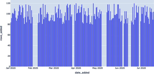
Figure 4-2. Rendering freshness patterns within our data set using a Jupyter Notebook
The resulting table, Example 4-5, says, “On date X, the most recent data in EXOPLANETS was Y days old.” This is information not explicitly available from the DATE_ADDED column in the table—but applying data observability gives us the tools to uncover it. This is visualized in Figure 4-3, where freshness anomalies are depicted by the high Y values. This denotes table update lags, which we can query for with a simple detector.
Example 4-5. Exoplanet data freshness table from query in Example 4-4
DATE_ADDED     DAYS_SINCE_LAST_UPDATE
2020–01–01
2020–01–02     1
2020–01–03     1
2020–01–04     1
2020–01–05     1
...            ...
2020–07–14     1
2020–07–15     1
2020–07–16     1
2020–07–17     1
2020–07–18     1
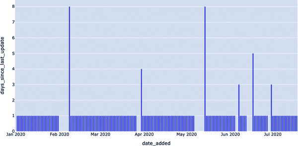
Figure 4-3. Visualization of freshness anomalies depicted by high Y values
Now, we have the data we need to detect freshness anomalies. All that’s left to do is to set a threshold parameter for Y—how many days old is too many? A parameter turns a query, Example 4-6, into a detector, since it decides what counts as anomalous (read: worth alerting) and what doesn’t.
Example 4-6. Modified query to alert to data that sits beyond expected freshness for exoplanet data
WITHUPDATESAS(SELECTDATE_ADDED,COUNT(*)ASROWS_ADDEDFROMEXOPLANETSGROUPBYDATE_ADDED),NUM_DAYS_UPDATESAS(SELECTDATE_ADDED,JULIANDAY(DATE_ADDED)-JULIANDAY(LAG(DATE_ADDED)OVER(ORDERBYDATE_ADDED))ASDAYS_SINCE_LAST_UPDATEFROMUPDATES)SELECT*FROMNUM_DAYS_UPDATESWHEREDAYS_SINCE_LAST_UPDATE>1;
The data returned to us, Example 4-7, represents dates where freshness incidents occurred.
Example 4-7. Data returned from Example 4-6 query
DATE_ADDED     DAYS_SINCE_LAST_UPDATE
2020–02–08     8
2020–03–30     4
2020–05–14     8
2020–06–07     3
2020–06–17     5
2020–06–30     3
On 2020–05–14, the most recent data in the table was 8 days old! Such an outage may represent a breakage in our data pipeline and would be good to know about if we’re using this data for anything high impact (and if we’re using this in a production environment, chances are, we are). As illustrated in Figure 4-4, we can render freshness anomalies by setting thresholds for what is an acceptable amount of time since the last update.
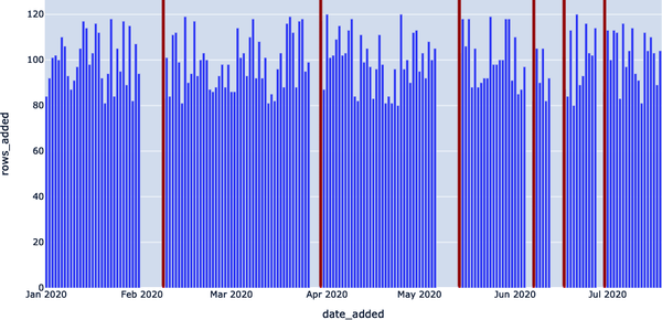
Figure 4-4. Visualization of freshness anomalies using thresholds
Note in particular the last line of the query: DAYS_SINCE_LAST_UPDATE > 1;.
Here, 1 is a model parameter—there’s nothing “correct” about this number, though changing it will impact what dates we consider to be incidents. The smaller the number, the more genuine anomalies we’ll catch (high recall), but chances are, several of these “anomalies” will not reflect real outages. The larger the number, the greater the likelihood all anomalies we catch will reflect true anomalies (high precision), but it’s possible we may miss some.
For the purpose of this example, we could change 1 to 7 and thus catch only the two worst outages (on 2020–02–08 and 2020–05–14). Any choice here will reflect the particular use case and objectives; it is an important balance to strike that comes up again and again when applying data observability at scale to production environments.
In Figure 4-5, we leverage the same freshness detector but with the SQLite query DAYS_SINCE_LAST_UPDATE > 3; serving as the threshold. Two of the smaller outages now go undetected.

Figure 4-5. Narrowing the search for anomalies (DAYS_SINCE_LAST_UPDATE > 3)
Now, we visualize the same freshness detector, but with DAYS_SINCE_LAST_UPDATE > 7; now serving as the threshold. All but the two largest outages now go undetected (Figure 4-6).
Just like planets, optimal model parameters sit in a “Goldilocks Zone” or “sweet spot” between values considered too low and too high.

Figure 4-6. Further narrowing the search for anomalies (DAYS_SINCE_LAST_UPDATE > 7)
Understanding Distribution
Next, we want to assess the field-level, distributional health of our data. Distribution tells us all of the expected values of our data, as well as how frequently each value occurs. One of the simplest questions is, “How often is my data NULL?” In many cases, some level of incomplete data is acceptable—but if a 10% null rate turns into 90%, we’ll want to know.
In statistics, we like to assume that sets of observations are drawn from baseline distributions that obey mathematical rules. Call the former “sample distributions” and the latter “true distributions.” Statistics has an observation about natural processes, called the central limit theorem, that states that distributions of independently generated random samples approach a certain distribution as the number of samples gets large.
Applying the Gaussian distribution may prompt an initial approach to anomaly detection that’s quite naive but surprisingly effective: calculating the standard score for each observation. That is, subtract μ, and then divide by σ. This score (also called the z-score) gives a quantifiable metric for how “far out” (on the bell curve) each observation is. Anomaly detection: solved! Just draw a line at some point out from the center of the bell and call everything outside that line “anomalous.” From a statistical standpoint, you’ll be correct. Unfortunately, statistical theory isn’t a compelling approach to anomaly detection in the very concrete field of data quality, for two reasons.
First, the central limit theorem states a key characteristic of the data generating process that many people overlook: independent, random observations yield normal distributions in the limit. This is a great assumption to make when measuring the volume of wind through grass, or the stride length of the average New Yorker. It’s not so great for business intelligence data, where observations tend to be highly correlated and confounded with other variables. For example, “daily customers” will not be normally distributed at Chick-Fil-A, which closes on Sundays, since 1/7th of all observations will be 0. These observations are not generated randomly but are instead impacted by the day of the week.
Second, there’s a distinction between “anomalous” and “interesting” observations that can’t be quite captured with purely statistical thinking. To illustrate this, consider the z-score, as discussed a few paragraphs earlier. We said (in jest) that anomaly detection can be solved with a simple z-score; unfortunately, that’s rarely the case.
If we choose to define “anomaly” as anything, say, three standard deviations from the distribution’s mean, we can be guaranteed to get that “correct” for any data. But we’re not just in the business of identifying simply anomalous metrics. For one, our time series contain important contextual information (What day of the week was it? Does the pattern repeat?). More importantly, though, is that not all anomalous observations are interesting—they don’t help us identify and correct for data downtime. Example 4-8 queries data with an anomalous distribution.
Example 4-8. Query to pull data about anomalous distributions
SELECTDATE_ADDED,CAST(SUM(CASEWHENDISTANCEISNULLTHEN1ELSE0END)ASFLOAT)/COUNT(*)ASDISTANCE_NULL_RATE,CAST(SUM(CASEWHENGISNULLTHEN1ELSE0END)ASFLOAT)/COUNT(*)ASG_NULL_RATE,CAST(SUM(CASEWHENORBITAL_PERIODISNULLTHEN1ELSE0END)ASFLOAT)/COUNT(*)ASORBITAL_PERIOD_NULL_RATE,CAST(SUM(CASEWHENAVG_TEMPISNULLTHEN1ELSE0END)ASFLOAT)/COUNT(*)ASAVG_TEMP_NULL_RATEFROMEXOPLANETSGROUPBYDATE_ADDED;
This query returns a lot of data, as depicted in Example 4-9.
Example 4-9. Data from Example 4-8 query
date_added     DISTANCE_NULL_RATE    G_NULL_RATE          ORBITAL_PERIOD_NULL_RATE
2020-01-01     0.0833333333333333    0.178571428571429    0.214285714285714
2020-01-02     0.0                   0.152173913043478    0.326086956521739
2020-01-03     0.0594059405940594    0.188118811881188    0.237623762376238
2020-01-04     0.0490196078431373    0.117647058823529    0.264705882352941
...            ...                   ...                  ...
2020-07-13     0.0892857142857143    0.160714285714286    0.285714285714286
2020-07-14     0.0673076923076923    0.125                0.269230769230769
2020-07-15     0.0636363636363636    0.118181818181818    0.245454545454545
2020-07-16     0.058252427184466     0.145631067961165    0.262135922330097
2020-07-17     0.101123595505618     0.0898876404494382   0.247191011235955
2020-07-18     0.0673076923076923    0.201923076923077    0.317307692307692
The general formula CAST(SUM(CASE WHEN SOME_METRIC IS NULL THEN 1 ELSE 0 END) AS FLOAT) / COUNT(*), when grouped by the DATE_ADDED column, is telling us the rate of NULL values for SOME_METRIC in the daily batches of new data in EXOPLANETS. It’s hard to get a sense by looking at the raw output, but a visual (Figure 4-8) can help illuminate this anomaly.
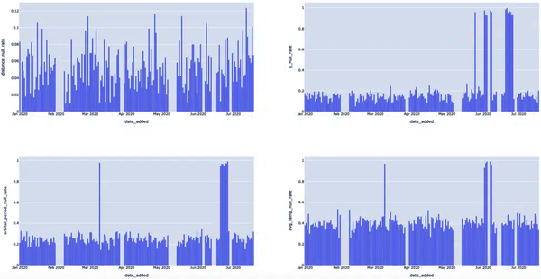
Figure 4-8. By rendering various events triggered by null rates, we can clearly see which dates were anomalous
The visuals make it clear that there are null rate “spike” events we should be detecting. Let’s focus on just the last metric, AVG_TEMP, for now. We can detect null spikes most basically with a simple threshold via the query in Example 4-10.
Example 4-10. Detecting null values in the AVG_TEMP column of the EXOPLANETS data set
WITHNULL_RATESAS(SELECTDATE_ADDED,CAST(SUM(CASEWHENAVG_TEMPISNULLTHEN1ELSE0END)ASFLOAT)/COUNT(*)ASAVG_TEMP_NULL_RATEFROMEXOPLANETSGROUPBYDATE_ADDED)SELECT*FROMNULL_RATESWHEREAVG_TEMP_NULL_RATE>0.9;
In Example 4-11, we share the corresponding data pulled in its raw form, illustrating the rows with null values in the AVG_TEMP column of the data set.
Example 4-11. AVG_TEMP rows with null values
DATE_ADDED     AVG_TEMP_NULL_RATE
2020-03-09     0.967391304347826
2020-06-02     0.929411764705882
2020-06-03     0.977011494252874
2020-06-04     0.989690721649485
2020-06-07     0.987804878048781
2020-06-08     0.961904761904762
In Figure 4-9, we highlight where the anomalous spikes were, correlating to the rate of null values in the temperature column of our EXOPLANETS data set.
As detection algorithms go, this approach to identifying null values is something of a blunt instrument. Sometimes, patterns in our data will be simple enough for a threshold like this to do the trick. In other cases, though, data will be noisy or have other complications, like seasonality, requiring us to change our approach.
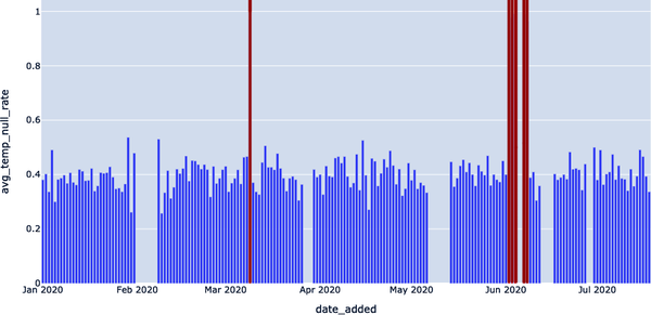
Figure 4-9. Detecting null spikes in the average temperature
Note
Seasonality refers to the tendency of a time series to observe predictable fluctuations over certain intervals. For example, data for “church attendees” might observe a weekly seasonality with a high bias toward Sunday, and data for a department store’s coat sales would likely observe yearly seasonality with a high in fall and a low in spring.
For example, detecting 2020–06–02, 2020–06–03, and 2020–06–04 seems redundant. We can filter out dates that occur immediately after other alerts to reduce duplication via the query in Example 4-12.
Example 4-12. Query to filter out dates that occur immediately after other alerts
WITHNULL_RATESAS(SELECTDATE_ADDED,CAST(SUM(CASEWHENAVG_TEMPISNULLTHEN1ELSE0END)ASFLOAT)/COUNT(*)ASAVG_TEMP_NULL_RATEFROMEXOPLANETSGROUPBYDATE_ADDED),ALL_DATESAS(SELECT*,JULIANDAY(DATE_ADDED)-JULIANDAY(LAG(DATE_ADDED)OVER(ORDERBYDATE_ADDED))ASDAYS_SINCE_LAST_ALERTFROMNULL_RATESWHEREAVG_TEMP_NULL_RATE>0.9)SELECTDATE_ADDED,AVG_TEMP_NULL_RATEFROMALL_DATESWHEREDAYS_SINCE_LAST_ALERTISNULLORDAYS_SINCE_LAST_ALERT>1;
The corresponding data set is listed in Example 4-13. These results highlight dates that don’t need to be taken into account in our null value anomaly detector, per the query in Example 4-12.
Example 4-13. Results of Example 4-12 query
DATE_ADDED     AVG_TEMP_NULL_RATE
2020-03-09     0.967391304347826
2020-06-02     0.929411764705882
2020-06-07     0.987804878048781
Note that in both of these queries, the key parameter is 0.9. We’re effectively saying, “Any null rate higher than 90% is a problem, and I need to know about it.” We visualize these results in Figure 4-10. This helps us reduce white noise and generate more accurate results.
In this instance, we can (and should) be a bit more intelligent by applying the concept of rolling average with a more intelligent parameter using the query in Example 4-14 to improve precision further.
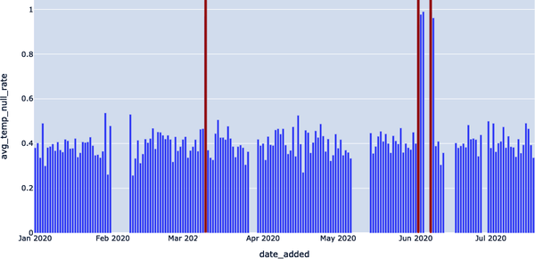
Figure 4-10. Visualizing any null rates higher than 90%
Example 4-14. Query to apply a rolling average to the null rate
WITHNULL_RATESAS(SELECTDATE_ADDED,CAST(SUM(CASEWHENAVG_TEMPISNULLTHEN1ELSE0END)ASFLOAT)/COUNT(*)ASAVG_TEMP_NULL_RATEFROMEXOPLANETSGROUPBYDATE_ADDED),NULL_WITH_AVGAS(SELECT*,AVG(AVG_TEMP_NULL_RATE)OVER(ORDERBYDATE_ADDEDASCROWSBETWEEN14PRECEDINGANDCURRENTROW)ASTWO_WEEK_ROLLING_AVGFROMNULL_RATESGROUPBYDATE_ADDED)SELECT*FROMNULL_WITH_AVGWHEREAVG_TEMP_NULL_RATE-TWO_WEEK_ROLLING_AVG>0.3;
The query’s results are shown in Example 4-15 and depicted in Figure 4-11. We see null values that might raise bigger alarms (i.e., with a null rate higher than 90%).
Example 4-15. Results from Example 4-14 query
DATE_ADDED     AVG_TEMP_NULL_RATE    TWO_WEEK_ROLLING_AVG
2020-03-09     0.967391304347826     0.436077995611105
2020-06-02     0.929411764705882     0.441299602441599
2020-06-03     0.977011494252874     0.47913211475687
2020-06-04     0.989690721649485     0.515566041654715
2020-06-07     0.987804878048781     0.554753033524633
2020-06-08     0.961904761904762     0.594966974173356
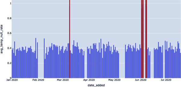
Figure 4-11. Using the query AVG_TEMP_NULL_RATE — TWO_WEEK_ROLLING_AVG to get even more specific when identifying the null value rate
One clarification: notice that we filter using the quantity AVG_TEMP_NULL_RATE — TWO_WEEK_ROLLING_AVG. In other instances, we might want to take the ABS() of this error quantity, but not here—the reason being that a null rate “spike” is much more alarming if it represents an increase from the previous average. It may not be worthwhile to monitor whenever nulls abruptly decrease in frequency, while the value in detecting a null rate increase is clear.
Building Monitors for Schema and Lineage
In the previous section, we looked at the first two pillars of data observability, freshness and distribution, and showed how a little SQL code can operationalize these concepts. These are what I would call more “classic” data anomaly detection problems—given a steady stream of data, does anything look out of whack?
Good anomaly detection is certainly part of the data observability puzzle, but it’s not everything. Equally important is context. If a data anomaly occurred, great. But where? What upstream pipelines may be the cause? What downstream dashboards will be affected by a data anomaly? And has the formal structure of my data changed? Good data observability hinges on our ability to properly leverage metadata to answer these data anomaly questions.
In our next section, we’ll look at the two data observability pillars designed to answer these questions—schema and lineage. Once again, we’ll use lightweight tools like Jupyter and SQLite, so you can easily spin up our environment and try these data anomaly exercises yourself. Let’s get started.
Anomaly Detection for Schema Changes and Lineage
As before, we’ll work with mock astronomical data about habitable exoplanets. It looks like our oldest data is dated 2020-01-01 (note: most databases will not store timestamps for individual records, so our DATE_ADDED column is keeping track for us). Our newest data looks to be from 2020-07-18:
sqlite>SELECTDATE_ADDEDFROMEXOPLANETSORDERBYDATE_ADDEDDESCLIMIT1;2020-07-18
Of course, this is the same table we used in the previous section. If we want to explore the more context-laden pillars of schema and lineage, we’ll need to expand our environment.
Now, in addition to EXOPLANETS, we have a table called EXOPLANETS_EXTENDED, which is a superset of our past table. It’s useful to think of these as the same table at different moments in time. In fact, EXOPLANETS_EXTENDED has data dating back to 2020-01-01:
sqlite>SELECTDATE_ADDEDFROMEXOPLANETS_EXTENDEDORDERBYDATE_ADDEDASCLIMIT 1; 2020-01-01
But it also contains data up to 2020-09-06, further than EXOPLANETS:
sqlite>SELECTDATE_ADDEDFROMEXOPLANETS_EXTENDEDORDERBYDATE_ADDEDDESCLIMIT 1; 2020-09-0
Something else is different between these tables, as depicted in Example 4-16. There are two additional fields, making the opportunity for anomalies even higher.
Example 4-16. Two additional fields in EXOPLANETS_EXTENDED data set
sqlite>PRAGMATABLE_INFO(EXOPLANETS_EXTENDED);_ID | VARCHAR(16777216) | 1 | | 0DISTANCE | FLOAT | 0 | | 0G | FLOAT | 0 | | 0ORBITAL_PERIOD | FLOAT | 0 | | 0AVG_TEMP | FLOAT | 0 | | 0DATE_ADDED | TIMESTAMP_NTZ(6) | 1 | | 0ECCENTRICITY | FLOAT | 0 | | 0ATMOSPHERE | VARCHAR(16777216) | 0 | | 0
In addition to the six fields in EXOPLANETS, the EXOPLANETS_EXTENDED table contains two additional fields:

-
ECCENTRICITY: the orbital eccentricity of the planet around its host star 
-
ATMOSPHERE: the dominant chemical makeup of the planet’s atmosphere
Note that like DISTANCE, G, ORBITAL_PERIOD, and AVG_TEMP, both ECCENTRICITY and ATMOSPHERE may be NULL for a given planet as a result of missing or erroneous data. For example, rogue planets have undefined orbital eccentricity, and many planets don’t have atmospheres at all.
Note also that data is not backfilled, meaning data entries from the beginning of the table (data contained also in the EXOPLANETS table) will not have eccentricity and atmosphere information. In Example 4-17, we share a query to highlight that older data is not backfilled; this will hopefully show the schema change that ensued.
Example 4-17. Query highlighting that older data is not backfilled
SELECTDATE_ADDED,ECCENTRICITY,ATMOSPHEREFROMEXOPLANETS_EXTENDEDORDERBYDATE_ADDEDASCLIMIT10;
We can make this file beautiful and searchable if this error is corrected: no commas found in this CSV file in line 0 (depicted in Example 4-18).
Example 4-18. Addition of two new columns, signaling a schema change in our EXOPLANETS data set
2020-01-01 | |
2020-01-01 | |
2020-01-01 | |
2020-01-01 | |
2020-01-01 | |
2020-01-01 | |
2020-01-01 | |
2020-01-01 | |
2020-01-01 | |
2020-01-01 | |
The addition of two fields is an example of a schema change—our data’s formal blueprint has been modified. Schema changes occur when an alteration is made to the structure of your data, and it’s a data anomaly that can be frustrating to manually debug. Schema changes can indicate any number of things about your data, including:
-
The addition of new API endpoints
-
Supposedly deprecated fields that are not yet deprecated
-
The addition or subtraction of columns, rows, or entire tables
In an ideal world, we’d like a record of this change, as it represents a vector for possible issues with our pipeline. Unfortunately, our database is not naturally configured to keep track of such changes. It has no versioning history, as depicted in Example 4-19. A schema change can easily sneak up on us.
Example 4-19. No versioning history in data set
sqlite>PRAGMATABLE_INFO(EXOPLANETS_COLUMNS);DATE | TEXT | 0 | | 0COLUMNS | TEXT | 0 | | 0
We ran into this issue when querying for the age of individual records and added the DATE_ADDED column to cope. In this case, we’ll do something similar, except with the addition of an entire table.
The EXOPLANETS_COLUMNS table “versions” our schema by recording the columns in EXOPLANETS_EXTENDED at any given date. Looking at the very first and last entries, we see that the columns definitely changed at some point, as highlighted by Example 4-20. The two entries in Example 4-20 highlight that there was an addition of two new columns in our EXOPLANETS data set—in other words, a schema change.
Example 4-20. Two entries highlighting a schema change
sqlite>SELECT*FROMEXOPLANETS_COLUMNSORDERBYDATEASCLIMIT1;2020-01-01 | [(0, '_id', 'TEXT', 0, None, 0),(1, 'distance', 'REAL', 0, None, 0),(2, 'g', 'REAL', 0, None, 0),(3, 'orbital_period', 'REAL', 0, None, 0),(4, 'avg_temp', 'REAL', 0, None, 0),(5, 'date_added', 'TEXT', 0, None, 0)]sqlite>SELECT*FROMEXOPLANETS_COLUMNSORDERBYDATEDESCLIMIT1;2020-09-06 | [(0, '_id', 'TEXT', 0, None, 0),(1, 'distance', 'REAL', 0, None, 0),(2, 'g', 'REAL', 0, None, 0),(3, 'orbital_period', 'REAL', 0, None, 0),(4, 'avg_temp', 'REAL', 0, None, 0),(5, 'date_added', 'TEXT', 0, None, 0),(6, 'eccentricity', 'REAL', 0, None, 0),(7, 'atmosphere', 'TEXT', 0, None, 0)]
Now, returning to our original question: when, exactly, did the schema change? Since our column lists are indexed by dates, we can find the date of the change and a good clue for where anomalies lie with a quick SQL script, as depicted in Example 4-21.
Example 4-21. A query of the extended EXOPLANETS table to showcase when schema for the data set changed
WITHCHANGESAS(SELECTDATE,COLUMNSASNEW_COLUMNS,LAG(COLUMNS)OVER(ORDERBYDATE)ASPAST_COLUMNSFROMEXOPLANETS_COLUMNS)SELECT*FROMCHANGESWHERENEW_COLUMNS!=PAST_COLUMNSORDERBYDATEASC;
Example 4-22 includes the data returned, which we’ve reformatted for legibility. Looking at the data, we see that the schema changed on 2022-07-19.
Example 4-22. Results pulled from the query in Example 4-21
DATE:          2020–07–19
NEW_COLUMNS:  [
               (0, '_id', 'TEXT', 0, None, 0),
               (1, 'distance', 'REAL', 0, None, 0),
               (2, 'g', 'REAL', 0, None, 0),
               (3, 'orbital_period', 'REAL', 0, None, 0),
               (4, 'avg_temp', 'REAL', 0, None, 0),
               (5, 'date_added', 'TEXT', 0, None, 0),
               (6, 'eccentricity', 'REAL', 0, None, 0),
               (7, 'atmosphere', 'TEXT', 0, None, 0)
          ]
PAST_COLUMNS: [
               (0, '_id', 'TEXT', 0, None, 0),
               (1, 'distance', 'REAL', 0, None, 0),
               (2, 'g', 'REAL', 0, None, 0),
               (3, 'orbital_period', 'REAL', 0, None, 0),
               (4, 'avg_temp', 'REAL', 0, None, 0),
               (5, 'date_added', 'TEXT', 0, None, 0)
          ]
With this query, we return the offending date: 2020–07–19. Like freshness and distribution observability, achieving schema observability follows a pattern: we identify the useful metadata that signals pipeline health, track it, and build detectors to alert us of potential issues. Supplying an additional table like EXOPLANETS_COLUMNS is one way to track schema, but there are many others. We encourage you to think about how you could implement a schema change detector for your own data pipeline!
Visualizing Lineage
We’ve described lineage as the most holistic of the five pillars of data observability, and for good reason. Lineage contextualizes incidents by telling us (1) which downstream sources may be impacted, and (2) which upstream sources may be the root cause. While it’s not intuitive to “visualize” lineage with SQL code, a quick example may illustrate how it can be useful. (In Chapter 6, we’ll teach you how to build your own field-level lineage system from scratch using common open source frameworks.)
To demonstrate how this works, let’s add another table to our database. So far, we’ve been recording data on exoplanets. Here’s one fun question to ask: how many of these planets may harbor life?
The HABITABLES table takes data from EXOPLANETS to help us answer that question, among other characteristics, as showcased in Example 4-23.
Example 4-23. HABITABLES provides information on whether the planets listed in EXOPLANETS are habitable
sqlite>PRAGMATABLE_INFO(HABITABLES);_id | TEXT | 0 | | 0perihelion | REAL | 0 | | 0aphelion | REAL | 0 | | 0atmosphere | TEXT | 0 | | 0habitability | REAL | 0 | | 0min_temp | REAL | 0 | | 0max_temp | REAL | 0 | | 0date_added | TEXT | 0 | | 0
An entry in HABITABLES contains the following:

-
_id: a UUID corresponding to the planet 
-
perihelion: the closest distance to the celestial body during an orbital period 
-
aphelion: the furthest distance to the celestial body during an orbital period 
-
atmosphere: the dominant chemical makeup of the planet’s atmosphere 
-
habitability: a real number between 0 and 1, indicating how likely the planet is to harbor life 
-
min_temp: the minimum temperature on the planet’s surface 
-
max_temp: the maximum temperature on the planet’s surface 
-
date_added: the date our system discovered the planet and added it automatically to our databases
Like the columns in EXOPLANETS, values for perihelion, aphelion, atmosphere, min_temp, and max_temp are allowed to be NULL. In fact, perihelion and aphelion will be NULL for any _id in EXOPLANETS where eccentricity is NULL, since you use orbital eccentricity to calculate these metrics. This explains why these two fields are always NULL in our older data entries.
To see which exoplanets are most habitable, we can use the following query to render the output in Example 4-24:
sqlite>SELECT*FROMHABITABLESLIMIT5;
Example 4-24. Output of query to get a sense for the most habitable exoplanets
_id,perihelion,aphelion,atmosphere,habitability,min_temp,max_temp,date_added
c168b188-ef0c-4d6a-8cb2-f473d4154bdb,,,,0.291439672855434,,,2020-01-01
e7b56e84-41f4-4e62-b078-01b076cea369,,,,0.835647137991933,,,2020-01-01
a27030a0-e4b4-4bd7-8d24-5435ed86b395,,,,0.894000806332343,,,2020-01-01
54f9cf85-eae9-4f29-b665-855357a14375,,,,0.41590200852556,103.71374885412 ...
4d06ec88-f5c8-4d03-91ef-7493a12cd89e,,,,0.593524201489497,,,2020-01-01
So, we know that HABITABLES depends on the values in EXOPLANETS (or, equally, EXOPLANETS_EXTENDED), and EXOPLANETS_COLUMNS does as well. A dependency graph of our database is depicted in Figure 4-12.

Figure 4-12. Dependency graph depicting the lineage between the source data and downstream “products”
Very simple lineage information, but already useful. Let’s look at a data anomaly in HABITABLES in the context of this graph, and see what we can learn.
Investigating a Data Anomaly
When we have a key metric, like habitability in HABITABLES, we can assess the health of that metric in several ways. For a start, what is the average value of habitability for new data on a given day? In Example 4-25, we query the average value of habitability for new exoplanet data.
Example 4-25. Query to pull average habitability value for new exoplanet data
SELECTDATE_ADDED,AVG(HABITABILITY)ASAVG_HABITABILITYFROMHABITABLESGROUPBYDATE_ADDED;
Example 4-26 is the CSV file generated by the query.
Example 4-26. Results from Example 4-25 query
DATE_ADDED,AVG_HABITABILITY
2020-01-01,0.435641365919993
2020-01-02,0.501288741945045
2020-01-03,0.512285861062438
2020-01-04,0.525461586113648
2020-01-05,0.528935065722722
...,...
2020-09-02,0.234269938329633
2020-09-03,0.26522042788867
2020-09-04,0.267919611991401
2020-09-05,0.298614978406792
2020-09-06,0.276007150628875
Looking at this data, we see that something is wrong. It looks like we have a data anomaly. The average value for habitability is normally around 0.5, but it halves to around 0.25 later in the recorded data (Figure 4-13).

Figure 4-13. Visualizing the CSV file to get a better understanding of where the data anomaly occurred—and why
In Figure 4-13, we can clearly see that this issue is a distributional data anomaly, but what exactly is going on? In other words, what is the root cause of this data anomaly?
Why don’t we look at the null rate for habitability, like we did when we were detecting distribution anomalies earlier in the chapter? We can do this by leveraging the query in Example 4-27, which pulls the nulls rate for our new, expanded data set, clueing us in to possible data anomalies.
Example 4-27. Null rate query for new data set
SELECTDATE_ADDED,CAST(SUM(CASEWHENHABITABILITYISNULLTHEN1ELSE0END)ASFLOAT)/COUNT(*)ASHABITABILITY_NULL_RATEFROMHABITABLESGROUPBYDATE_ADDED;
Fortunately, nothing looks out of character here, as you can see in the results, as highlighted in Example 4-28.
Example 4-28. Results of Example 4-27 query
DATE_ADDED,HABITABILITY_NULL_RATE
2020-01-01,0.0
2020-01-02,0.0
2020-01-03,0.0
2020-01-04,0.0
2020-01-05,0.0
...,...
2020-09-02,0.0
2020-09-03,0.0
2020-09-04,0.0
2020-09-05,0.0
2020-09-06,0.0
As you can see in Example 4-28, this doesn’t look promising as the cause of our issue. What if we looked at another distributional health metric, the rate of zero values? This is another potential root cause of a distribution anomaly. Let’s run another query, as shown in Example 4-29, to help us do exactly that.
Example 4-29. Query to understand the rate of zero values
SELECTDATE_ADDED,CAST(SUM(CASEWHENHABITABILITYIS0THEN1ELSE0END)ASFLOAT)/COUNT(*)ASHABITABILITY_ZERO_RATEFROMHABITABLESGROUPBYDATE_ADDED;
Something seems evidently more amiss here, as evidenced by the CSV file depicted in Example 4-30. Several exoplanets’ habitability have a zero rate, which could be a root cause of a data anomaly.
Example 4-30. Results from our query in Example 4-29
DATE_ADDED,HABITABILITY_ZERO_RATE
2020-01-01,0.0
2020-01-02,0.0
2020-01-03,0.0
2020-01-04,0.0
2020-01-05,0.0
...,...
2020-09-02,0.442307692307692
2020-09-03,0.441666666666667
2020-09-04,0.466666666666667
2020-09-05,0.46218487394958
2020-09-06,0.391304347826087
In Figure 4-14, we visualize the results of our zero-rate query using AS FLOAT) / COUNT (*) AS HABITABILITY_ZERO_RATE; this illustrates the anomalous results in August and September 2020.
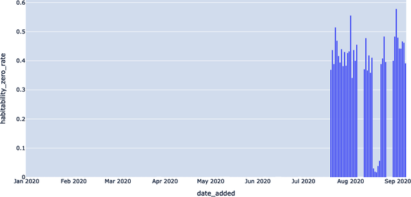
Figure 4-14. Visualizing zero value rates and the probable root cause of the anomaly
We can adapt one of the distribution detectors we built earlier in the chapter to get the first date of appreciable zero rates in the habitability field, as depicted in Example 4-31.
Example 4-31. Query for first date of zero rates in habitability field
WITHHABITABILITY_ZERO_RATESAS(SELECTDATE_ADDED,CAST(SUM(CASEWHENHABITABILITYIS0THEN1ELSE0END)ASFLOAT)/COUNT(*)ASHABITABILITY_ZERO_RATEFROMHABITABLESGROUPBYDATE_ADDED),CONSECUTIVE_DAYSAS(SELECTDATE_ADDED,HABITABILITY_ZERO_RATE,LAG(HABITABILITY_ZERO_RATE)OVER(ORDERBYDATE_ADDED)ASPREV_HABITABILITY_ZERO_RATEFROMHABITABILITY_ZERO_RATES)SELECT*FROMCONSECUTIVE_DAYSWHEREPREV_HABITABILITY_ZERO_RATE=0ANDHABITABILITY_ZERO_RATE!=0;
We can then run this query through the command line in Example 4-32, which will fetch the first date of appreciable zeros in the habitability field.
Example 4-32. Command-line interface running the query in Example 4-31
$ sqlite3 EXOPLANETS.db < queries/lineage/habitability-zero-rate-detector.sqlDATE_ADDED | HABITABILITY_ZERO_RATE | PREV_HABITABILITY_ZERO_RATE2020–07–19 | 0.369047619047619 | 0.0
2020–07–19 was the first date the zero rate began showing anomalous results. Recall that this is the same day as the schema change detection in EXOPLANETS_EXTENDED. EXOPLANETS_EXTENDED is upstream from HABITABLES, so it’s very possible that these two incidents are related.
In this way lineage information can help us identify the root cause of incidents and move quicker toward resolving them. Compare the two following explanations for this incident in HABITABLES:
-
On 2020–07–19, the zero rate of the habitability column in the
HABITABLEStable jumped from 0% to 37%. -
On 2020–07–19, we began tracking two additional fields,
eccentricityandatmosphere, in theEXOPLANETStable. This had an adverse effect on the downstream tableHABITABLES, often setting the fieldsmin_tempandmax_tempto extreme values whenevereccentricitywas notNULL. In turn, this caused thehabitabilityfield spike in zero rate, which we detected as an anomalous decrease in the average value.
Let’s break these explanations down. Explanation 1 uses just the fact that a data anomaly took place. Explanation 2 uses lineage, in terms of dependencies between both tables and fields, to put the incident in context and determine the root cause. Everything in the second explanation is actually correct, and we encourage you to mess around with the environment to understand for yourself what’s going on. While these are just simple examples, an engineer equipped with Explanation 2 would be faster to understand and resolve the underlying issue, and this is all owed to proper observability.
Tracking schema changes and lineage can give you unprecedented visibility into the health and usage patterns of your data, providing vital contextual information about who, what, where, why, and how your data was used. In fact, schema and lineage are the two most important data observability pillars when it comes to understanding the downstream (and often real-world) implications of data downtime.
Scaling Anomaly Detection with Python and Machine Learning
At a high level, machine learning is instrumental for data observability and data monitoring at scale. Detectors outfitted with machine learning can apply more flexibly to larger numbers of tables, eliminating the need for manual checks and rules as your data warehouse or lake grows. Also, machine learning detectors can learn and adapt to data in real time and can capture complicated seasonal patterns that otherwise would be invisible to human eyes. Let’s dive in—no prior machine learning experience required.
As you may recall from the previous two sections of this exercise, we’re working again with mock astronomical data about habitable exoplanets. Now, we’re going to restrict our attention to the EXOPLANETS table again, as we did earlier in the chapter, to better understand how to scale anomaly detection with machine learning, depicted in Example 4-33.
Example 4-33. Our trusty EXOPLANETS data set
$ sqlite3 EXOPLANETS.dbsqlite>PRAGMATABLE_INFO(EXOPLANETS);_id | TEXT | 0 | | 0distance | REAL | 0 | | 0g | REAL | 0 | | 0orbital_period | REAL | 0 | | 0avg_temp | REAL | 0 | | 0date_added | TEXT | 0 | | 0
Note that EXOPLANETS is configured to manually track an important piece of metadata—the date_added column—which records the date our system discovered the planet and added it automatically to our databases. To detect for freshness and distribution anomalies, we used a simple SQL query to visualize the number of new entries added per day, as highlighted in Example 4-34.
Example 4-34. Query to pull the number of new EXOPLANETS entries added per day
SELECTDATE_ADDED,COUNT(*)ASROWS_ADDEDFROMEXOPLANETSGROUPBYDATE_ADDED;
This query yields a seemingly healthy set of data, as depicted in Example 4-35. But is there more we should know?
Example 4-35. Results of Example 4-34 (which look entirely standard)
date_added,ROWS_ADDED
2020-01-01,84
2020-01-02,92
2020-01-03,101
2020-01-04,102
2020-01-05,100
...,...
2020-07-14,104
2020-07-15,110
2020-07-16,103
2020-07-17,89
2020-07-18,104
These results are visualized in Figure 4-15.

Figure 4-15. Visualizing the number of rows added per day for a given month
In words, the EXOPLANETS table routinely updates with around 100 entries per day, but goes “offline” on some days when no data is entered, as depicted in Figure 4-15. We introduced a metric called DAYS_SINCE_LAST_UPDATE to track this aspect of the table via our anomaly detection query template, as depicted in Example 4-36. This will tell us how many days it has been since the EXOPLANETS data set was updated, between distinct entries.
Example 4-36. Query on how many days since EXOPLANETS data set was updated
WITHUPDATESAS(SELECTDATE_ADDED,COUNT(*)ASROWS_ADDEDFROMEXOPLANETSGROUPBYDATE_ADDED)SELECTDATE_ADDED,JULIANDAY(DATE_ADDED)-JULIANDAY(LAG(DATE_ADDED)OVER(ORDERBYDATE_ADDED))ASDAYS_SINCE_LAST_UPDATEFROMUPDATES;
The results are listed in a CSV file, depicted in Example 4-37, and visualized in Figure 4-16. We see a list of dates with new data entries.
Example 4-37. Results from Example 4-36
DATE_ADDED,DAYS_SINCE_LAST_UPDATE
2020–01–01,
2020–01–02,1
2020–01–03,1
2020–01–04,1
2020–01–05,1
...,...
2020–07–14,1
2020–07–15,1
2020–07–16,1
2020–07–17,1
2020–07–18,1
In Figure 4-16, we can clearly see that there were some dates in February, April, May, June, and July 2020 where data was not added to our EXOPLANETS data set, signaling an anomaly.
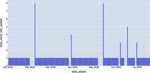
Figure 4-16. Using a freshness anomaly detection query, we can identify when the data goes “offline”
With a small modification, we introduced a threshold parameter to our query to create a freshness detector, which allows us to further refine our anomaly detection. Our detector returns all dates where the newest data in EXOPLANETS was older than one day, as highlighted in Example 4-38.
Example 4-38. Query to identify when a column in our EXOPLANETS data set has not been updated in over one day
WITHUPDATESAS(SELECTDATE_ADDED,COUNT(*)ASROWS_ADDEDFROMEXOPLANETSGROUPBYDATE_ADDED),NUM_DAYS_UPDATESAS(SELECTDATE_ADDED,JULIANDAY(DATE_ADDED)-JULIANDAY(LAG(DATE_ADDED)OVER(ORDERBYDATE_ADDED))ASDAYS_SINCE_LAST_UPDATEFROMUPDATES)SELECT*FROMNUM_DAYS_UPDATESWHEREDAYS_SINCE_LAST_UPDATE>1;
The CSV file generated by this query is depicted in Example 4-39, highlighting freshness anomalies.
Example 4-39. Results of Example 4-38 query
DATE_ADDED,DAYS_SINCE_LAST_UPDATE
2020–02–08,8
2020–03–30,4
2020–05–14,8
2020–06–07,3
2020–06–17,5
2020–06–30,3
In Figure 4-17, we can clearly visualize the specific dates when our data set was collecting stale data, likely from an exoplanet orbiter or other space probe.

Figure 4-17. Visualizing dates when the table was collecting “stale” data, indicating data downtime
The spikes in Figure 4-17 represent instances where the EXOPLANETS table was working with old or “stale” data. In some cases, such outages may be standard operating procedure—maybe our telescope was due for maintenance, so no data was recorded over a weekend. In other cases, though, an outage may represent a genuine problem with data collection or transformation—maybe we changed our dates to ISO format, and the job that traditionally pushed new data is now failing. We might have the heuristic that longer outages are worse, but beyond that, how do we guarantee that we only detect the genuine issues in our data?
The short answer: you can’t. Building a perfect predictor is impossible (for any interesting prediction problem, anyway). But, we can use some concepts from machine learning to frame the problem in a more structured way and, as a result, deliver data observability and trust at scale.
Improving Data Monitoring Alerting with Machine Learning
Whenever we alert about a broken data pipeline, we have to question whether the alert was accurate. Does the alert indicate a genuine problem? We might be worried about two scenarios:
-
A data monitoring alert was issued, but there was no genuine issue. We’ve wasted the user’s time responding to the alert.
-
There was a genuine issue, but no data monitoring alert was issued. We’ve let a real problem go undetected.
These two scenarios are described as false positives (predicted anomalous, actually OK) and false negatives (predicted OK, actually anomalous), and we want to avoid them. Issuing a false positive is like crying wolf—we sounded the alarm, but all was OK. Likewise, issuing a false negative is like sleeping on guard duty—something was wrong, but we didn’t do anything.
Our goal is to avoid these circumstances as much as possible and focus on maximizing true positives (predicted anomalous, actually a problem) and true negatives (predicted OK, actually OK).
Accounting for False Positives and False Negatives
Anomaly detection is an unsupervised task. Unsupervised learning is a machine learning task where the optimal behavior is not knowable at training time. In other words, the data on which you’re training doesn’t come with labels attached. For this reason, you may be compelled to call anomaly detection unsupervised, since anomalies don’t come with a ground truth. Without a ground truth, you can’t get an error signal, in other words, the difference between what you predicted and what you should have predicted.
While some anomaly detection tasks are best understood as unsupervised learning problems, it still makes sense to consider supervised error signal vocabulary like false negative, false positive, precision, etc. Otherwise, we cannot benchmark different detection algorithms against one another or have any metric for improvement and success.
For any given data point, an anomaly detector issues either an “anomalous” or a “not anomalous” prediction. Also, consider that there is some truth about the matter—the data point in question is either a genuine problem, or not a problem at all. Consider a measurement reflecting that your key analytics table has not updated once in the last three days. If your table should update hourly, this is a genuine problem!
When a data point is problematic and our detector calls it “anomalous,” we call this a true positive. When a data point is just fine and our detector doesn’t detect it (i.e., issues “not anomalous”), we call this a true negative. Table 4-1 illustrates this concept.
| Predicted | |||
|---|---|---|---|
| Negative | Positive | ||
| Actual | Negative | True Negative | False Positive |
| Positive | False Negative | True Positive | |
False negatives are cases where the data point was genuinely problematic, yet our detector did not detect. A false negative detection is like a sleeping guard dog—your algorithm lets a problem go by undetected. False positives are cases where we detected an anomaly, but the point in question was not actually problematic. A false positive detection is like crying wolf—your algorithm issued an “anomalous” result, but the underlying data point was actually fine. False positives and false negatives are realities for even the most well-trained anomaly detection algorithms.
False positives and false negatives both sound bad. It seems like the best anomaly detection techniques ought to avoid them both. Unfortunately, for reasons to do with simple statistics, we can’t “just avoid both.” In fact, fewer false positives comes at the expense of more false negatives—and vice versa.
To understand why, let’s think about the boy who cried wolf again—through an anomaly detector lens! The boy who cried wolf detects every data point as an anomaly. As a result, his detection is highly sensitive (not likely to let any false negatives slip by) but not at all specific (liable to produce lots of false positives). Data professionals dislike boy-who-cried-wolf detectors because their detections aren’t believable. When an anomaly detector with a high false positive rate detects, you’re likely to believe the alert isn’t genuine.
The sleeping guard dog is another kind of anomaly detector—actually, the opposite kind. This detector never considers data points anomalous. The resulting anomaly detection algorithm is highly specific (no false positives will be produced) but not at all sensitive (lots of false negatives will occur). Data professionals dislike sleeping-guard-dog detectors too, because their results aren’t dependable. Overly conservative detectors will never issue anomalous detections, meaning they’re bound to miss when things go really awry.
The trick, as it turns out, is to aim somewhere in the middle between these two detection schemes.
Improving Precision and Recall
For a given collection of data, once you’ve applied an anomaly detection algorithm, you’ll have a collection of true positives (TPs), true negatives (TNs), false positives (FPs), and false negatives (FNs). We typically don’t just look at these “scores” by themselves—there are common statistical ways of combining them into meaningful metrics. We focus on precision and recall, accuracy metrics that quantify the anomaly detector’s performance.
Precision is defined as the rate of correct predictions made, so:
In other words: out of all the “positives” (predictions made), how many are correct?
Recall is defined as the rate of actual anomalies detected, so:
In other words: out of all the genuine anomalies, how many did we catch?
These terms are popular accuracy metrics for classification systems, and their names are semantically meaningful. A detector with high precision is “precise” in that when it predicts anomalies, it’s more often than not correct. Similarly, a detector with high recall “recalls” well—it catches a high rate of all the actual anomalies.
The problem, of course, is that you can’t have the best of both worlds. Notice that there’s an explicit trade-off between these two. How do we get perfect precision? Simple: alert for nothing—the guard dog sleeping on duty all the time—forcing us to have a false positive rate of 0%. The problem? Recall will be horrible, since our false negative rate will be huge.
Likewise, how do we get perfect recall? Also simple: alert for everything—crying wolf at every opportunity—forcing a false negative rate of 0%. The issue, as expected, is that our false positive rate will suffer, affecting precision.
Our world of data is run by quantifiable objectives, and in most cases we’ll want a singular objective to optimize, not two. We can combine both precision and recall into a single metric called an F-score. The general formula for nonnegative real β is:
Fβ is called a weighted F-score, since different values for beta weigh precision and recall differently in the calculation. In general, an Fβ-score says, “I consider recall to be beta times as important as precision.”
When β = 1, the equation values each equally. Set β > 1, and recall will be more important for a higher score. In other words, β > 1 says, “I care more about catching all anomalies than occasionally causing a false alarm.” Likewise, set β < 1, and precision will be more important. β < 1 says, “I care more about my alarms being genuine than about catching every real issue.”
There are many frameworks you can use to apply anomaly detection at scale without having to hand-code your algorithms in Python. See the following for a few of our favorites:
- Facebook Prophet
- A forecasting model built to handle daily, weekly, monthly, and yearly seasonalities in time series data at scale. Users can load baseline Prophet models and tweak human-interpretable model parameters, adding domain knowledge via feature augmentation. The package ships in both Python and R.
- TensorFlow
- A popular machine learning library for a variety of tasks, including natural language processing, computer vision, and time series anomaly detection. The package provides useful and well-documented implementations of more advanced anomaly detection algorithms. TensorFlow’s Keras package, for example, implements an autoencoder model that can be used for a neural form of autoregression, more powerful than a basic autoregressive-integrated-moving-average (ARIMA) model.
- PyTorch
- Developed at Facebook, this is another machine learning Python library fulfilling similar use cases to TensorFlow (which is developed by Google). PyTorch typically has higher uptake in the academic side of the industry, while TensorFlow enjoys greater popularity in industry settings.
- scikit-learn
- Another popular machine learning software package with implementations for all sorts of algorithms. In addition to time series anomaly detection methods like ARIMA, scikit-learn has versions of the k-nearest neighbor algorithm and the isolation forest algorithm, two popular methods for clustering. Like TensorFlow, scikit-learn is developed in Python.
- MLflow
-
A popular experiment tracking tool developed as open source by the creators of Databricks. Experiment tracking refers to the process of managing machine learning models in development and production. MLflow is primarily an experiment tracking and reproduction software. MLflow instances have shared model registries where experiments can be backed up and compared side by side. Each model belongs to a project, which is a packaged software environment designed to ensure model reproducibility, as depicted in Figure 4-18. An important aspect of developing anomaly detection software is the guarantee that the code runs the same on different machines. You don’t want to think you’ve solved a bug locally just for the fix to fail to apply in production. Likewise, if a colleague reports an accuracy metric for their updated model, you’d like to know that you could replicate their quality results yourself. Also with projects, the MLflow registry assists with deploying models to production environments, including Azure ML and Amazon SageMaker, or to Spark clusters as an Apache Spark UDF.
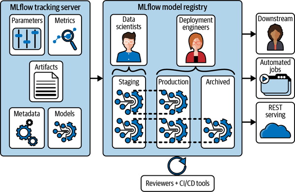
Figure 4-18. MLflow’s model registry visualized in the data science workflow
Note
Experiment tracking, the process of managing machine learning model development and training, involves hyperparameter comparison, dependency checking, managing and orchestrating training jobs, saving model snapshots, and collecting logs—among other tasks! This can in principle be done using some incredibly complicated spreadsheets, though obviously there are better tools for the job.
- TensorBoard
-
This is TensorFlow’s visualization toolkit, yet you don’t need to model with TensorFlow to take advantage of the software. With TensorBoard, as shown in Figure 4-19, you can visualize common machine learning metrics like loss per epoch of training, confusion matrices, and individual error analysis.
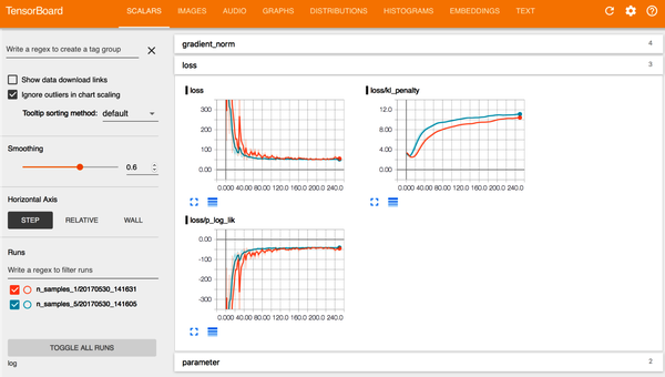
Figure 4-19. A standard TensorBoard view during model training. Source: Tran et al.1
These and other frameworks can take your anomaly detectors to the next level, eliminating false negatives and positives and reducing the need for model tuning over time.
Detecting Freshness Incidents with Data Monitoring
With our new vocabulary in hand, let’s return to the task of detecting freshness incidents in the EXOPLANETS table. We’re using a simple prediction algorithm, since we turned our query into a detector by setting one model parameter X. Our algorithm says, “Any outage longer than X days is an anomaly, and we will issue an alert for it.” Even in a case as simple as this, precision, recall, and F-scores can help us!
To showcase, we took the freshness outages in EXOPLANETS and assigned ground truth labels encoding whether each outage is a genuine incident or not. It’s impossible to calculate a model’s accuracy without some kind of ground truth, so it’s always helpful to think about how you’d generate these for your use case. Recall that there are a total of six outages lasting for more than one day in the EXOPLANETS table, as highlighted in the data depicted in Example 4-40.
Example 4-40. Results from Example 4-38 query on outages lasting more than one day
DATE_ADDED,DAYS_SINCE_LAST_UPDATE
2020–02–08,8
2020–03–30,4
2020–05–14,8
2020–06–07,3
2020–06–17,5
2020–06–30,3
Let’s say, arbitrarily, that the incidents on 2020-02-08 and 2020-05-14 are genuine. Each is eight days long, so it makes sense that they’d be problematic. On the flip side, suppose that the outages on 2020-03-30 and 2020-06-07 are not actual incidents. These outages are four and three days long, respectively, so this is not outlandish. Finally, let the outages on 2020-06-17 and 2020-06-30, at five and three days, respectively, also be genuine incidents, as depicted in Example 4-41.
Example 4-41. Classifying the “true” anomalies
INCIDENT,NOT INCIDENT
2020-02-08 (8 days),2020-03-30 (4 days)
2020-05-14 (8 days),2020-06-07 (3 days)
2020-06-17 (5 days),
2020-06-30 (3 days),
Having chosen our ground truth in this way, we see that longer outages are more likely to be actual issues, but there’s no guarantee. This weak correlation will make a good model effective, but imperfect, just as it would be in more complex, real use cases. To improve model accuracy, we need look no further than one of the most common tools in a data or ML engineer’s toolkit: the F-score.
F-Scores
F-scores are classification accuracy metrics designed to optimize jointly for both precision and recall. The “default” of these is the F1-score, defined (for the statisticians) as the harmonic mean between precision and recall:
This means that the F1-score is designed to equally balance precision and recall, which results in meaning we reward gains in one just as much as the other. In some contexts, this kind of evaluation might be appropriate. In other cases, though, either recall or precision might matter a lot more.
A real-world example that drives home the point: on Saturday morning, January 13, 2018, Hawaiian islanders received text messages that a ballistic missile was inbound and that they should seek underground shelter immediately. The alert went out at 8:07 a.m. and ended ominously with “This is not a drill.”
Thirty-eight minutes later, after the Hawaiian telephone network and 911 emergency line had gone down from overuse, the Hawaiian state government issued that the alert had been a mistake. While one Hawaiian man suffered a heart attack upon hearing the news, there were no immediate fatalities from the event.
The Hawaiian incident had been intended as a test of the island’s actual alerting system—the problem was, instead, that the system had sent out a real alert in error. In this instance, the real alert is an example of anomaly detection gone wrong, in the real world—a false positive. Now, while certainly scary, consider the equivalent false negative and the potential repercussions there. When considering real-world impacts, the consequences when things don’t work as anticipated could be severe.
What does this mean for product design and what can we do to mitigate it? In terms of what we’ve been discussing here: a false positive is better than a false negative for the missile detection system. Meaning: recall is more important than precision. If we’re examining the performance of a system such as this, we should use something other than the F1-score. In particular, a general Fβ score lets us say, “recall is beta times as important than precision for my detector”:
When β = 1, note that this equation comes out the same as the F1-score equation. It would also say “recall is one times as important as precision”—weighing them equally. However, if we were testing something like a missile alert system where recall was twice or three times as important, we might consider evaluating using an F2 or an F3.
Does Model Accuracy Matter?
In the past several pages, you may have noticed our sparing use of the word “accuracy.” Machine learning algorithms, anomaly detectors included, are supposed to be “accurate”—or so you’ve heard. Why aren’t we then leading with that vocabulary?
Here’s part of our answer (an example drawn from a Stanford professor, Mehran Sahami). Suppose you’re building a sophisticated, machine learning anomaly detection system to test for acquired immunodeficiency syndrome (AIDS). Here’s how our super sophisticated system works: it just predicts “No” anytime you ask it if someone has AIDS. AIDS affects approximately 1.2 million people in the United States today. The US population hovers somewhere about 330 million. Our “accuracy,” or how correct we are on average, is 1 − (Americans with AIDS / Americans) = 1 − (1.2 million / 330 million) = 99.6%. That’s one of the best accuracies we’ve ever seen—surely, publication worthy, cause for celebration, etc.
I hope this example illustrates the point: accuracy is not as simple as how correct your detector is on average, and moreover it shouldn’t be defined the same for different applications. After all, the outcome of relying on accuracy metrics in the preceding example would misdiagnose tens of thousands of individuals—or more. At the end of the day, we want a good detection scheme to minimize both false positives and false negatives. In machine learning practice, it’s more common to think about related but more insightful terms, precision and recall, as depicted in Figure 4-20.
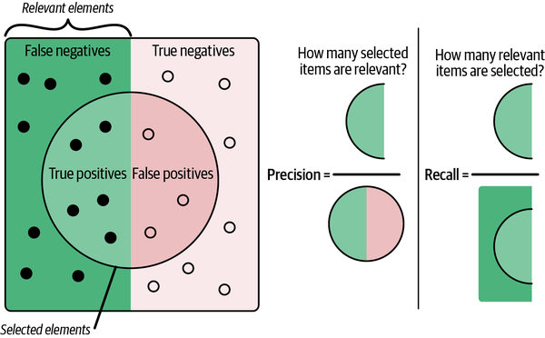
Figure 4-20. Precision (how often your algorithm accurately detects an anomaly) and recall (how many of the total anomalies were caught)
As discussed earlier in the chapter, precision, generally, tells us how often we’re right when we issue an alert. Models with good precision output believable alerts, since their high precision guarantees that they cry wolf very infrequently.
Recall, generally, tells us how many issues we actually alert for. Models with good recall are dependable, since their high recall guarantees that they rarely sleep on the job.
Extending our metaphor, a model with good precision is a model that rarely cries wolf—when it issues an alert, you had better believe it. Likewise, a model with good recall is like a good guard dog—you can rest assured that this model will catch all genuine problems.
Now, suppose we begin by setting our threshold to three days—in words, “every outage longer than three days is an anomaly.” This means we correctly detect anomalies on 2020-02-08, 2020-05-14, and 2020-06-17, so we have three true positives. But, we unfortunately detected 2020-03-30 as an incident when it isn’t one, so we have one false positive. Three true positives / (three true positives + one false positive) means our precision is 0.75. Also, we failed to detect 2020-06-30 as an incident, meaning we have one false negative. Three true positives / (three true positives + one false negative) means our recall is also 0.75. F1-score, given by the formula:
Inputting the appropriate values, this means that our F1-score is also 0.75. Not bad!
Now, let’s assume we set the threshold higher, at five days. Now, we detect only 2020-02-08 and 2020-05-14, the longest outages. These turn out to both be genuine incidents, so we have no false positives, meaning our precision is 1—perfect! But note that we fail to detect other genuine anomalies, 2020-06-17 and 2020-06-30, meaning we have two false negatives. Two true positives / (two true positives + two false negatives) means our recall is 0.5, worse than before. It makes sense that our recall suffered, because we chose a more conservative classifier with a higher threshold. Our F1-score can again be calculated with the preceding formula, and turns out to be 0.667.
If we plot our precision, recall, and F1-score in terms of the threshold we set, we see some important patterns. First, aggressive detectors with low thresholds have the best recall, since they’re quicker to alert and thus catch more genuine issues. On the other hand, more passive detectors have better precision, since they only alert for the worst anomalies that are more likely to be genuine. The F1-score peaks somewhere between these two extremes—in this case, at a threshold of four days. Finding the sweet spot is key to best fine-tune our detectors, as depicted in Figure 4-21.
Finally, let’s look at one last comparison (Figure 4-22). Notice that we’ve looked only at the F1-score, which weighs precision and recall equally. What happens when we look at other values of beta?
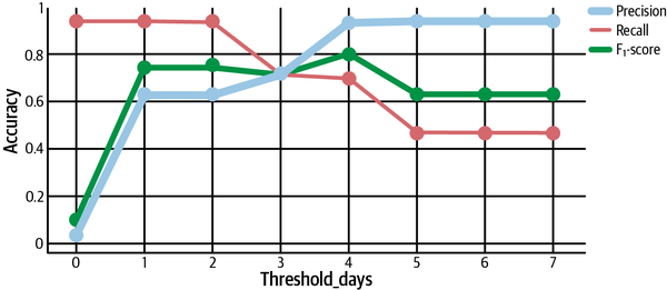
Figure 4-21. Calculating precision, recall, and F1-score and plotting the results to determine how to tune anomaly detectors
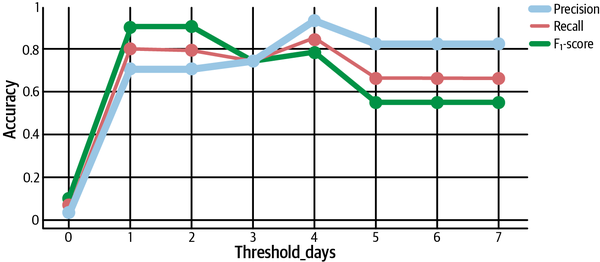
Figure 4-22. Calculating F-score with different values of β
Recall that a general Fβ says “recall is β times as important as precision.” Thus, we should expect that F2 is higher than F1 when recall is prioritized—which is exactly what we see at thresholds less than 4, as depicted in Figure 4-22. At the same time, the F0.5-score is higher for larger thresholds, showing more allowance for conservative classifiers with greater precision.
With this F-score in tow and a better-tuned algorithm, you’re ready to detect issues across the five pillars of data observability: freshness, volume, distribution, schema, and lineage.
Beyond the Surface: Other Useful Anomaly Detection Approaches
The best anomaly detection algorithms do three things: detect issues in near real time, alert those who need to know, and give you information to help prevent future downtime from occurring. In this chapter, we walked through common approaches and key elements of basic anomaly detection algorithms, but our example only scratches the surface. There are several other best practices, algorithm components, and methodologies that warrant similar, or even more accurate, results depending on the tooling you use:
- Rule definitions or hard thresholding
- Rule definitions set explicit cutoffs for certain metric values and determine anomalies relative to the threshold. While technically detection, this approach can only properly be called “anomaly” detection if most of the data points lie within the threshold. Rule definitions are incredibly scalable and might work for extremely well-defined SLAs, data uptime guarantees, and so forth.
- Autoregressive models
- Autoregression works on time-series anomaly detection, where data points are ordered using a timestamp object. Autoregressive models take data from previous timesteps, feed them into a regression (linear) model, and use the output to form a prediction for where the next timestamp’s data will be. Data points veering too far from the autoregressive prediction are marked anomalous. Combined with a simple moving average algorithm, autoregression gives us the autoregressive-moving-average and ARIMA detection algorithms. If we had taken our exoplanet example a step further and layered in autoregression, this data set would have worked quite well.
- Exponential smoothing
- Exponential smoothing methods exist to remove trend and seasonality from time series so that more naive approaches (e.g., ARIMA) can take over. Holt-Winters is a famous seasonal model for time series forecasting, and there is, again, a rich taxonomy (additive, multiplicative, damped, nondamped, and so on).
- Clustering
- Clustering techniques, like the k-nearest neighbor algorithm or the isolation forest algorithm find anomalies by putting similar data points in buckets, and alerting you to the “odd ones out,” e.g., the data fitting into small or even one-off buckets.
- Hyperparameter tuning
- Machine learning models have lots of parameters, which are numerical representations of the data used by the prediction algorithm. Some parameters are learned using the data and training process. For example, with a z-scoring model, μ and σ are parameters set automatically from the input data’s distribution. Other parameters, called hyperparameters, are not set by the learning process but instead dictate the learning and inference processes in certain ways. Some hyperparameters affect the model architecture, for example the size of a neural network, the size of embedding and hidden state matrices, and so on. These are called model hyperparameters. Another class, algorithm hyperparameters, affects the way training is done, for example the learning rate, number of epochs, or number of data points per training batch.
- Ensemble model framework
- An ensemble model framework takes the best of each method—a bit of clustering, exponential smoothing, and autoregressive nodes combined into a neural feed-forward network—and combines their predictions using a majority-voting ensemble algorithm.
While important, such approaches are outside the scope of this book—for more on building great anomaly detection algorithms, we suggest you check out Hands-On Machine Learning with Scikit-Learn, Keras, and TensorFlow (O’Reilly) by Aurélien Géron.
Designing Data Quality Monitors for Warehouses Versus Lakes
When it comes to building data quality monitors for your data system, it’s important to distinguish whether you’re working with structured, monolithic data from a warehouse or entering the wild west of the modern data lake ecosystem.
The primary differences between designing anomaly detection algorithms for warehouses and lakes boil down to:
-
The number of entrypoints you have to account for
-
How the metadata is collected and stored
-
How you can access that metadata
First, data lake systems tend to have high numbers of entrypoints, meaning one should assume high heterogeneity in data entering from different sources. In monitoring, say, null rates in tabular data entering from Postgres, application logs, and a web API, a data scientist might notice clusters of table behavior corresponding to the different endpoints. In these cases, be wary of a “one-size-fits-all” modeling approach. More likely than not, different model architectures (e.g., different hyperparameters) may work better at predicting anomalies in each different format. One way to do that is to condition on the endpoint of the data itself, forming a new feature for input into the machine learning model. Another is to use an ensemble model architecture, or simply to have separate models for each of your use cases.
Second, metadata collected straight into a data lake may need varying levels of preprocessing before you can expect an anomaly detection algorithm to derive anything of value from it. Types may need coercion, schemas may need alignment, and you may find yourself deriving entirely new augmented features in the data before running the detector’s training task.
This is fine to do immediately before model training, provided you aren’t bottlenecking your compute resources by applying “transformations” on large batches of input data. In some cases, it may be advantageous to devise some ELT steps in between the lake data and the machine learning algorithm. “Cleaning Data” provides some insight into why this may be valuable.
Summary
In this chapter, we’ve taken a quick safari through monitoring and anomaly detection as it relates to basic data quality checks. Now, how can these concepts help us apply detectors to our production environments in data warehouses and lakes?
The key lies in understanding that there’s no perfect classifier for any anomaly detection problem. There is always a trade-off between false positives and false negatives, or equally precision and recall. You have to ask yourself, “How do I weigh the trade-off between these two? What determines the ‘sweet spot’ for my model parameters?” Choosing an Fβ score to optimize will implicitly decide how you weigh these occurrences, and thereby what matters most in your classification problem.
Also, remember that any discussion of model accuracy isn’t complete without some sort of ground truth to compare with the model’s predictions. You need to know what makes a good classification before you know that you have one. In Chapter 5, we’ll discuss how to apply the technologies highlighted in Chapters 2, 3, and 4 to architecting more reliable data systems, as well as discuss new processes, like SLAs, SLIs, and SLOs, to help them scale.
1 Dustin Tran, Alp Kucukelbir, Adji B. Dieng, Maja Rudolph, Dawen Liang, and David M. Blei, “Edward: A Library for Probabilistic Modeling, Inference, and Criticism,” arXiv preprint arXiv:1610.09787, 2016, https://oreil.ly/CvuKL.
Get Data Quality Fundamentals now with the O’Reilly learning platform.
O’Reilly members experience books, live events, courses curated by job role, and more from O’Reilly and nearly 200 top publishers.

