Chapter 6. Working with Layout Grids
As you may have noticed from the series of semitransparent rectangles overlaying a few examples in this book, I use grid systems fairly often. Several different grid systems are available for websites, many of which were created for specific projects by developers who decided to give their work back to the design community. This chapter will focus on two that I’ve become a fan of: 960.gs and Square Grid.
The 960 Grid System (960.gs, see Figure 6-1), developed by Nathan Smith, focuses on a page width of 960 pixels, which makes it suitable for any monitor with a resolution of 1024 × 768 or higher. Three standard grids are available—12-column, 16-column, and a relatively new 24-column grid—and each column in the grid is set up with 10-pixel margins on each side to give your blocks plenty of room to breathe. The grid is incorporated into both the NineSixty (http://drupal.org/project/ninesixty) and Omega (http://drupal.org/project/omega) Drupal themes, and the 960 grid generator (http://grids.heroku.com/) allows you to create your own version of the 960 grid by setting up some initial grid values, which you can then add to a base theme of your choosing.
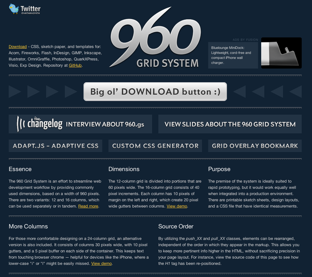
Figure 6-1. Nathan Smith’s lovely 960.gs is a good starting place for working with grids in your web design. If you want to try your hand at a custom grid, it even includes a custom grid generator that ...
Get Drupal for Designers now with the O’Reilly learning platform.
O’Reilly members experience books, live events, courses curated by job role, and more from O’Reilly and nearly 200 top publishers.

