May 2018
Beginner to intermediate
364 pages
7h 43m
English
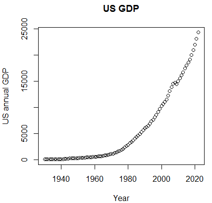
It is understandable that the concepts and datasets would be much more clear if we could use graphs. The first example shows the fluctuation of the US GDP over the last five decades:
> path<-"http://canisius.edu/~yany/RData/"> dataSet<-"usGDPannual"> con<-paste(path,dataSet,".RData",sep='')> load(url(con))> title<-"US GDP"> xTitle<-"Year"> yTitle<-"US annual GDP"> x<-.usGDPannual$YEAR> y<-.usGDPannual$GDP> plot(x,y,main=title,xlab=xTitle,ylab=yTitle)
The related graph is shown here:
If we used log scale for the GDP, we would have the following code and graph:
> yTitle<-"Log US annual GDP" > plot(x,log(y),main=title,xlab=xTitle,ylab=yTitle) ...
Read now
Unlock full access


