Chapter 4. Constraint Layouts: Draw Up a Blueprint
You donât build a house without a blueprint.
And some layouts use blueprints to make sure they look exactly the way you want. In this chapter, weâll introduce you to Androidâs constraint layout: a flexible way of designing more complex UIs. Youâll discover how constraints and bias let you position and size your views, irrespective of screen size and orientation. Youâll find out how to keep views in their place with guidelines and barriers. Finally, youâll learn how to pack or spread views with chains and flows. Letâs get designingâ¦
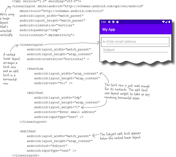
Nesting layouts comes at a price
The downside to nested layouts is that building complex layouts in this way can be inefficient, make your code harder to read and maintain, and can also slow down your app.
When Android displays a layout on the device screen, it first checks the structure of the layout file, and uses this to build a hierarchy of views. For the nested layout shown on the previous page, for example, it builds a hierarchy of views that contains two linear layouts, two edit texts, and a text view:
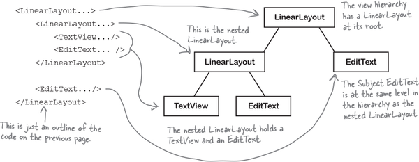
Android uses the view hierarchy to help it figure out where each view should be placed on the device screen. Each view needs to be measured, laid out, and drawn on the screen, and Android needs to make sure each view has enough space for its contents, and that any weights are taken into account.
If the layout contains nested layouts, the view hierarchy is more complex, and Android may need to make multiple passes in order to figure out how views need to be arranged. If the layouts are deeply nested, this can lead to bottlenecks in your code, and can leave you with a mass of code thatâs difficult to read and maintain.
If you have a more complex UI like this, an alternative to using nested layouts is to use a constraint layout.
Each view in the layout needs to be initialized, measured, laid out, and drawn. In deeply nested layouts, this can slow down your app.
Introducing the constraint layout
A constraint layout is more complex than a linear or frame layout, but itâs way more flexible. Itâs also much more efficient for complex UIs as it gives you a flatter view hierarchy, which means that Android has less processing to do at runtime.
You design constraint layouts VISUALLY
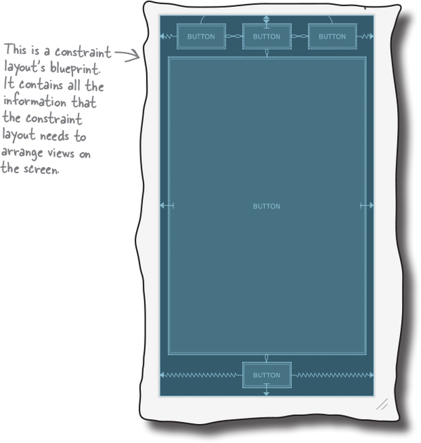
Another advantage of using constraint layouts is that theyâre specifically designed to work with Android Studioâs design editor. Unlike linear and frame layouts where you usually hack directly in XML, you build constraint layouts visually. You drag and drop views into the design editorâs blueprint, and give it instructions for how each view should be displayed:
Use a constraint layout to build flexible UIs without nesting layouts.
Unlike linear and frame layouts, constraint layouts are part of a suite of libraries known as Android Jetpack. You may have already heard something about Jetpack, but what is it?
Constraint layouts are part of Android Jetpack
Android Jetpack is a collection of libraries that help you follow best practice, reduce boilerplate code, and make your coding life easier. It includes constraint layouts, navigation, the Room persistence library (which helps you build databases) and lots, lots more.
Here are some of our favorite Jetpack components; youâll find out how to use them in later chapters:

Another great thing about Jetpack is that it lets you write code that works consistently across new and old versions of Android. This is great news for your users, as it means that you can include exciting new Android features that will work on older devices.
An example of this is AppCompatActivity, which youâve already been using to write activity code. We didnât mention it earlier, but AppCompatActivity is part of Android Jetpack. It adds new features to activities across new and old versions of Android without you having to worry about backward compatibility.
Note
Yes! Youâve already been using part of Android Jetpack without knowing it. Youâll learn more about using Jetpack through the rest of this book.
In this chapter, youâre going to learn how to use constraint layouts. Letâs run through what weâre going to do.
Hereâs what weâre going to do
Weâre going to break learning about constraint layouts into two main parts:
How to position and size a single view.
Youâll learn how to use constraints and bias to control how and where a single view is shown in its layout.

How to position and size multiple views.
Youâll then apply your knowledge to multiple views, and learn more advanced techniques using guidelines, barriers, chains, and flows.

Create a new project
Weâre going to use a new project for the app weâre going to build, so create one now using the same steps you used in the previous chapters. Choose the Empty Activity option, enter a name of âMy Constraint Layoutâ and a package name of âcom.hfad.myconstraintlayoutâ, and accept the default save location. Make sure the language is set to Kotlin and the minimum SDK is API 21 so it will run on most Android devices.
Now that weâve created the project, letâs make sure that it has been set up to use constraint layouts.
Use Gradle to include Jetpack libraries

To make sure that all the Jetpack librariesâincluding constraint layoutsâwork across all versions of Android, theyâre not included in the main Android SDK. Instead, you have to add any libraries you need using Gradle. This is a build tool thatâs used to compile code, configure apps, and fetch any extra libraries that your project requires.
Every time you create a new project, Android Studio creates two Gradle files named build.gradle.
The first version of build.gradle lives in the project folder, and specifies the basic settings of your app, such as what version of the Gradle plug-in to use.
The second version of build.gradle lives in the projectâs app folder. Itâs where the majority of the appâs properties are set, such as the API level.
Behind the scenes, every Android Studio project uses Gradle as its build tool.
The project build.gradle needs a Google repository line
Every project needs to know where to find any extra Jetpack libraries it needs, and this is done by adding a reference to the Google repository in the projectâs build.gradle file. Android Studio usually does this for you, but you can make sure itâs there by opening the file MyConstraintLayout/build.gradle, and looking for the following line (in bold) in the repositories section under allprojects:

The app build.gradle includes the constraint layoutâs library
To use constraint layouts, a reference to its library needs to be included in the appâs build.gradle file. Android Studio should have already added this for you, but you can double-check by opening the file MyConstraintLayout/app/build.gradle, and looking for the following line (in bold) in the dependencies section:

If the file doesnât include this line, add it now, and click on the Sync Now option that appears in the code editor. This syncs any changes youâve made with the rest of your project, and adds the library.
Letâs add a constraint layout to activity_main.xml
Now that your project is all set up to use constraint layouts, letâs start using one.
You add a constraint layout to a layout file using an <androidx.constraintlayout.widget.ConstraintLayout> element. Weâre going to use one in the layout file activity_main.xml, so open this file in the app/src/main/res/layout folder, and make sure its code looks like this:

Show the layout in the blueprint
Weâre going to add views to the layout using the design editorâs blueprint. Switch to the design editor by clicking on the Design option, click on the Select Design Surface button in the editorâs toolbar, and select the Blueprint option. This shows you a blueprint of the layout like this:


Add a button to the blueprint
Weâre going to add a button to the layout. To do this, go to the design editorâs palette, find the Button component (itâs usually in the Common section), and drag it to the blueprint. You can place the button anywhere in the blueprint, just so long as it appears in its main area like this:

Position views using constraints
With a constraint layout, you donât specify where views should be positioned by dropping them on the blueprint in a particular place. Instead, you specify placement by defining constraints. A constraint is a connection or attachment that tells the layout where the view should be positioned. You can use a constraint to attach a view to the start edge of the layout, for example, or underneath another view.
Weâll add a horizontal constraint to the button
To see how this works, letâs add a constraint to attach the button to the left edge of the layout.
First, make sure the buttonâs selected by clicking it. When you select a view, a bounding box is drawn around it, and handles are added to its corners and sides. The handles in the corners let you resize the view, and the handles on the sides let you add constraints:

To add a constraint, you click on one of the viewâs constraint handles and drag it to whatever you want to attach it to. In this case, weâre going to attach the left edge of the button to the left edge of the layout, so click on the left constraint handle and drag it to the left edge of the blueprint:

This adds the constraint, and pulls the button over to the left:

Thatâs how you add a horizontal constraint. Letâs see what happens when you add a vertical one.
Use opposing constraints to center views
As youâve learned, you can use constraints to attach a view to the edge of the blueprint. Each constraint works like a spring that pulls the view to the blueprintâs edge.
If you want to position views in the center of the blueprint, you can do so by adding constraints to opposite sides of the view. To center a button horizontally, for example, you add one constraint that pulls the view to the left, and another that pulls it to the right like this:

The two constraints pull the button in opposite directions, which centers it horizontally like so:

You can also center a view vertically by adding constraints to its top and bottom edges. And if you wanted to center it horizontally and vertically, youâd add constraints to all four edges like this:

You can delete constraints you no longer need
You can remove any constraints you no longer need by selecting them in the blueprint, and deleting them. If you have a button thatâs centered in the middle of the blueprint, for example, you delete the constraint thatâs attached to its bottom edge:

Deleting this constraint means that the button is no longer being pulled toward the bottom of the blueprint. The top constraint pulls the button to the top so that itâs only centered horizontally, and not vertically:

Another way of removing constraints you no longer need is to use the constraint widget tool. Letâs see how this works.
Remove constraints with the constraint widget
The constraint widget is displayed in the Attributes panel at the side of the design editor. It appears when you select a view, and displays a diagram featuring the viewâs constraints, and the size of any margins.
Note
Youâll find out more about the Attributes panel a few pages ahead.
To delete a constraint in the constraint widget, select the view in the blueprint you want to remove the constraint from, then click on the constraintâs handle in the constraint widget. The constraint is removed, and the view is repositioned in the blueprint.

You can use it to add margins too
You may have noticed that each of the constraints in the constraint widget has a number next to it. This is used to set the margin size for that edge of the view so that thereâs space between the view and the layoutâs edge. To change the size of a viewâs left and top margins to 24dp, for example, youâd update their values in the diagram to 24:


You can set a default size for any new margins using the Default Margins button in the design editorâs toolbar. Setting this to 24dp, for example, means that any new constraints that get added will automatically include a margin of 24dp.

Changes to the blueprint appear in the XML
When you add views to a blueprint, and specify constraints and margins, they get added to the layoutâs underlying XML. To see this, switch to the layoutâs code view. Your code should look something like this (but donât worry if itâs slightly different):

As you can see, the XML now includes a button. Does its code look familiar to you? If so, nice catchâit includes attributes that you learned about in Chapter 3.
The buttonâs width, height, and margins are specified in exactly the same way as before, and if you want to, you can change their values in the XML instead of using the design editor.
The only unfamiliar code is the two lines that specify the viewâs constraints on its start and top edges:

Similar code is generated if you add constraints to the buttonâs remaining edges.
Now that youâve had a glimpse of what constraint layout XML looks like switch back to the design editor, and weâll look at some more techniques you can use to position views.
Views can have bias
As you learned earlier, you can add constraints to opposite sides of a view. This centers the view by default, but you can also control its position relative to each side by changing its bias. This tells Android what the proportionate length of each constraint should be on either side of the view.
To see this in action, letâs change the buttonâs horizontal bias so that itâs positioned off-center. First, make sure that the button includes constraints on its left and right sides like this:

Then select the button so the constraint widget is displayed.
Underneath the widgetâs diagram of the view, you should see a slider with a number in it. This is a percentage of the viewâs horizontal bias.

To change the bias, simply move the slider. If, say, you move the slider to the left so that the number changes to 30, it moves the button in the blueprint to the left as well:

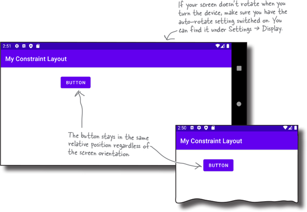
The view maintains this relative position irrespective of screen size and orientation. Letâs try this out by taking the app for a test drive.
 Test Drive
When we run the app, a button appears off-center toward the top of the screen. It maintains the same relative position when we rotate the device.
Youâve now learned various techniques to control a viewâs position on the screen. Next up, how to change its size.
You can change a viewâs size
As you might expect, you can change a viewâs size in a constraint layout by updating its layout_width and layout_height attributes. You can do this in the layoutâs XML, or in the design editorâs Attributes panel.
The Attributes panel is displayed to the side of the blueprint. When you select a view, it shows you all the attributes that have already been declared (such as layout_width and layout_height), and lets you set ones that havenât.
Make the view just big enough
Just like with linear and frame layouts, you make a view just large enough to display its contents by setting its layout_width and layout_height properties to wrap_content. If the view is a button, for example, it makes the button just large enough to hold its text:

Match the viewâs constraints
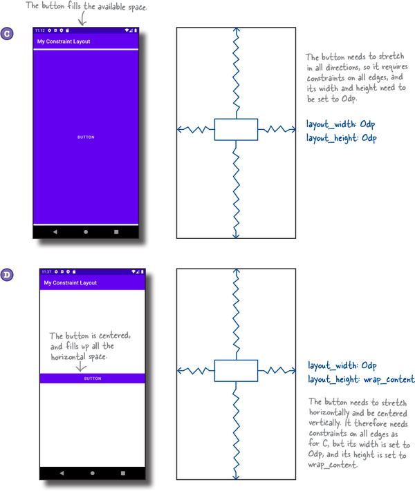
If youâve added constraints to opposite sides of your view, you can make the view match the size of its constraints. You do this by setting its layout_width and/or layout_height to 0dp: set layout_width to 0dp to make the view match its horizontal constraints, and set layout_height to 0dp to make it match its vertical ones.
In the example below, weâve set the buttonâs layout_width to 0dp so that the button matches its horizontal constraints:

Now that youâve seen how to resize a view, try experimenting with the different techniques, then have a go at the exercise on the next page.
BE the Constraint Solution

Your job is to play like youâre the constraint layout and draw the constraints that are needed to produce each layout. You also need to specify the layout_width, layout_height, and bias (when needed) for each view. Weâve completed the first one for you.

Most layouts need multiple views

So far youâve seen how to position and size a single view in a constraint layout. Most of the time, however, your layout will need to contain multiple views that are laid out relative to one another.
To see how this works, first make sure that your constraint layout includes a single button with two constraints: one that connects its top edge to the top of the blueprint, and another that connects its left edge to the blueprintâs left side. Its layout_width and layout_height properties should be set to wrap_content, and the margins for these edges should be set to 24dp.
After youâve made these changes, the button should be positioned in the blueprintâs top-left corner like this:

Add a second button to the blueprint
Next, add a second button to the blueprint by dragging one from the palette, and placing it somewhere underneath the first button like this:

The blueprint now includes two buttons. Letâs find out how to position them relative to one another.
You can connect views to other views
As you already know, constraints let you attach a view to the edge of its blueprint. You can also use constraints to connect two views together, and this is used to specify how they should be displayed relative to one another.
To see how this works, select the second button in the blueprint, then draw a constraint that goes from the second buttonâs top edge to the first buttonâs bottom edge like this:

When the constraint is added, it pulls the button up so that itâs connected to the first, and displayed underneath it:

The constraint means that the second button will always be positioned under the first, irrespective of the first buttonâs position on the device screen.
Once youâve positioned two views in this way, the next thing you might want to do is make sure that theyâre aligned. Letâs find out how to do this.
You can align views too
The simplest way of aligning two views is to use the Align button in the design editorâs toolbar.
To see how this works, letâs left-align the two buttons in the blueprint so that their left edges line up. First, select both buttons by holding down the Shift key as you click on each one. Then click on the Align button to open up a set of alignment options like this:

Click on the Left Edges option to left-align the two buttons. This adds a constraint to the blueprint that connects their left edges together like this:

Align views using guidelines
Another technique you can use to align views is a guideline. This is a fixed line you add to the blueprint that you can use to constrain views. Itâs only visible in the design editor, so users donât see it when they run the app.
Letâs explore how guidelines work by adding one to the blueprint. Click on the Guidelines button in the design editorâs toolbar, and choose the option to add a vertical guideline. This places a vertical guideline in the blueprint:

Once the guideline has been added, you can move it elsewhere by dragging it. You can set it to be either a fixed distance from the blueprintâs edge, or a fixed percentage:

You can then use constraints to attach views to the guideline like this:

Guidelines have a fixed position
Guidelines are either positioned a fixed distance from the blueprintâs edge, or a fixed percentage between the two. They stay in that position when the app runs, so theyâre a useful way of aligning views.
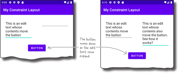
In some situations, you need something thatâs a little more flexible. As an example, suppose you have a layout that includes two multi-line edit texts, side by side, with a button underneath like this:

The edit texts expand vertically as the user enters text. You want the button to move as the views change size so that itâs always positioned beneath them like so:
So how can you build this sort of layout?
Create a movable barrier
To create layouts like this, you can use a barrier. This is like a guideline, except that it doesnât have a fixed position. Instead, it forms a barrier against views, and moves when they change size. This repositions any views that are constrained to the barrier.
In the example on the previous page, the two edit texts are placed above a horizontal barrier, and the button is constrained beneath it. As the edit texts expand, the barrier moves down and repositions the button:

Letâs build a layout that uses a barrier
To see how barriers work, letâs create this example.
First, delete any views, and make sure the blueprint includes a vertical guideline positioned at 50%. Then drag two multi-line edit texts from the palette, and position them on either side of the guideline.
Note
You can usually find these in the âTextâ part of the palette, listed as âMultiline Text.â
Next, add vertical constraints to constrain each view to the top of the blueprint, and horizontal constraints to position each one between the blueprintâs edge and the guideline.
Finally, change the layout_width of each edit text to 0dp so that it matches its horizontal constraints, and set their layout_heights to âwrap_contentâ so that the views can expand.
When youâre done, the blueprint should look something like this:

Add a horizontal barrier
We need to add a horizontal barrier to the blueprint. To do this, click on the Guidelines button in the design editor toolbar, and choose the option to add a horizontal barrier:

This creates the horizontal barrier.
Place the barrier beneath the views
We want the barrier to move down as the two edit text views expand. To do this, go to the layoutâs component tree panel, and drag the two edit text components onto the barrier:

This doesnât change the position of the edit text views in the blueprint: it simply tells the barrier that it needs to move with these views.
Next, we need to position the barrier so that itâs at the bottom of the two views. Select the barrier in the component tree, and use the Attributes panel to change its barrierDirection attribute to âbottom.â This positions the barrier below the two edit texts so that the blueprint looks like this:

Constrain a button under the barrier
Now that the layoutâs barrier is in place, letâs add the button, and constrain it to the barrier so that it moves down as the edit text views expand.
First drag a button from the palette to the blueprint, and place it somewhere underneath the barrier. Then center it horizontally by adding two horizontal constraints that connect the buttonâs sides to the edges of the blueprint like this:

Next, you need to attach the top of the button to the barrier. You can try doing this by drawing the constraint directly in the blueprint. If, like us, you find this a bit too fiddly, select the button, search for its layout_constraintTop_toBottomOf attribute in the Attributes panel, and change its value to the barrierâs ID (in our case, this is @id/barrier).

After you make this change, the blueprint should look something like this:

As barriers can be quite tricky to work with at first, weâll show you our complete XML over the next couple pages, and then take the app for a test drive.
 Test Drive
When we run the app, a button is displayed beneath two edit text views. The button moves down when we type into each edit text, and the views expand.
As you can see, adding a barrier is a bit more complicated than drawing constraints and aligning views, but we think itâs worth the extra effort.
So whatâs next?

Use a chain to control a linear group of views
Youâve now learned how to connect and align views, and use guidelines and constraints. But what if you want to create a row or column of views, and evenly space them out?
In this sort of situation, you can use a chain. This is a linear group of views that are linked together with bidirectional constraints. The chain controls each viewâs position, so you can use it to evenly space the views out, or pack them in the center of the blueprint.
Weâre going to create a horizontal chain
To see how this works, weâre going to create a chain that controls the position of three buttons. The buttons will be lined up in a horizontal row, and evenly spaced between each side of the blueprint like this:

When the app runs, the buttons will maintain their relative positions, regardless of screen size or orientation:

Letâs find out how to create a chain.
The chain will use three buttons
Before we create the chain, first remove all of the constraints that have been added to the blueprint so far. The quickest way of doing this is with the Clear All Constraints button in the design editorâs toolbar, so click on this button now.

You also need to get rid of any guidelines, barriers, and edit text views. Do this by selecting each one, and deleting it.
Then add two more buttons to the blueprint so there are three in total, and use the âOrientation for Previewâ button in the design editorâs toolbar to change the blueprintâs orientation to landscape. This will make it easier to see the chain.

When youâve added the buttons, the blueprint should look something like this:

Align the views weâre going to chain
Chains work best when views are aligned. First, add a constraint that connects the first button to the top of the blueprint, and set its margin to 64. Then select all three buttons, and use the Align button in the design editorâs toolbar to align their top edges. The blueprint should look like this.

Now that the buttons are nicely aligned, letâs go ahead and create the chain.
Create the horizontal chain
To create the chain, select all three buttons, then right-click on one of them. From the menu that appears, choose the Chains option, followed by Create Horizontal Chain.

When the horizontal chain is created, it joins the buttons together, and fastens the first and last view to the blueprintâs vertical edges. The chain should look something like this:

By default, views in a chain are evenly spaced out between the blueprintâs edges. You can change this behavior by right-clicking on one of the chainâs views, selecting the Chains option from the menu that appears, and then choosing Horizontal Chain Style.
Possible chain style options include spread, spread inside, and packed. See if you can work out what these options do by having a go at the following exercise.
There are different styles of chain
As you have discovered, you can choose different chain styles to change how a chain arranges its views.
Spread spaces out views between the blueprintâs edges
The default style is spread. This is used to evenly distribute the views between the blueprintâs edges like this:

Spread inside moves the first and last view to the edges
The spread inside style is similar to spread, except that it moves the first and last view to the blueprintâs edges. It then evenly spaces out any remaining views like so:

Packed moves the views together
The packed style is used to pack views together. It then centers the entire group of views like this:

Now that youâve seen what these options do, letâs take the app for a test drive.
 Test Drive
When we use the spread style of chain and run the app, the buttons are evenly spread in the device screen. This is irrespective of screen orientation.

Always test layouts on a variety of device sizes and orientations to make sure they look and behave how you want.

Constraint layouts can include both horizontal and vertical chains, and a single view can belong to both types. You can use this to arrange views in a grid.
The blueprint above, for example, shows six buttons arranged in a grid. Each row is a horizontal chain, and the leftmost buttons form a vertical chain:
Another way in which you can create grids is to use a flow. Letâs find out what this is, and how to use it.
A flow is like a multi-line chain
A flow is like a chain that can span multiple rows. Itâs invaluable when, say, you want to display lots of views in a row, but they might not fit on the screen for some screen sizes or orientations.
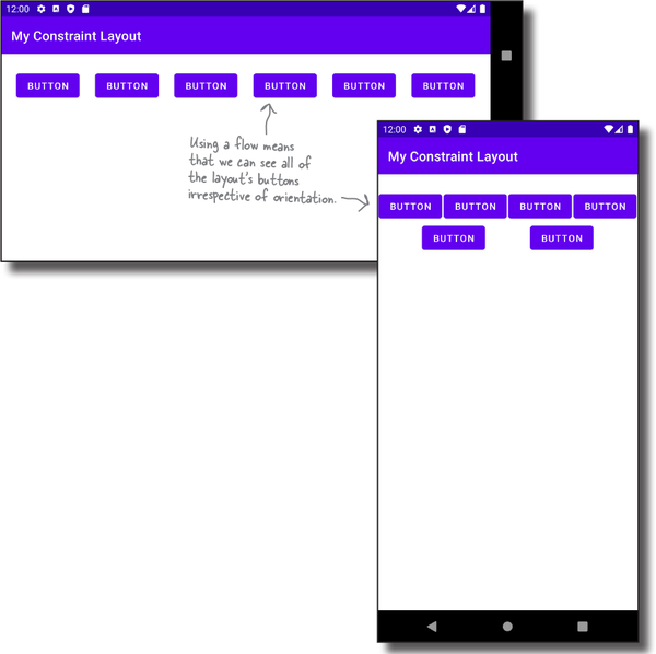
As an example, suppose you have a chain that displays six buttons in a horizontal row. When the orientation is landscape, they are displayed like this:

But when the orientation is changed to portrait, thereâs not enough room to display all of the views:

If you replace the chain with a flow, any views that canât fit on the first row will flow onto a second row like this:

Letâs see how flows work by building the above layout.
How to add a flow
First, remove any constraints by clicking on the Clear All Constraints button in the design editorâs toolbar. Then add extra buttons to the blueprint so there are six in total like this:

Next, select all of the buttons, click on the Guidelines button in the design editorâs toolbar, and choose the Flow option. This adds the flow component.
We now need to tweak the flow componentâs settings to make it behave the way we want. To do this, select the flow in the component tree, then use the blueprint or constraint widget to add constraints to connect its sides and top to the edges of the blueprint. Change its layout_width attribute to â0dpâ so that it matches its constraints. Finally, search for its flow_wrapMode attribute in the Attributes panel, and set this to âchainâ.
When youâve made all of these changes, the blueprint should look something like this when the orientation is landscape:

If you change the orientation to portrait, the blueprint should look like this instead:

Once youâve created a flow, you can tweak the way in which it displays its views. Letâs see how.
You can control the flowâs appearance
The main way in which you can alter the flowâs appearance is with its flow_wrapMode attribute.
Use âchainâ to create a multi-line chain
If you set the flow_wrapMode attribute to chain, the flow behaves like a flexible chain that lets its views flow onto extra rows.
With this option, you can make further changes to the flowâs appearance by changing the value of its flow_horizontalStyle attribute. Possible options for this attribute are spread, spread inside, and packed. These have exactly the same effect as when you used them with chains. The packed option, for example, packs the views together like this:

Use âalignedâ to line up the views
If you set the flow_wrapMode attribute to aligned, the views flow onto extra rows, and they are lined up like this:

You can also set the flow_wrapMode attribute to none or leave it unset. This makes the flow behave like a normal chain so that its views donât flow onto a second row.
 Test Drive
When we use the chain style of flow and run the app, the buttons are evenly spread in the device screen when the orientation is landscape.
When we change the orientation to portrait, any buttons that donât fit onto the first row flow onto the second.
Congratulations! Youâve now learned how to design super-flexible screens using constraint layouts. As well as looking and behaving the way you want, they donât use nested layouts, so theyâre extremely efficient.
Before you move on to the next chapter, why not put your new skills into practice, and try experimenting with some of the techniques youâve learned?
Your Android Toolbox

Youâve got Chapter 4 under your belt and now youâve added constraint layouts to your toolbox.

Get Head First Android Development, 3rd Edition now with the O’Reilly learning platform.
O’Reilly members experience books, live events, courses curated by job role, and more from O’Reilly and nearly 200 top publishers.
