In global and local navigation systems, the most common and important navigation elements are those that are integrated into the content-bearing pages of the web site. As users move through the site or sub-site, these are the elements they see and use again and again. Most integrated navigation elements fit into one of two categories: navigation bars and pull-down menus.
You can implement navigation bars in many ways and use them for the hierarchical, global, and local navigation systems. In simplest form, a navigation bar is a collection of hypertext links grouped together on a page. Alternatively, the navigation bar may be graphical in nature, implemented as an image map or as graphic images within a table structure.
The decision to use text versus graphic navigation bars falls primarily within the realms of graphic design and technical performance rather than information architecture. Graphic navigation bars tend to look nicer but can significantly slow down the page loading speed (although, if you’re able to reuse the same global navigation bar throughout the site, loading speed will only be hurt once, since the image will be cached locally). If you do use graphic navigation bars, you need to be sensitive to the needs of users with low bandwidth connections. You should also consider those users with text-only browsers (there are still quite a few out there) and those users with high-end browsers who turn off the graphical capabilities to get around more quickly. Appropriate use of the <ALT> attribute to define replacement text for the image will ensure that your site supports navigation for these users.
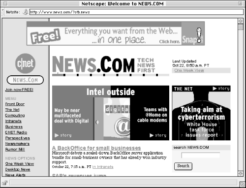
However, key issues related to the architecture should also influence this decision. For example, it is usually much easier to add options to a text menu than a graphic-based menu. If you anticipate substantial growth or change in a particular area, it may make sense to employ a textual navigation bar, like the one in Figure 4.10. Cost is also an issue, since graphic navigation bars require more work to create and change than text-based bars. In many cases, you might employ a graphic bar for global navigation and a textual menu for local navigation. A good graphic designer will strike an elegant balance between form and function in creating these navigation bars.
It is often best to place the navigation bar towards the top and/or bottom of the page, rather than at the side.[9] Placement at the top provides immediate access to the navigation system as well as an instant sense of context within the site. This supports the scenario in which a user quickly scans the first paragraph and decides to move on to other areas of the site. Placement at the bottom assumes navigation once the page has been fully read. Placement at both the top and bottom should be determined by the length of the content.
Graphical navigation bars may employ several techniques for conveying content and context, including textual labels and icons. Textual labels are the easiest to create and by far most clearly indicate the contents of each option. Icons, on the other hand, are relatively difficult to create and often fail to indicate the contents of each option. It’s difficult to represent abstract concepts through images. A picture may say a thousand words, but often they’re the wrong words. Icons can successfully be used to complement the textual labels. Since repeat users may become so familiar with the icons that they no longer take the time to read the textual labels, icons are useful in facilitating rapid menu selection for them. See Figure 4.11 for an example.
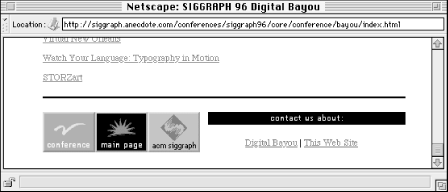
Figure 4-11. This navigation bar, which appears at the bottom of the page, demonstrates an interesting blend of graphic icons (with labels) and textual options. The global navigation icons provide a splash of color, while their labels ensure usability. The textual local navigation options allow for the creation of many footer navigation bars without restrictive costs.
However, hidden minefields may plague an iconic system. First, the Internet’s global nature introduces the potential for confusion or even anger, since an image may have very different meanings from one culture to another. Second, the iconic system may work well for a limited number of menu options, but if the decision is made to add one or more options, creating an appropriate icon can be very challenging. While icons certainly work well sometimes, the skillful use of a color system can facilitate rapid menu selection without the inherent problems of iconic systems. (For more about the use of icons, see Chapter 5.)
Frames present an additional factor to consider in the application of textual or graphical navigation bars. Frames allow you to define one or more independently scrollable “panes” within a single browser window. Hypertextual links within one pane can control the content displayed in other panes within that same window. This enables the designer to create a static or independently scrolling navigation bar that appears on every page in that area of the web site. This frame-based navigation bar will be visible to the user in the same location in the browser window even while scrolling through long documents. By separating the navigation system from content in this way, frames can provide added context and consistency as users navigate a web site.
However, frames present several serious problems, both from the consumer’s and producer’s perspective. Architects should proceed very carefully in considering frame-based navigation solutions. Let’s review a few of the major considerations.
Static navigation bars implemented through frames often take up significant portions of valuable screen real estate (see Figure 4.12). No matter how far the user scrolls, the navigation bar always stays with them. The addition of winking, blinking banner advertisements into the static navigation bar often compounds this problem. On a large, high resolution monitor this may be only a minor irritation. On a standard 640 x 480 monitor, these frames can be really annoying. If you’re going to use a frame-based navigation bar, keep it relatively small and non-obtrusive. You should also consider a vertical rather than horizontal frame, since left-to-right reading lends itself to narrow text columns like those found in newspapers and magazines.
The Web is built upon a model of pages, with each page having a unique address or URL. Users are familiar with the concept of pages. Frames confuse this issue, by slicing up pages into independent panes of content. By violating the page model, the use of frames frequently disables important browser navigation features such as bookmarking, visited and unvisited link discrimination, and history lists. Frames can also confuse and frustrate users executing simple tasks such as using the back button, reloading a page, and printing a page. While web browsers have improved in their ability to handle frames, they can’t remove the confusion caused by violating the page model.
Right off the bat, a web page with multiple panes will take a hit on display speed. Since each pane is a separate file with its own URL, loading and displaying each pane requires a separate client-server interaction. In other words, the user spends a lot of time watching “Host Contacted” messages fly by at the bottom of the screen. This problem is compounded by heavy graphics use.
In theory, there are some compelling reasons to try frames. You can make global navigation bars or section headers (or advertisements) visible to the user at all times. However, in practice, designing user-friendly web sites using frames is quite challenging. Frames add a layer of complexity that many architects and designers deal with unsuccessfully. You must think about the multiple ways users will access your frame-based documents. What if they come from another frame-based document? Then you face the danger of frames within frames. In addition, while most web browsers now support frames, different browsers on different computer platforms display the frames and their contents slightly differently. This requires more testing and more careful design. Before using frames, make sure you consider the additional overhead in architecture and design.
Pull-down menus compactly provide for many navigation options. The user can expand what appears as a single-line menu to present dozens of options (as shown in Figure 4.13). The most common pull-down menus on the Web are implemented using the standard interactive forms syntax. Users must choose an option from the menu and then hit a Go or Submit button to move to that destination.
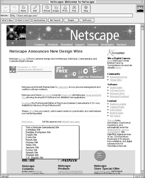
Figure 4-13. This pull-down menu enables users to select a location without first going to a separate web page. This approach avoids further cluttering the main page with a long list of locations.
You can implement a more sophisticated version of the pull-down menu (also know as the pop-up menu ) on the Web by using a programming language such as Java or JavaScript. As the user moves the cursor over a word or area on the page, a menu pops up. The user can directly select an option from that menu.
Use pull-down and pop-up menus with caution. These menus allow designers to pack lots of options on one page. This is usually what you are working hard to avoid. Additionally, menus hide their options and force the user to act before being able to see those options. However, when you have a very straightforward, exact organization scheme, these menus can work well.
[9] One usability study showed that “Sites with navigation buttons or links at the top and bottom of pages did slightly better than sites with navigation buttons down the side of the page.” Spool et al., 24.
Get Information Architecture for the World Wide Web now with the O’Reilly learning platform.
O’Reilly members experience books, live events, courses curated by job role, and more from O’Reilly and nearly 200 top publishers.

