You are using the default appearance of the UISlider UI component, and now you want to
customize this look and feel.
Either modify the tint colors of the different parts of the slider or provide your own images for the parts.
Apple has done a great job giving us methods to customize UI
components in the iOS SDK. One customization is to modify the tint
colors of various parts of the UI component. Let’s take a simple
UISlider as an example. I have broken
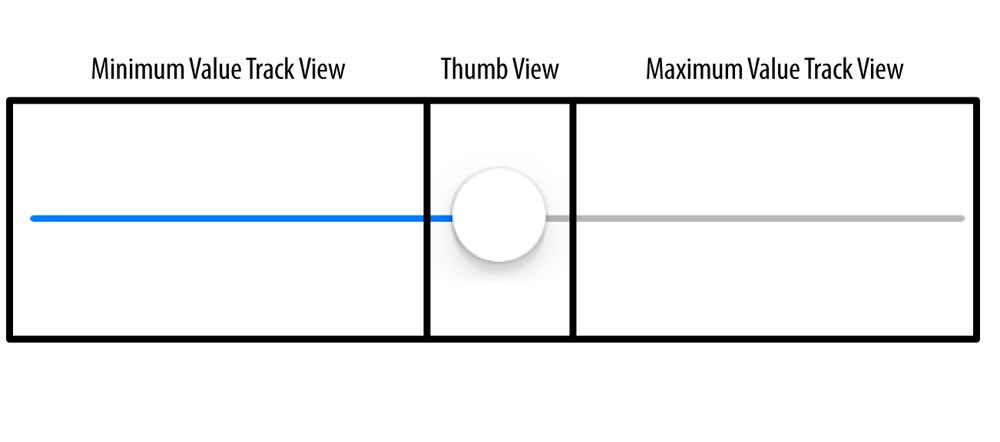
it down into its different UI components in Figure 1-20.
For each of these components in UISlider, a method and property exist that
allow you to change the appearance of the slider. The easiest of these
properties to use are the ones that modify the tint color of these
components:
minimumTrackTintColorThis property sets the tint color of the minimum value track view.
thumbTintColorThis property, as its name shows, sets the tint color of the thumb view.
maximumTrackTintColorThis property sets the tint color of the maximum value track view.
All these properties are of type UIColor.
The following sample code instantiates a UISlider and places it at the center of the
view of the view controller. It also sets the tint color of the minimum
value tracking view of the slider to red, the tint color of the thumb
view of the slider to black, and the tint color of the maximum value
tracking view of the slider to green:
-(void)viewDidLoad{[superviewDidLoad];/* Create the slider */self.slider=[[UISlideralloc]initWithFrame:CGRectMake(0.0f,0.0f,118.0f,23.0f)];self.slider.value=0.5;self.slider.minimumValue=0.0f;self.slider.maximumValue=1.0f;self.slider.center=self.view.center;[self.viewaddSubview:self.slider];/* Set the tint color of the minimum value */self.slider.minimumTrackTintColor=[UIColorredColor];/* Set the tint color of the thumb */self.slider.maximumTrackTintColor=[UIColorgreenColor];/* Set the tint color of the maximum value */self.slider.thumbTintColor=[UIColorblackColor];}
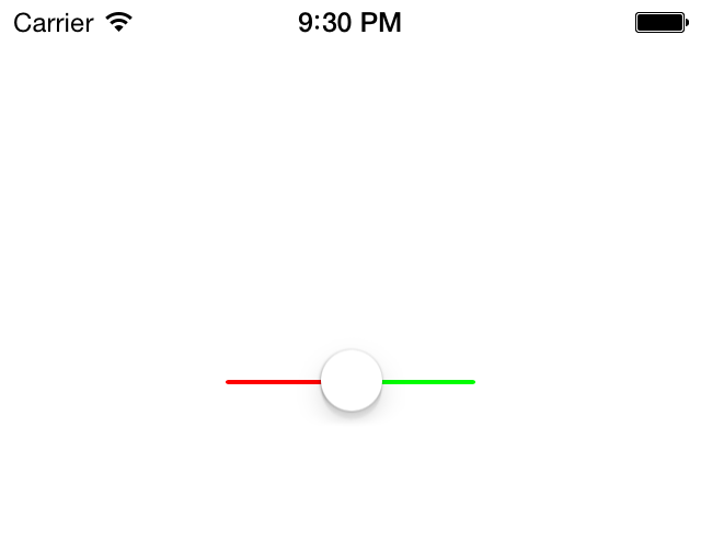
If you run the app now, you will see something similar to Figure 1-21.
Sometimes you may want to have more control over how a slider looks on the screen. For this, tint colors may not be sufficient. That’s why Apple has provided other ways of modifying the look and feel of a slider, allowing you to provide images for different components in the slider. These images are the following:
- Minimum value image
This is the image that will be displayed to the outer-left side of the slider. By default, no image is provided for the minimum value image, so you cannot really see this if you create a new slider on a view. You can use this image to give your users an indication of what the minimum value in your slider may mean in the context of your app. For instance, in an app where the user is allowed to increase or decrease the brightness of the screen, the minimum value image may display a dim lightbulb, suggesting to users that moving the thumb in the slider to the left (toward the minimum value) will reduce the brightness of the screen further. To change this image, use the
setMinimumValueImage:instance method of the slider. The image needs to be 23 points wide and 23 points tall. Obviously, for Retina displays, simply provide the same image but twice as big.- Minimum track image
This is the image that will be displayed for the slider’s track on the left side of the thumb. To change this image, use the
setMinimumTrackImage:forState:instance method of the slider. The image needs to be 11 points wide and 9 points tall and be constructed as a resizable image (see Recipe 20.5).- Thumb image
The image for the thumb, the only moving component in the slider. To change this image, use the
setThumbImage:forState:instance method of the slider. The image needs to be 23 points wide and 23 points tall.- Maximum track image
The image for the track of the slider to the right of the thumb. To change this image, use the
setMaximumTrackImage:forState:instance method of the slider. The image needs to be 11 points wide and 9 points tall and be constructed as a resizable image (see Recipe 20.5).- Maximum value image
The maximum value image is the image that gets displayed on the outer-right side of the slider. This is similar to the minimum value image but of course depicts the maximum value of the slider instead. To continue the earlier example of a brightness slider, the image for the maximum value can be a bright light with rays emitting from it, suggesting to the user that the farther he moves the slider to the right, the brighter the display gets. To change this image, use the
setMaximumValueImage:instance method of the slider. The image needs to be 23 points wide and 23 points tall.
Note
The images that you provide for the minimum and the maximum track need to be resizable. For more information about resizable images, see Recipe 20.5.
For the sake of this exercise, I have created five unique images for each one of the components of the slider. I’ve made sure that the minimum and the maximum track images are resizable images. What I am trying to achieve with the customization of this slider component is to make the user think that she is changing the temperature settings of a room, where moving the slider to the left means less heat and moving to the right means more heat. So here is the code that creates a slider and skins its various components:
#import "ViewController.h"@interfaceViewController()@property(nonatomic,strong)UISlider*slider;@end@implementationViewController/*This method returns a resizable image for theminimum track component of the slider*/-(UIImage*)minimumTrackImage{UIImage*result=[UIImageimageNamed:@"MinimumTrack"];UIEdgeInsetsedgeInsets;edgeInsets.left=4.0f;edgeInsets.top=0.0f;edgeInsets.right=0.0f;edgeInsets.bottom=0.0f;result=[resultresizableImageWithCapInsets:edgeInsets];returnresult;}/*Similar to the previous method, this one returns the resizable maximumtrack image for the slider*/-(UIImage*)maximumTrackImage{UIImage*result=[UIImageimageNamed:@"MaximumTrack"];UIEdgeInsetsedgeInsets;edgeInsets.left=0.0f;edgeInsets.top=0.0f;edgeInsets.right=3.0f;edgeInsets.bottom=0.0f;result=[resultresizableImageWithCapInsets:edgeInsets];returnresult;}-(void)viewDidLoad{[superviewDidLoad];/* Create the slider */self.slider=[[UISlideralloc]initWithFrame:CGRectMake(0.0f,0.0f,218.0f,23.0f)];self.slider.value=0.5;self.slider.minimumValue=0.0f;self.slider.maximumValue=1.0f;self.slider.center=self.view.center;[self.viewaddSubview:self.slider];/* Change the minimum value image */[self.slidersetMinimumValueImage:[UIImageimageNamed:@"MinimumValue"]];/* Change the minimum track image */[self.slidersetMinimumTrackImage:[selfminimumTrackImage]forState:UIControlStateNormal];/* Change the thumb image for both untouched and touched states */[self.slidersetThumbImage:[UIImageimageNamed:@"Thumb"]forState:UIControlStateNormal];[self.slidersetThumbImage:[UIImageimageNamed:@"Thumb"]forState:UIControlStateHighlighted];/* Change the maximum track image */[self.slidersetMaximumTrackImage:[selfmaximumTrackImage]forState:UIControlStateNormal];/* Change the maximum value image */[self.slidersetMaximumValueImage:[UIImageimageNamed:@"MaximumValue"]];}
Note
The slider in iOS 7 has a completely new look, as you can
guess, very streamlined and slim and thin. The height of the minimum
and maximum track images in iOS 7 is only 1 point wide, so setting an
image for these components is absolutely useless and won’t look very
good anyway. Therefore, to skin these components of a UISlider in iOS 7, it is recommended that
you use the tint colors instead of assigning custom images
to it.
Get iOS 7 Programming Cookbook now with the O’Reilly learning platform.
O’Reilly members experience books, live events, courses curated by job role, and more from O’Reilly and nearly 200 top publishers.


