January 2002
Beginner
768 pages
25h 51m
English
The
highlight rectangle is normally displayed with a thickness of 2
pixels.[3] This can
be changed using the -highlightthicknessoption:
-highlightthickness => amountThe amount specified is any valid screen distance. In Figure 4-38, the Exit Button on the right has a
-highlightthickness of 10 and has the focus.
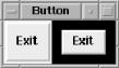
Figure 4-38. Example of -highlightthickness => 10
When the Button doesn’t have the keyboard focus, a small space
is left around it. If this extra space bothers you, you can set
-highlightthickness to 0 and the space won’t
display, even if that widget has the focus. It is bad style to set
the -highlightthickness to 0 without setting
-takefocus to 0.
The color of
the highlight rectangle can also be changed. There are two values for
this: the color of the highlight rectangle when the Button does not
have the focus and the color of the highlight rectangle when it does
have the focus. The option -highlightcolor is the
color of the highlight rectangle when the Button does have focus:
-highlightcolor => color
Figure 4-39 shows the right Button with the focus
and with -highlightcolor set to
'yellow'. Compare it to Figure 4-38 to see the difference.
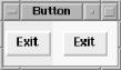
Figure 4-39. Example of Button with -highlightcolor => `yellow’
To change the color of the space left around ...
Read now
Unlock full access


 O’Reilly covers everything we've got, with content to help us build a world-class technology community, upgrade the capabilities and competencies of our teams, and improve overall team performance as well as their engagement.I wanted to learn C and C++, but it didn't click for me until I picked up an O'Reilly book. When I went on the O’Reilly platform, I was astonished to find all the books there, plus live events and sandboxes so you could play around with the technology.I’ve been on the O’Reilly platform for more than eight years. I use a couple of learning platforms, but I'm on O'Reilly more than anybody else. When you're there, you start learning. I'm never disappointed.I'm always learning. So when I got on to O'Reilly, I was like a kid in a candy store. There are playlists. There are answers. There's on-demand training. It's worth its weight in gold, in terms of what it allows me to do.