May 2017
Intermediate to advanced
310 pages
8h 5m
English
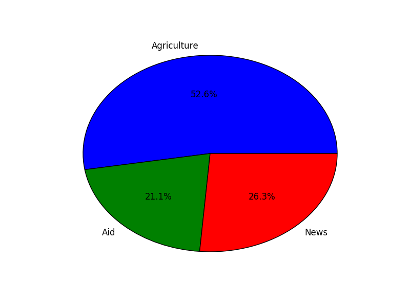
The pie chart interprets and visually presents data as if to fit into a circle. The individual data points are expressed as sectors of a circle that add up to 360 degrees. This chart is good for displaying categorical data and summaries too:
import matplotlib.pyplot as plt data = [500, 200, 250] labels = ["Agriculture", "Aide", "News"] plt.pie(data, labels=labels,autopct='%1.1f%%') plt.show()
The sectors in the graph are labeled with the strings in the labels array: