Introducing regional maps
We encounter maps on a daily basis, be it for directions or to infer information regarding the distribution of data. Maps have been widely used to plot various types of data in R.
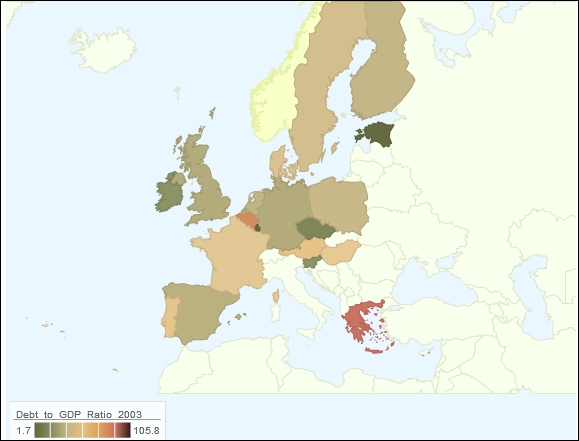
The following visualization relates to the debt to GDP ratio in the European Union. Users can hover over the visualization and get more information related to the data. The visualization is inspired by the New York Times article on the same issue.
Getting ready
We need to install and load the googleVis package in R:
install.packages("googleVis")
library(googleVis)
How to do it…
For the purpose of this recipe, we will import the data in R using the ...
Get R: Recipes for Analysis, Visualization and Machine Learning now with the O’Reilly learning platform.
O’Reilly members experience books, live events, courses curated by job role, and more from O’Reilly and nearly 200 top publishers.

