1
Abstract Window Toolkit Overview
In this chapter:
- Components
- Peers
- Layouts
- Containers
- And the Rest
- Summary
For years, programmers have had to go through the hassles of porting software from BSD-based UNIX to System V Release 4-based UNIX, from OpenWindows to Motif, from PC to UNIX to Macintosh (or some combination thereof), and between various other alternatives, too numerous to mention. Getting an application to work was only part of the problem; you also had to port it to all the platforms you supported, which often took more time than the development effort itself. In the UNIX world, standards like POSIX and X made it easier to move applications between different UNIX platforms. But they only solved part of the problem and didn't provide any help with the PC world. Portability became even more important as the Internet grew. The goal was clear: wouldn't it be great if you could just move applications between different operating environments without worrying about the software breaking because of a different operating system, windowing environment, or internal data representation?
In the spring of 1995, Sun Microsystems announced Java, which claimed to solve this dilemma. What started out as a dancing penguin (or Star Trek communicator) named Duke on remote controls for interactive television has become a new paradigm for programming on the Internet. With Java, you can create a program on one platform and deliver the compilation output (byte-codes/class files) to every other supported environment without recompiling or worrying about the local windowing environment, word size, or byte order. The first generation of Java programs consisted mostly of fancy animation applets that ran in a web browser like Netscape Navigator, Internet Explorer, or HotJava. We're beginning to see the next generation now: powerful distributed applications in areas ranging from commerce to medical imaging to network management. All of these applications require extreme portability: Joe's Online Bait Shop doesn't have the time or energy to port its “Online Bait Buyer” program to every platform on the Internet but doesn't want to limit its market to a specific platform. Java neatly solves their problem.
Windowing systems present the biggest challenges for portability. When you move an application from Windows to the Macintosh, you may be able to salvage most of the computational guts, but you'll have to rewrite the window interface code completely. In Java, this part of the portability challenge is addressed by a package called AWT, which stands for Abstract Window Toolkit (although people have come up with many other expansions). AWT provides the magic of maintaining the local look and feel of the user's environment. Because of AWT, the same application program can look appropriate in any environment. For example, if your program uses a pull-down list, that list will look like a Windows list when you run the program under Windows; a Macintosh list when you run the program on a Mac; and a Motif list when you run the program on a UNIX system under Motif. The same code works on all platforms. In addition to providing a common set of user interface components, AWT provides facilities for manipulating images and generating graphics.
This book is a complete programmer's guide and reference to the java.awt package (including java.awt.image, java.awt.event, java.awt.datatransfer, and java.awt.peer). It assumes that you're already familiar with the Java language and class libraries. If you aren't, Exploring Java, by Pat Niemeyer and Josh Peck, provides a general introduction, and other books in the O'Reilly Java series provide detailed references and tutorials on specific topics. This chapter provides a quick overview of AWT: it introduces you to the various GUI elements contained within the java.awt package and gives you pointers to the chapters that provide more specific information about each component. If you're interested in some of the more advanced image manipulation capabilities, head right to Chapter 12, Image Processing. The book ends with a reference section that summarizes what you need to know about every class in AWT.
In using this book, you should be aware that it covers two versions of AWT: 1.0.2 and 1.1. The Java 1.1 JDK (Java Developer's Kit) occurred in December 1996. This release includes many improvements and additions to AWT and is a major step forward in Java's overall functionality. It would be nice if I could say, “Forget about 1.0.2, it's obsolete—use this book to learn 1.1.” However, I can't; at this point, since browsers (Netscape Navigator in particular) still incorporate 1.0.2, and we have no idea when they will incorporate the new release. As of publication, Navigator 4.0 is in beta test and incorporates 1.0.2. Therefore, Java release 1.0.2 will continue to be important, at least for the foreseeable future.
In this summary, we'll point out new features of Java 1.1 as they come up. However, one feature deserves mention and doesn't fit naturally into an overview. Many of the methods of Java 1.0.2 have been renamed in Java 1.1. The old names still work but are “deprecated.” The new names adhere strictly to the design patterns discussed in the JavaBeans documentation:* all methods that retrieve the value of an object's property begin with “get,” all methods that set the value of a property begin with “set,” and all methods that test the value of some property begin with “is.” For example, the size() method is now called getSize(). The Java 1.1 compiler issues warnings whenever you used a deprecated method name.
1.1 Components
Modern user interfaces are built around the idea of “components”: reusable gadgets that implement a specific part of the interface. They don't need much introduction: if you have used a computer since 1985 or so, you're already familiar with buttons, menus, windows, checkboxes, scrollbars, and many other similar items. AWT comes with a repertoire of basic user interface components, along with the machinery for creating your own components (often combinations of the basic components) and for communicating between components and the rest of the program.
The next few sections summarize the components that are part of AWT. If you're new to AWT, you may find it helpful to familiarize yourself with what's available before jumping into the more detailed discussions later in this book.
1.1.1 Static Text
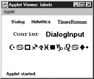
The Label class provides a means to display a single line of text on the screen. That's about it. They provide visual aids to the user: for example, you might use a label to describe an input field. You have control over the size, font, and color of the text. Labels are discussed in Section 5.2. Figure 1-1 displays several labels with different attributes.
1.1.2 User Input
Java provides several different ways for a user to provide input to an application. The user can type the information or select it from a preset list of available choices. The choice depends primarily on the desired functionality of the program, the user-base, and the amount of back-end processing that you want to do.
Figure 1–1: Multiple Label instances
1.1.2.1 The TextField and TextArea classes
Two components are available for entering keyboard input: TextField for single line input and TextArea for multi-line input. They provide the means to do things from character-level data validation to complex text editing. These are discussed in much more detail in Chapter 8, Input Fields. Figure 1-2 shows a screen that contains various TextField and TextArea components.
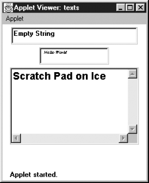
Figure 1–2: TextField and TextArea elements
1.1.2.2 The Checkbox and CheckboxGroup classes
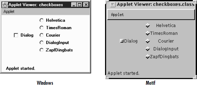
The remaining input-oriented components provide mechanisms for letting the user select from a list of choices. The first such mechanism is Checkbox, which lets you select or deselect an option. The left side of the applet in Figure 1-3 shows a checkbox for a Dialog option. Clicking on the box selects the option and makes the box change appearance. A second click deselects the option.
The CheckboxGroup class is not a component; it provides a means for grouping checkboxes into a mutual exclusion set, often called a set of radio buttons. Selecting any button in the group automatically deselects the other buttons. This behavior is useful for a set of mutually exclusive choices. For example, the right side of the applet in Figure 1-3 shows a set of checkboxes for selecting a font. It makes sense to select only one font at a time, so these checkboxes have been put in a CheckboxGroup.
Figure 1–3: Examples of Checkbox and CheckboxGroup
The appearance of a checkbox varies from platform to platform. On the left, Figure 1-3 shows Windows; the right shows Motif. On most platforms, the appearance also changes when a checkbox is put into a CheckboxGroup.
1.1.2.3 The Choice class
Checkbox and CheckboxGroup present a problem when the list of choices becomes long. Every element of a CheckboxGroup uses precious screen real estate, which limits the amount of space available for other components. The Choice class was designed to use screen space more efficiently. When a Choice element is displayed on the screen, it takes up the space of a single item in the list, along with some extra space for decorations. This leaves more space for other components. When the user selects a Choice component, it displays the available options next to or below the Choice. Once the user makes a selection, the choices are removed from the screen, and the Choice displays the selection. At any time, only one item in a Choice may be selected, so selecting an item implicitly deselects everything else. Section 9.1 explores the details of the Choice class. Figure 1-4 shows examples of open (on the right of the screens) and closed (on the left) Choice items in Windows 95 and Motif.
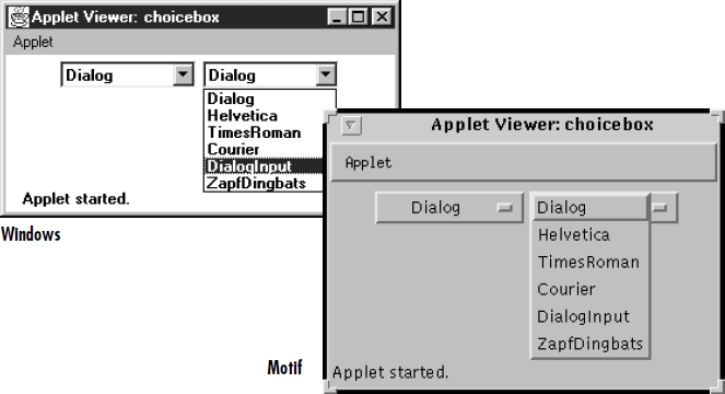
Figure 1–4: Open and closed Choice items
1.1.2.4 The List class
Somewhere between Choice and CheckboxGroup in the screen real estate business is a component called List. With a List, the user is still able to select any item. However, the programmer recommends how many items to display on the screen at once. All additional choices are still available, but the user moves an attached scrollbar to access them. Unlike a Choice, a List allows the user to select multiple items. Section 9.2 covers the List component. Figure 1-5 shows List components in different states.
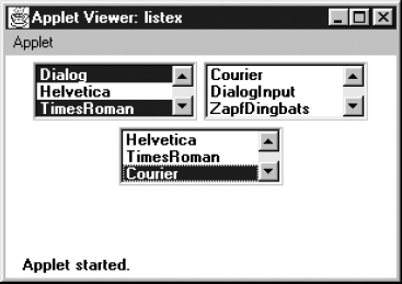
Figure 1–5: List components in different states
1.1.2.5 Menus
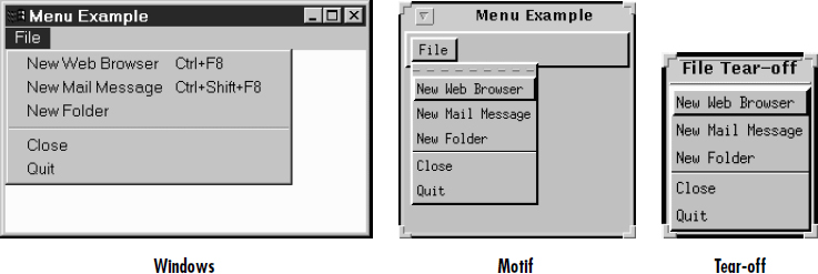
Most modern user interfaces use menus heavily; therefore, it's no surprise that Java supports menus. As you'd expect, Java menus look like the menus in the windowing environment under which the program runs. Currently, menus can only appear within a Frame, although this will probably change in the future. A Menu is a fairly complex object, with lots of moving parts: menu bars, menu items, etc. Java 1.1 adds hot keys to menus, allowing users to navigate a menu interface using keyboard shortcuts. The details of Menu are explored in Chapter 10, Would You Like to Choose from the Menu? Figure 1-6 shows frames with open menus for both Windows and Motif. Since tear-off menus are available on Motif systems, its menus look and act a little differently. Figure 1-6 also includes a tear-off menu. The shortcuts (Ctrl+F8) are newly supported in Java 1.1.
1.1.2.6 The PopupMenu class
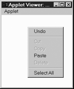
The PopupMenu class is new to Java 1.1. Pop-up menus can be used for context-sensitive, component-level menus. Associated with each Component can be its own popup menu. The details of creating and working with the PopupMenu class and the fun time you have catching their events are covered in Chapter 10, Would You Like to Choose from the Menu? Figure 1-7 shows an example of a pop-up menu.
1.1.3 Event Triggers
Java provides two components whose sole purpose is to trigger actions on the screen: Button and Scrollbar. They provide the means for users to signal that they are ready to perform an operation. (Note that all components except labels generate events; I'm singling out buttons and scrollbars because their only purpose is to generate events.)
1.1.3.1 The Scrollbar class
Most people are familiar with scrollbars. In a word processor or a web browser, when an image or document is too large to fit on the screen, the scrollbar allows the user to move to another area. With Java, the Scrollbar performs similarly. Selecting or moving the scrollbar triggers an event that allows the program to process the scrollbar movement and respond accordingly. The details of the Scrollbar are covered in Section 11.1. Figure 1-8 shows horizontal and vertical scrollbars.
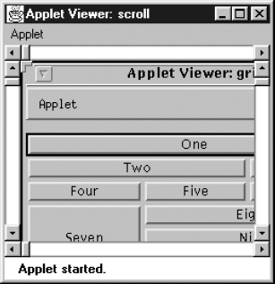
Figure 1–8: Horizontal and vertical scrollbars
Note that a scrollbar is just that. It generates events when the user adjusts it, but the program using the scrollbar is responsible for figuring out what to do with the events, such as displaying a different part of an image or the text, etc. Several of the components we've discussed, like TextArea and List, have built-in scrollbars, saving you the trouble of writing your own code to do the actual scrolling. Java 1.1 has a new container called a ScrollPane that has scrolling built in. By using a scroll pane, you should be able to avoid using scroll bars as a positioning mechanism. An example of ScrollPane appears later in this chapter.
1.1.3.2 The Button class
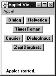
A button is little more than a label that you can click on. Selecting a button triggers an event telling the program to go to work. Section 5.3 explores the Button component. Figure 1-9 shows Button examples.
The Java Management API includes a fancier button (ImageButton) with pictures rather than labels. For the time being, this is a standard extension of Java and not in the Core API. If you don't want to use these extensions, you'll have to implement an image button yourself.
1.1.4 Expansion
1.1.4.1 The Canvas class
The Canvas class is just a blank area; it doesn't have any predefined appearance. You can use Canvas for drawing images, building new kinds of components, or creating super-components that are aggregates of other components. For example, you can build a picture button by drawing a picture on a Canvas and detecting mouse click events within the area of the Canvas. Canvas is discussed in Section 5.5.
1.2 Peers
Java programs always have the look and feel of the platform they are running on. If you create your program on a UNIX platform and deliver it to Microsoft Windows users, your program will have Motif's look and feel while you're developing it, but users will see Microsoft Windows objects when they use it. Java accomplishes this through a peer architecture, shown in Figure 1-10.

Figure 1–10: Peer architecture
There are several layers of software between your Java program and the actual screen. Let's say you are working with a scrollbar. On your screen, you see the scrollbar that's native to the platform you're using. This system-dependent scrollbar is the “peer” of the Java Scrollbar object. The peer scrollbar deals with events like mouse clicks first, passing along whatever it deems necessary to the corresponding Java component. The peer interface defines the relationship between each Java component and its peer; it is what allows a generic component (like a Scrollbar) to work with scrollbars on different platforms.
Peers are described in Chapter 15, Toolkit and Peers. However, you rarely need to worry about them; interaction between a Java program and a peer takes place behind the scenes. On occasion, you need to make sure that a component's peer exists in order to find out about platform-specific sizes. This process usually involves the addNotify() method.
1.3 Layouts
Layouts allow you to format components on the screen in a platform-independent way. Without layouts, you would be forced to place components at explicit locations on the screen, creating obvious problems for programs that need to run on multiple platforms. There's no guarantee that a TextArea or a Scrollbar or any other component will be the same size on each platform; in fact, you can bet they won't be. In an effort to make your Java creations portable across multiple platforms, Sun created a LayoutManager interface that defines methods to reformat the screen based on the current layout and component sizes. Layout managers try to give programs a consistent and reasonable appearance, regardless of the platform, the screen size, or actions the user might take.
The standard JDK provides five classes that implement the LayoutManager interface. They are FlowLayout, GridLayout, BorderLayout, CardLayout, and GridBagLayout. All of these layouts are covered in much greater detail in Chapter 7, Layouts. This chapter also discusses how to create complex layouts by combining layout managers and how to write your own LayoutManager. The Java 1.1 JDK includes the LayoutManager2 interface. This interface extends the LayoutManager interface for managers that provide constraint-based layouts.
1.3.1 FlowLayout
The FlowLayout is the default layout for the Panel class, which includes its most famous subclass, Applet. When you add components to the screen, they flow left to right (centered within the applet) based upon the order added and the width of the applet. When there are too many components to fit, they “wrap” to a new row, similar to a word processor with word wrap enabled. If you resize an applet, the components' flow will change based upon the new width and height. Figure 1-11 shows an example both before and after resizing. Section 7.2 contains all the FlowLayout details.
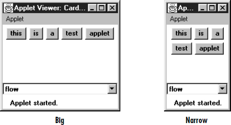
Figure 1–11: A FlowLayout before and after resizing
1.3.2 GridLayout
The GridLayout is widely used for arranging components in rows and columns. As with FlowLayout, the order in which you add components is relevant. You start at row one, column one, move across the row until it's full, then continue on to the next row. However, unlike FlowLayout, the underlying components are resized to fill the row-column area, if possible. GridLayout can reposition or resize objects after adding or removing components. Whenever the area is resized, the components within it are resized. Figure 1-12 shows an example before and after resizing. Section 7.4 contains all the details about GridLayout.
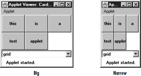
Figure 1–12: A GridLayout before and after resizing
1.3.3 BorderLayout
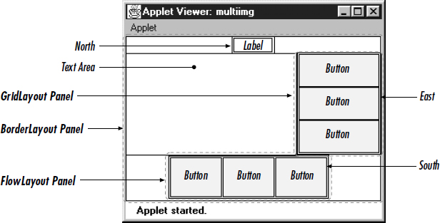
BorderLayout is one of the more unusual layouts provided. It is the default layout for Window, along with its children, Frame and Dialog. BorderLayout provides five areas to hold components. These areas are named after the four different borders of the screen, North, South, East, and West, with any remaining space going into the Center area. When you add a component to the layout, you must specify which area to place it in. The order in which components are added to the screen is not important, although you can have only one component in each area. Figure 1-13 shows a BorderLayout that has one button in each area, before and after resizing. Section 7.3 covers the details of the BorderLayout.
1.3.4 CardLayout
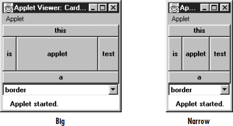
The CardLayout is a bit on the strange side. A CardLayout usually manages several components, displaying one of them at a time and hiding the rest. All the components are given the same size. Usually, the CardLayout manages a group of Panels (or some other container), and each Panel contains several components of its own. With a little work, you can use the CardLayout to create tabbed dialog boxes or property sheets, which are not currently part of AWT. CardLayout lets you assign names to the components it is managing and lets you jump to a component by name. You can also cycle through components in order. Figure 1-11, Figure 1-12, and Figure 1-13 show multiple cards controlled by a single CardLayout. Selecting the Choice button displays a different card. Section 7.5 discusses the details of CardLayout.
1.3.5 GridBagLayout
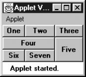
GridBagLayout is the most sophisticated and complex of the layouts provided in the development kit. With the GridBagLayout, you can organize components in multiple rows and columns, stretch specific rows or columns when space is available, and anchor objects in different corners. You provide all the details of each component through instances of the GridBagConstraints class. Figure 1-14 shows an example of a GridBagLayout. GridBagLayout and GridBagConstraints are discussed in Section 7.6 and Section 7.7.
1.4 Containers
A Container is a type of component that provides a rectangular area within which other components can be organized by a LayoutManager. Because Container is a subclass of Component, a Container can go inside another Container, which can go inside another Container, and so on, like Russian nesting dolls. Subclassing Container allows you to encapsulate code for the components within it. This allows you to create reusable higher-level objects easily. Figure 1-15 shows the components in a layout built from several nested containers.
Figure 1–15: Components within containers
1.4.1 Panels
A Panel is the basic building block of an applet. It provides a container with no special features. The default layout for a Panel is FlowLayout. The details of Panel are discussed in Section 6.2. Figure 1-16 shows an applet that contains panels within panels within panels.
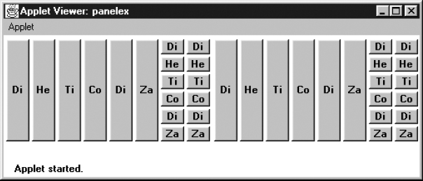
Figure 1–16: A multilevel panel
1.4.2 Windows
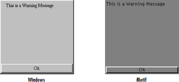
A Window provides a top-level window on the screen, with no borders or menu bar. It provides a way to implement pop-up messages, among other things. The default layout for a Window is BorderLayout. Section 6.4 explores the Window class in greater detail. Figure 1-17 shows a pop-up message using a Window in Microsoft Windows and Motif.
1.4.3 Frames
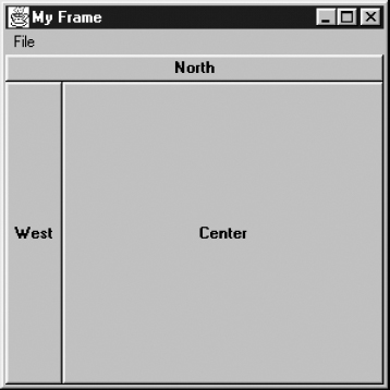
A Frame is a Window with all the window manager's adornments (window title, borders, window minimize/maximize/close functionality) added. It may also include a menu bar. Since Frame subclasses Window, its default layout is BorderLayout. Frame provides the basic building block for screen-oriented applications. Frame allows you to change the mouse cursor, set an icon image, and have menus. All the details of Frame are discussed in Section 6.5. Figure 1-18 shows an example Frame.
1.4.4 Dialog and FileDialog
A Dialog is a Window that accepts input from the user. BorderLayout is the default layout of Dialog because it subclasses Window. A Dialog is a pop-up used for user interaction; it can be modal to prevent the user from doing anything with the application before responding. A FileDialog provides a prebuilt Dialog box that interacts with the filesystem. It implements the Open/Save dialog provided by the native windowing system. You will primarily use FileDialog with applications since there is no guarantee that an applet can interact with the local filesystem. (Netscape Navigator will throw an exception if you try to use it.) The details of Dialog are revealed in Section 6.6, while FileDialog is discussed in Section 6.7. Figure 1-19 shows sample Dialog and FileDialog boxes.
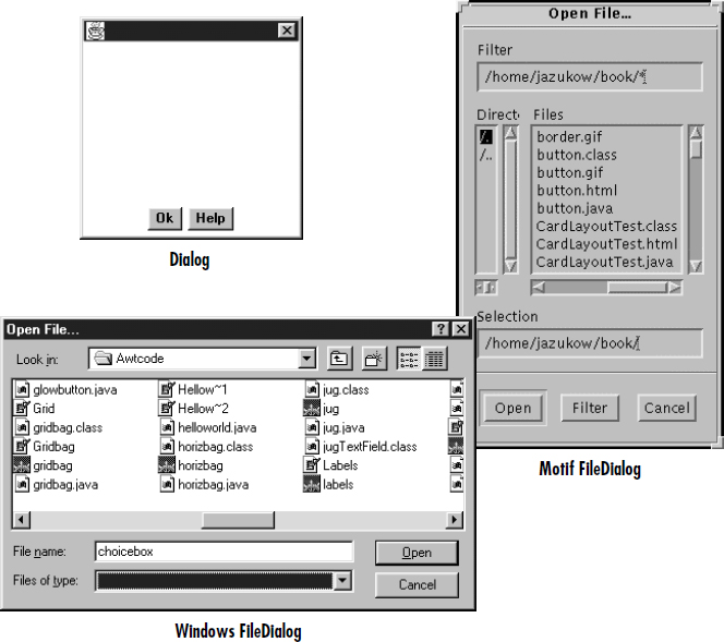
Figure 1–19: Examples of Dialog and FileDialog boxes
1.4.5 ScrollPane
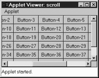
Java 1.1 introduces the ScrollPane container. In version 1.0, if you want to have a scrolling area (for example, to display an image that won't fit onto the screen), you create a panel using BorderLayout that contains scrollbars on the right and bottom, and display part of the image in the rest of the screen. When the user scrolls, you capture the event, figure out what part of the image to display, and update the screen accordingly. Although this works, its performance is poor, and it's inconvenient. With version 1.1 of Java, you can tell the ScrollPane what needs to scroll; it creates the scrollbars and handles all the events automatically. Section II.4 covers the ScrollPane; Figure 1-20 shows a ScrollPane. Chapter 11, Scrolling, covers the Adjustable interface that Scrollbar implements and ScrollPane utilizes.
1.5 And the Rest
Several of the remaining classes within java.awt are important to mention here but did not fit well into a general category. The following sections are a grab bag that summarize the remaining classes.
1.5.1 Drawing and Graphics
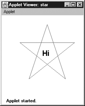
Java provides numerous primitives for drawing lines, squares, circles, polygons, and images. Figure 1-21 shows a simple drawing. The drawing components of AWT are discussed in Chapter 2, Simple Graphics.
The Font, FontMetrics, Color, and SystemColor classes provide the ability to alter the displayed output. With the Font class, you adjust how displayed text will appear. With FontMetrics, you can find out how large the output will be, for the specific system the user is using. You can use the Color class to set the color of text and graphics. SystemColor is new to Java 1.1; it lets you take advantage of desktop color schemes. These classes are discussed in Chapter 3, Fonts and Colors.
AWT also includes a number of classes that support more complex graphics manipulations: displaying images, generating images in memory, and transforming images. These classes make up the package java.awt.image, which is covered in Chapter 12.
1.5.2 Events
Like most windows programming environments, AWT is event driven. When an event occurs (for example, the user presses a key or moves the mouse), the environment generates an event and passes it along to a handler to process the event. If nobody wants to handle the event, the system ignores it. Unlike some windowing environments, you do not have to provide a main loop to catch and process all the events, or an infinite busy-wait loop. AWT does all the event management and passing for you.
Probably the most significant difference between versions 1.0.2 and 1.1 of AWT is the way events work. In older versions of Java, an event is distributed to every component that might conceivably be interested in it, until some component declares that it has handled the event. This event model can still be used in 1.1, but there is also a new event model in which objects listen for particular events. This new model is arguably a little more work for the programmer but promises to be much more efficient, because events are distributed only to objects that want to hear about them. It is also how JavaBeans works.
In this book, examples that are using the older (1.0.2) components use the old event model, unless otherwise indicated. Examples using new components use the new event model. Don't let this mislead you; all components in Java 1.1 support the new event model. The details of Event for both version 1.0.2 and 1.1 can be found in Chapter 4, Events.
1.5.3 Applets
Although it is not a part of the java.awt package, the Core Java API provides a framework for applet development. This includes support for getting parameters from HTML files, changing the web page a browser is displaying, and playing audio files. Chapter 14, And Then There Were Applets, describes all the details of the java.applet package. Because audio support is part of java.applet, portable audio playing is limited to applets. Chapter 14 also shows a nonportable way to play audio in applications. Additional audio capabilities are coming to the Java Core API in the announced extensions.
1.5.4 Clipboards
In Java 1.1, programs can access the system clipboard. This process makes it easier to transfer (cut, copy, and paste) data between various other sources and your Java programs and introduces developers to the concepts involved with JavaBeans. Chapter 16, Data Transfer, describes the java.awt.datatransfer package.
1.5.5 Printing
Java 1.1 adds the ability to print. Adding printing to an existing program is fairly simple: you don't have to do much beside adding a Print menu button. Chapter 17, Printing, describes these capabilities.
1.6 Summary
The java.awt package provides a great deal of functionality and flexibility. The package goes well beyond the basics presented in this chapter. Do not be intimidated by the vast libraries available to you in Java. With the help of this book, you should get an excellent grasp of the java.awt, java.awt.image, java.awt.datatransfer, java.awt.event, and java.applet packages, along with some pieces of the proprietary sun.awt and sun.audio packages.
Do not feel the need to read this book cover to cover. Pick the section that interests you most, where you feel you do not fully understand something, or where you have an immediate question to be answered and dive right in.
Get Java AWT Reference now with the O’Reilly learning platform.
O’Reilly members experience books, live events, courses curated by job role, and more from O’Reilly and nearly 200 top publishers.
