Skip to Content
Pythonデータサイエンスハンドブック 第2版 ―Jupyter、NumPy、pandas、Matplotlib、scikit-learnを使ったデータ分析、機械学習
book

Pythonデータサイエンスハンドブック 第2版 ―Jupyter、NumPy、pandas、Matplotlib、scikit-learnを使ったデータ分析、機械学習

by Jake VanderPlas, 菊池 彰
February 2024
Intermediate to advanced
576 pages
9h 17m
Japanese
O'Reilly Japan, Inc.
Content preview from Pythonデータサイエンスハンドブック 第2版 ―Jupyter、NumPy、pandas、Matplotlib、scikit-learnを使ったデータ分析、機械学習

27章単純な散布図

もう1つの一般的によく使用されるプロットは、線グラフと非常に近い単純な散布図(scatter plots)です。ポイントを線分で結合する代わりに、点、円、または他の形状でそれぞれのポイントを個別に表します。まず、いつものように必要なパッケージをインポートしてJupyter Notebookを設定します。

In [1]: %matplotlib inline
        import matplotlib.pyplot as plt
        plt.style.use('seaborn-whitegrid')
        import numpy as np

27.1 plt.plotを使った散布図

前の章では、plt.plotまたはax.plot用いて線グラフを作成しました。散布図も同じ関数を使用します(図27-1を参照)。

In [2]: x = np.linspace(0, 10, 30)
        y = np.sin(x)

        plt.plot(x, y, 'o', color='black');
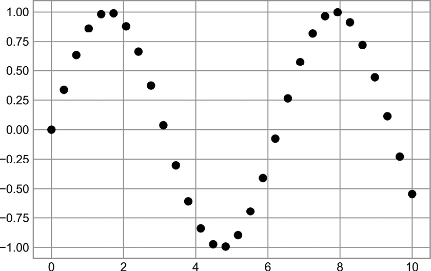
散布図の例

図27-1 散布図の例

3番目の引数は、散布図で使用する点マーカーの種類を表す文字を指定します。線スタイルを制御するために'-''--'などを指定できるのと同じように、点マーカーのスタイルにも独自の短い文字コードが割り当てられています。使用可能な文字の完全なリストは、plt.plotのドキュメントまたはMatplotlibのオンラインマニュアル(https://oreil.ly/tmYIL ...

Become an O’Reilly member and get unlimited access to this title plus top books and audiobooks from O’Reilly and nearly 200 top publishers, thousands of courses curated by job role, 150+ live events each month,
and much more.
Start your free trial

You might also like

Pythonデータサイエンスハンドブック ―Jupyter、NumPy、pandas、Matplotlib、scikit-learnを使ったデータ分析、機械学習

Pythonデータサイエンスハンドブック ―Jupyter、NumPy、pandas、Matplotlib、scikit-learnを使ったデータ分析、機械学習

Jake VanderPlas, 菊池 彰
推薦システム実践入門 ―仕事で使える導入ガイド

推薦システム実践入門 ―仕事で使える導入ガイド

風間 正弘, 飯塚 洸二郎, 松村 優也
プロダクトマネージャーのしごと 第2版 ―1日目から使える実践ガイド

プロダクトマネージャーのしごと 第2版 ―1日目から使える実践ガイド

Matt LeMay, 永瀬 美穂, 吉羽 龍太郎, 原田 騎郎, 高橋 一貴

Publisher Resources

ISBN: 9784814400638Publisher Website