Chapter 4. Images
Introduction
When Marc Andreessen’s first browser allowed for the inline display of images back in the early 1990s, it helped to kick-start a visually engaging aspect of surfing the Web. Shared documents no longer were just text-laden academic papers, allowing designers the initial foothold to begin the field of web design.
Since those early days, designers have been using GIFs, JPEGs, and PNGs to enhance websites beyond the placement of one or two images on a web page.
In this chapter, we’ll discuss many recipes regarding CSS interactions with images. Recipes include dealing with borders, manipulating background images, rounding corners on boxes, replacing HTML text with images, and much more.
Transforming Color Images to Black and White in IE with CSS
Problem
You want to convert color images in a web page to grayscale versions in Internet Explorer.
Solution
Use the proprietary filter CSS property to automatically convert images to grayscale:
img {
 filter: gray;
}
Note
In IE8, Microsoft is transitioning filter and other properties to use CSS vendor extensions. For more information, see http://blogs.msdn.com/ie/archive/2008/09/08/microsoft-css-vendor-extensions.aspx.
Discussion
Although not the most useful CSS property, filter does have its uses.
One example is to set images to gray for print stylesheets (see Chapter 11). This approach saves your user money, as color inks are more expensive than black ink.
Another example is to craft custom stylesheets for older versions of Internet Explorer with conditional comments (see Using Conditional Comments to Deliver Styles to Different Versions of Internet Explorer), setting all the imagery to be black and white. This approach is what web designer Andy Clarke did with his site redesign (see http://stuffandnonsense.co.uk/blog/about/hello/).
See Also
MSDN documentation on the grayscale filter property at http://msdn.microsoft.com/en-us/library/ms533003(VS.85).aspx
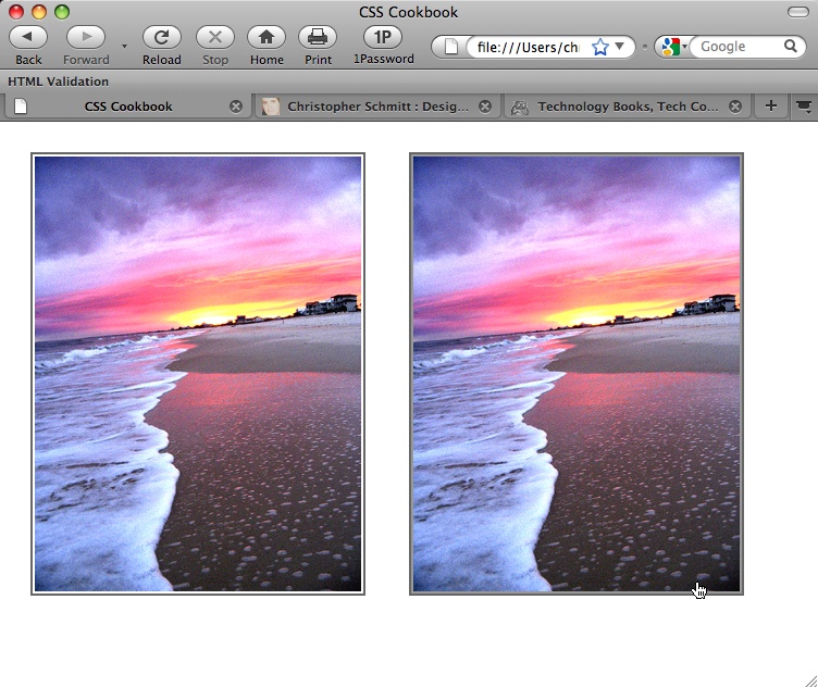
Setting a Border Around an Image
Problem
You want to place a border around an image.
Solution
Use the border property on the img element, as shown in Figure 4-1:
img {
 width: 300px;
 border: 2px solid #666;
 background: #fff;
 padding: 2px;
}
Discussion
If you make an image a link, you can create a more complex presentation with the border property.
Using the :hover pseudo-class, you can change the style of the border when a user rolls his mouse cursor over the image, as shown on the right side of Figure 4-1:
img {
 width: 300px;
 border: 2px solid #666;
 background: #fff;
 padding: 2px;
}
a:hover img {
 border-style: solid;
 background: #999;
}
Although the border acts like a frame around the image, you can change the border style and color when a user rolls his mouse cursor over the image. The padding of 2px set in the img declaration block allows for color changes inside this frame as well. So, a simple move of rolling over an image creates a rich visual with only two declaration blocks.
See Also
Removing Borders Set on Images by Default in Some Browsers for removing borders from images
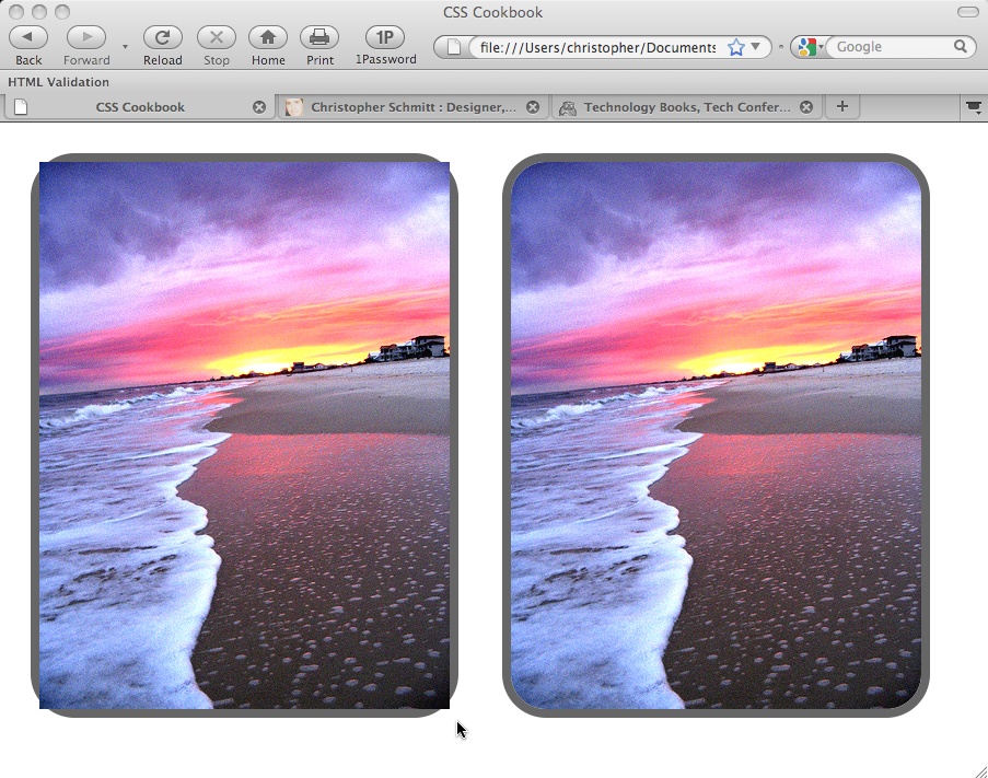
Setting a Rounded Border Around an Image
Problem
You want to round the right-angle corners of an image border.
Solution
Set the border value and then use the CSS3 border-radius property along with its browser-specific border-radius properties, as shown in the right side of Figure 4-2:
div{
 background-image: url(beach.jpg);
 width: 375px;
 height: 500px;
 border: 8px solid #666;
 border-radius: 40px;
 -moz-border-radius: 40px;
 -webkit-border-radius: 40px;
}
Discussion
The radius is half the distance of a circle’s diameter and is used to set the amount of curvature on the corner. The higher the value for the radius, the more rounded the corner will be.
At the time of this writing, the border-radius property isn’t supported as is; however, the proprietary properties in both Firefox and Safari replicate the effect. The main drawback (other than cross-browser support) is that the names of the border properties are not consistent, as shown in Table 4-1.
| CSS3 | Firefox | WebKit |
|
|
|
|
|
|
|
|
|
|
|
|
|
|
|
Specifying corners
Rounded corners are also rendered on individual corners, not just all four corners. To set the rounded effect on only one or a few corners, specify each rounded corner individually in the CSS rule.
For example, the following CSS rule defines that all corners be rounded except for the top-right corner:
div#roundbkgd {
 background-image: url(beach.jpg);
 width: 375px;
 height: 500px;
 border: 8px solid #666;

 /* top-left corner */
 border-top-left-radius: 40px;
 -moz-border-radius-topleft: 40px;
 -webkit-border-top-left-radius: 40px;

 /* bottom-right corner */
 border-bottom-right-radius: 40px;
 -moz-border-radius-bottomright: 40px;
 -webkit-border-bottom-right-radius: 40px;

 /* bottom-left corner */
 border-bottom-left-radius: 40px;
 -moz-border-radius-bottomleft: 40px;
 -webkit-border-bottom-left-radius: 40px;
}
Known issues
If the image is inline, or placed within the HTML and not as a background image, the rounded borders are shown behind the image instead of clipping the image, as shown on the left side of Figure 4-2:
img {
 width: 375px;
 height: 500px;
 border: 8px solid #666;
 background: #fff;
 display:block;
 border-radius: 40px;
 -moz-border-radius: 40px;
 -webkit-border-radius: 40px;
}
To work around this problem, keep the value of the border-radius property relatively small (no more than four or five pixels) or set the image within the background of an element (see Setting a Background Image).
Note
Opera is scheduled to support border-radius for the next major release after Opera 10.
See Also
The CSS3 specification for border-radius at http://www.w3.org/TR/2005/WD-css3-background-20050216/#the-border-radius
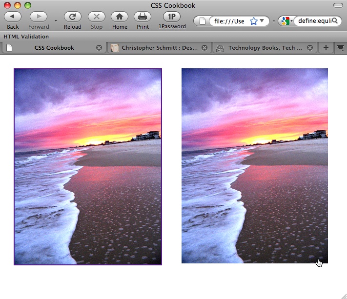
Removing Borders Set on Images by Default in Some Browsers
Problem
You want to remove borders on images that are clickable, as shown in Figure 4-3.
Discussion
Before CSS, web developers would set the border of images through the border attribute of the img element:
<a href="http://csscookbook.com">
 <img src="beach.jpg" border="0" alt="beach" />
</a>
See Also
Setting a Border Around an Image for applying a border to an image
Setting a Background Image
Problem
You want a background image that does not repeat.
Solution
Use the background-image and background-repeat properties to control the display of an image (see Figure 4-4):
body {
 background-image: url(bkgd.jpg);
 background-repeat: no-repeat;
}
Discussion
You can place text and other inline images over a background image to create a sense of depth on a web page. Also, you can provide a framing device for the web page by tiling a background image along the sides of a web browser.
See Also
Creating a Line of Background Images for repeating background images in a line either horizontally or vertically
Creating a Line of Background Images
Problem
You want a series of background images to repeat vertically or horizontally.
Solution
To tile the background images horizontally or along the x-axis, use the following CSS rule (see Figure 4-5):
body {
 background-image: url(bkgd.jpg);
 background-repeat: repeat-x;
}
Discussion
To have the background image repeat along the vertical axis, use the repeat-y value for the background-repeat property.
See Also
Positioning a Background Image for placing a background image at a specific location in a web page
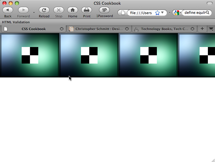
Positioning a Background Image
Problem
You want to position a background image in a web page.
Solution
Use the background-position property to set the location of the background image. To place an image that starts 75 pixels to the right and 150 pixels below the upper-left corner of the viewport (see Figure 4-6), use the following CSS rule:
html {
 height: 100%;
}
body {
 background-image: url(bkgd.jpg);
 background-repeat: no-repeat;
 background-position: 75px 150px;
}
Discussion
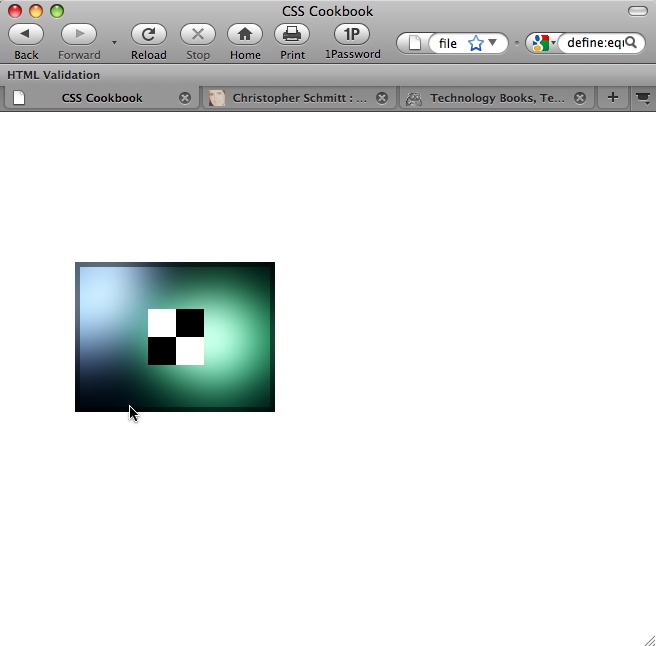
The background-position property contains two values separated by a space. The first value of the pair sets the origin point along the y-axis, and the second value sets the point on the x-axis. If only one value is given, that value is used for the horizontal position and the vertical position is set to 50%.
The Solution used pixel units to determine the placement of the background image; however, you also can use percentages. A value of 50% for background-position means the browser places the image in the dead center of the viewport, as shown in Figure 4-7; the values 0% and 100% place the image in the upper-left and lower-right corners, respectively.
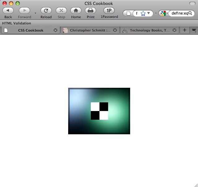
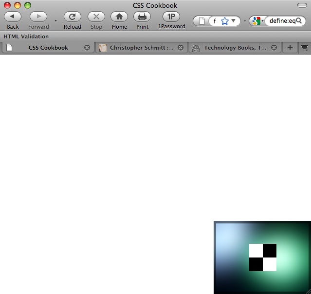
Along with percentages, you can use the values top, center, and bottom for the y-axis and left, center, and right for the x-axis. Using combinations of these values, you can place the background image at eight points around the edges of the viewport (in the corners and in between), as well as in the middle of the viewport. For example, to re-create the value of 50% in Figure 4-7, you can use this CSS rule instead:
body {
 background-image: url(bkgd.jpg);
 background-repeat: no-repeat;
 background-position: center;
}
To place a background image in the lower-right corner, as shown in Figure 4-8, you can use the following CSS rule:
body {
 background-image: url(bkgd.jpg);
 background-repeat: no-repeat;
 background-position: bottom right;
}
You also can use the background-position and background-repeat properties for background images that tile but aren’t chained to the sides of the viewport.
See Also
Creating a Stationary Background Image for setting an image so that it doesn’t scroll; the CSS 2.1 specification for background-position at http://www.w3.org/TR/CSS21/colors.html#propdef-background-position
Using Multiple Background Images on One HTML Element
Problem
You want to place more than one background image within one HTML element.
Solution
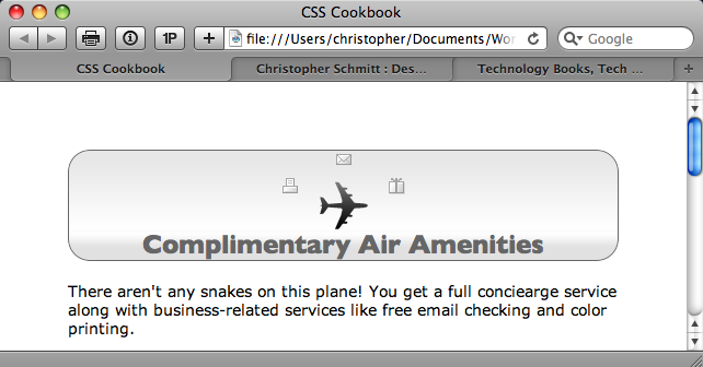
In CSS3, the shorthand background property can accept multiple sets of background image information as long as commas separate them, as shown in Figure 4-9:
h2 {
 border: 1px solid #666;
 border-radius: 20px;
 -moz-border-radius: 20px;
 -webkit-border-radius: 20px;
 background: white;
 padding-top: 72px;
 text-align: center;
 background: url(mail.gif) top center no-repeat,
  url(printer.gif) 40% 24px no-repeat,
  url(gift.gif) 60% 24px no-repeat,
  url(content-bkgd.png) 50% 50% repeat-x,
  url(heading-sub-bkgd.png) 3em 3em repeat-x,
  url(plane.gif) center no-repeat;
 font-family: "Gill Sans", Trebuchet, Calibri, sans-serif;
 color: #666;
}
Note
For a discussion of the technique to position images in the background of HTML elements, see Positioning a Background Image.
Discussion
As of this writing, Safari for Macintosh has implemented the CSS3 specification for layering multiple background images in one element.
Shorthand properties
Like most shorthand properties, you can split the shorthand code for multiple backgrounds into separate CSS declaration blocks:
h2 {
 border: 1px solid #666;
 border-radius: 20px;
 -moz-border-radius: 20px;
 -webkit-border-radius: 20px;
 background: white;
 padding-top: 72px;
 text-align: center;
 background-image: url(mail.gif),
  url(printer.gif),
  url(gift.gif),
  url(content-bkgd.png),
  url(heading-sub-bkgd.png),
  url(plane.gif);
 background-position: top center,
  40% 24px,
  60% 24px,
  50% 50%,
  3em 3em,
  center;
 background-repeat: no-repeat,
  no-repeat,
  no-repeat,
  repeat-x,
  repeat-x,
  no-repeat;
 font-family: "Gill Sans", Trebuchet, Calibri, sans-serif;
}
If all the backgrounds in the CSS rule are the same value, you can place one no-repeat value in the code and apply it to all the background images:
h2 {
 padding-top: 72px; /* enough padding for the images */
 text-align: center;
 background: url(plane.gif), url(mail.gif), url(printer.gif), url(gift.gif);
 background-position: center, top center, 40% 24px, 60% 24px;
 background-repeat: no-repeat;
}
You can apply this reduction of similar values to all CSS background-related properties, making sure that you want the background images to share the same value.
Not ready for everyday use
For the time being, introducing new elements and applying background images to these new elements is the only way to achieve the technique of multiple images across all modern browsers. For more information and examples of these techniques, see Recipes Setting How a Browser Renders an Image and Rotating Images with CSS.
See Also
The CSS3 specification for layering multiple images at http://www.w3.org/TR/2005/WD-css3-background-20050216/#layering
Setting Images on a Border
Problem
You want to place an image on a border of an HTML element.
Solution
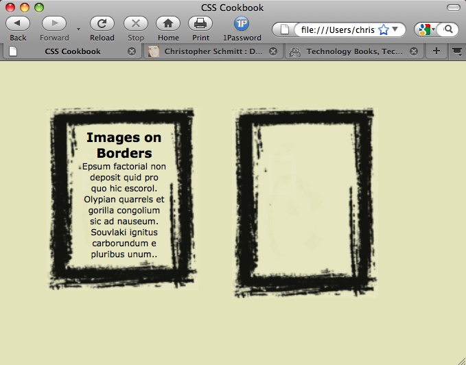
First, create an image that contains the frame of the image. Wrap the content with div elements and a unique id attribute value:
<div id="section">
 <h2>Images on Borders</h2>
 <p>Epsum factorial non deposit quid pro quo hic escorol. Olypian quarrels et
 gorilla congolium sic ad nauseum. Souvlaki ignitus carborundum
 e pluribus unum..</p>
</div><!-- /#section -->
Then use the CSS3 border-image property to place the image along the border width of the element, as shown in Figure 4-10:
#section {
 margin-right: 40px;
 color: #000;
 font-family: Verdana, Geneva, Tahoma, sans-serif;
 width: 100px;
 text-align: center;
 border-style: solid;
 border-color: #930;
 border-width: 26px 39px 37px 43px;
 border-image: url(frame.png) 26 39 37 43 stretch stretch;
 -webkit-border-image: url(frame.png) 26 39 37 43 stretch stretch;
-moz-border-image: url(frame.png) 26 39 37 43 stretch round;
}
Discussion
The border-image property is a new CSS3 property that Firefox 3.1 and later and Safari 4 and later support as of this writing.
Note
When the text is resized with the Solution, the border image scales and contains the text.
Not only does the border-image property allow you to frame content with one image that can scale, but it also provides a way to create image-rich buttons for web forms, as shown in Figure 4-11.
For example, first use HTML to create a simple button:
<form action="/" method="get">
 <button>Submit</button>
</form>
Then use the border-image property to set a visually interesting button, as shown in Figure 4-11, that is better than the default rendering:
button {
 background: none;
 width: 250px;
 padding: 10px 0 10px 0;
 border-style: solid;
 border-color: #666;
 border-width: 0 17px 0 17px;
 border-image: url(bkgd-button.png) 0 17 0 17 stretch stretch;
 -webkit-border-image: url(bkgd-button.png) 0 17 0 17 stretch stretch;
 -moz-border-image: url(bkgd-button.png) 0 17 0 15 stretch stretch;
 color: white;
 font-family: "Gill Sans", Trebuchet, Calibri, sans-serif;
 font-weight: bold;
 text-transform: uppercase;
 text-shadow: 0px 0px 5px rgba(0,0,0,.8);
}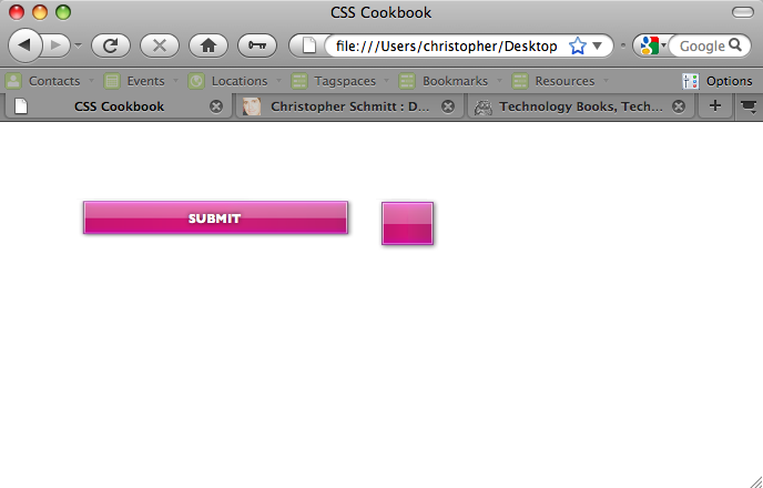
When setting an image on a border, first set the widths of the border:
border-width: 0 17px 0 17px;
Then bring in the image through the url() function with the background-image property:
border-width: 0 17px 0 17px;
border-image: url(bkgd-button.png);
The next four values should match the values of the border-width property for the top, right, bottom, and left sides of the HTML element:
border-width: 0 17px 0 17px;
border-image: url(bkgd-button.png);
border-image: url(bkgd-button.png) 0 17 0 17;
The values of 0 for border-image instruct the browser to cover the entire top and bottom borders with the border image. The values of 17 indicate that 17 pixels of the border image on the right and left sides should be used.
Set the next two values to stretch so that the background image expands across the distance of the sides to create a seamless fit:
border-width: 0 17px 0 17px;
border-image: url(bkgd-button.png);
border-image: url(bkgd-button.png) 0 17 0 17 stretch stretch;
Other values besides stretch are repeat (which tiles the image) and round (which also tiles, but makes the tiling of the image fit nicely between the edges).
See Also
The CSS3 specification for border-image at http://www.w3.org/TR/css3-background/#the-border-image
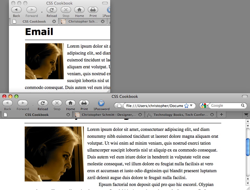
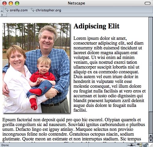
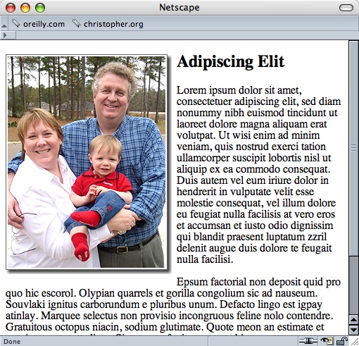
Creating a Stationary Background Image
Problem
You want a background image to remain in the browser window, even as the user scrolls down a web page.
Solution
Use the background-attachment property set with a fixed value, like so:
body {
 background-image: url(bkgd.jpg);
 background-repeat: no-repeat;
 background-attachment: fixed;
}
Discussion
By using this technique, you are locking down the background image. Therefore, even if a visitor scrolls, the image remains where you placed it originally. Another acceptable value for background-attachment is scroll, which is the default value. So, even if you don’t specify scroll, the background image moves up with the rest of the document as the visitor scrolls down.
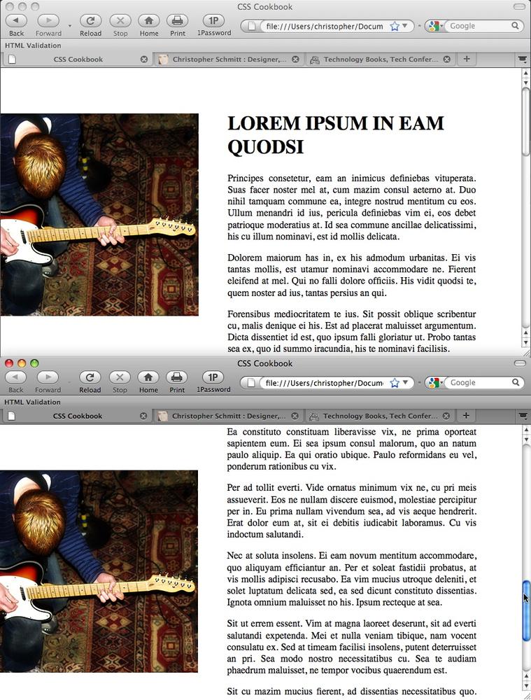
For example, imagine you want to post on your web page a photo of a recent trip, and you want the photo positioned on the left side of the page and your text on the right. As the reader scrolls down to read more about the trip, the photo from the trip stays in place, as shown in Figure 4-12.
Here’s the code:
body {
 background-image: url(bkgd2.jpg);
 background-repeat: no-repeat;
 background-attachment: fixed;
 background-position: −125px 75px;
 margin: 75px 75px 0 375px;
}
h1, h2, h3 {
 padding-top: 0;
 margin-top: 0;
 text-transform: uppercase;
}
p {
 text-align: justify;
}
To take this further, you can lock down the image on block-level elements other than body. For example, try the heading elements when designing a review for a movie or concert. The following CSS rule can create an interesting surfing experience:
h1, h2, h3 {
 font-size: 200%;
 background-image: url(bkgd2.jpg);
 background-repeat: no-repeat;
 background-attachment: fixed;
 background-position: center;
 padding: 1.5em;
 text-align: center;
 color: white;
}
Because of the padding and light color on the headings, there is enough room to see the background image “through” the elements as well as to read the headlines. As the visitor scrolls the web page reading the review, she will see the rest of the image, as shown in Figure 4-13.
See Also
Setting a Background Image to position a background image; the CSS 2.1 specification for background-attachment at http://www.w3.org/TR/CSS21/colors.html#propdef-background-attachment
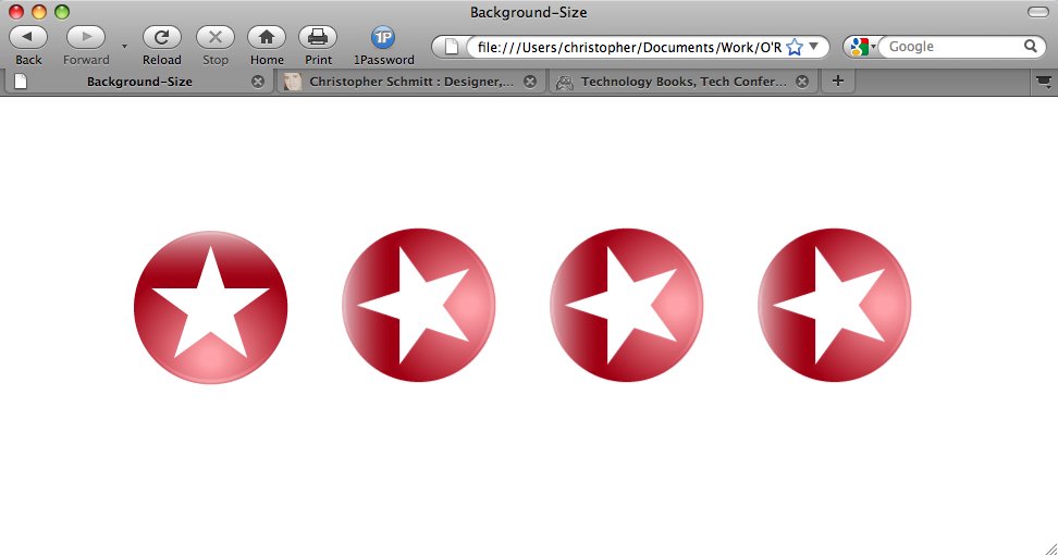
Stretching Images As the Browser Resizes
Problem
You want the background image to stretch as the browser resizes.
Solution
Use the background-size property along with related browser-vendor-specific properties, as shown in Figure 4-14:
body {
 background-image: url(button_redstar.gif);
 background-size: 25% auto;
 -o-background-size: 25% auto;
 -webkit-background-size: 25% auto;
 -khtml-background-size: 25% auto;
 background-repeat: repeat-x;
 margin-top: 30%;
}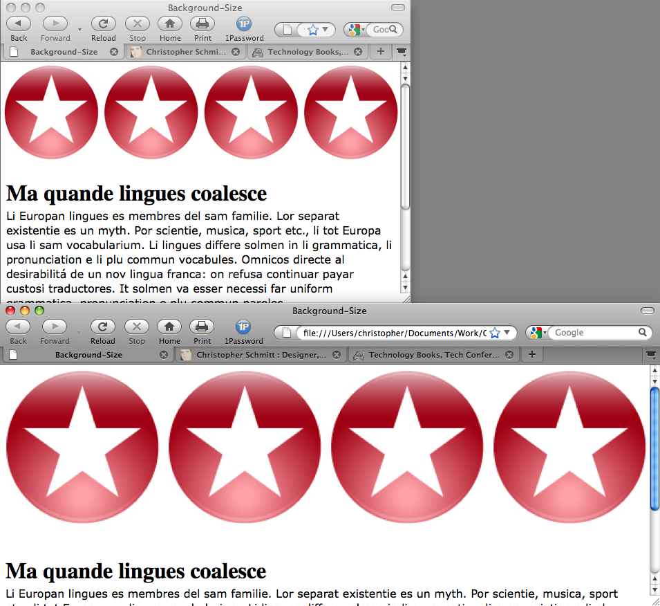
Discussion
When setting the background-size property, the browser stretches the image according to its values. The first value sets the width and the second value sets the height.
In the Solution, setting a value of 25% instructs the browser to tile out the background image four times along the width of the browser’s viewport. Since the background-repeat property is set to repeat along the x-axis, only four images are tiling out in the background.
The value of auto for height means the aspect ratio of the image is preserved.
Note
Firefox 3.6 supports the background-size property.
See Also
The CSS3 specification on background-size at http://www.w3.org/TR/css3-background/#the-background-size
Stretching an Image Across the Entire Browser Window
Problem
You want to expand an image across the entire browser window.
Solution
For a cross-browser solution, use HTML frames.
First create a full-bleed.html file and place an image in the body element:
<img id="stretch" src="green_car.jpg" alt="photo of green car" />
Use CSS to remove the margins and padding in the body as well as expand the width and height of the image:
body {
 margin: 0;
 padding: 0;
}
#stretch {
 position: absolute;
 width: 100%;
 height: 100%;
}
Discussion
This Solution works best in most browsers tested by leveraging the ability to remove the image from the normal flow of the document and then resetting the width and height to 100%.
To overlay content on top of the image, use the absolute position property and set the new content to a high z-index value (or at least higher than the stretched image).
Using background-size
The most ideal and direct method of creating a full-bleed image effect is to use the background-size property (see Stretching Images As the Browser Resizes) to stretch a background image to the entire width and height of a browser viewport in Safari:
body {
 background-image: url(green_car.jpg);
 -webkit-background-size: 100% 100%;
 -o-background-size: 100% 100%;
}
However, if the browser is made smaller, the image starts to shrink to maintain its aspect ratio and tiles out copies of the image underneath it.
Using an iframe
Another method is to use an iframe HTML element to somehow replicate the HTML frameset:
<iframe width="100%" height="100%" src="full-bleed.html" border="0"
noborder="noborder" frameborder="0" padding="0" spacing="0"
scrolling="no"></iframe>
However, the stretching of the image within the full-bleed.html file does not extend all the way down in some browsers, such as Opera and Safari.
Note
Another step is to use HTML framesets. However, for accessibility concerns it’s best to avoid those if at all possible.
See Also
Using Absolute Positioning for more information on positioning elements absolutely
Making Images Scalable
Problem
You want images to resize as the browser window resizes.
Solution
Define the width of images to percentages, as shown in Figure 4-15:
img {
 border: 1px solid #cecece;
 width: 60%;
 float: left;
 margin-right: .7em;
 margin-bottom: .5em;
}
Modern browsers will scale the height of the images in relative proportion to the width. So, defining both the width and the height is not necessary.
Discussion
When building fluid or flexible layouts, you set the HTML text in columns to expand and retract as the browser resizes. However, images with dimensions that are commonly set in pixels retain their size.
To make sure all the page elements are resized in proportion to each other in flexible layouts, developers may set the width and height to percentages.
Keeping images from expanding
When images are set to percentage-based dimensions, browsers might stretch the images beyond the point where the images retain their integrity. For example, compression artifacts that are nearly invisible in a JPEG or GIF image become apparent when they are expanded.
To keep the images from expanding beyond a defined width, use the max-width property with length units:
img {
 border: 1px solid #cecece;
 width: 60%;
 max-width: 300px;
 float: left;
 margin-right: .7em;
 margin-bottom: .5em;
}
See Also
Chapter 9 for more on flexible layouts
Setting How a Browser Renders an Image
Problem
You want to set the browser to render images as shown in Figure 4-16.
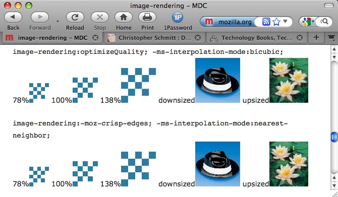
Solution
Use the image-rendering property along with the Microsoft proprietary property, -ms-interpolation-mode:
#content img[src$=".gif"] {
 image-rendering: -moz-crisp-edges;
 -ms-interpolation-mode: nearest-neighbor;
}
Discussion
The image-rendering property was originally a Scalable Vector Graphics (SVG) property; however, it has been ported to work on HTML elements. The property instructs the browser on how to render images that are resized.
The CSS rule listed in the Solution displays images with hard edges or high contrast. Use the following CSS rules for smoother rendering:
#content img[src$=".gif"] {
 image-rendering: optimizeQuality;
 -ms-interpolation-mode: bicubic;
}
Note
For Firefox browsers, the image-rendering property applies to inline and background images as well as HTML5 video and canvas elements.
Smoothing images for Internet Explorer
Web designer Ethan Marcotte created another solution for resizing images for Internet Explorer that uses JavaScript to use Microsoft’s filter property (see http://unstoppablerobotninja.com/entry/fluid-images/). An easy-to-use jQuery plug-in that extends the solution is available at http://thinkdrastic.net/journal/wp-content/uploads/2009/05/imgresizer.htm.
See Also
SVG attribute details for image-rendering at http://www.zvon.org/xxl/svgReference/Output/attr_image-rendering.html; the MSDN entry for -ms-interpolation-mode at http://msdn.microsoft.com/en-us/library/ms530822(VS.85,loband).aspx; the Mozilla Developer Center description for image-rendering at https://developer.mozilla.org/en/CSS/image-rendering
Rotating Images with CSS
Problem
You want to rotate images.
Solution
First set the img element to display as a block-level element:
img {
 display: block;
 float: left;
 margin: 20px;
}
Then use a set of proprietary CSS properties for Safari, Firefox, and Internet Explorer browsers to rotate the images 270 degrees, as shown in Figure 4-17:
img+img {
 -webkit-transform: rotate(270deg);
 -moz-transform: rotate(270deg);
 filter: progid:DXImageTransform.Microsoft.BasicImage(rotation=3);
}
Discussion
Web designers rotate block-level elements through the use of proprietary CSS properties, but only in 90-degree increments.
Although the Safari and Firefox proprietary transform properties allow for a fine degree of rotating of elements (e.g., 78 degrees), Microsoft’s BasicImage filter property can rotate in only four stops, as shown in Table 4-2.
| Degree rotation | BasicImage filter value |
0 | 0 |
90 | 1 |
180 | 2 |
270 | 3 |
Note
The Safari and Firefox transform properties also allow the benefit of skewing the rendering of block-level elements. However, at the time of this writing, the effect is not available in Internet Explorer 8. For more information on this effect, refer to the See Also section of the previous recipe.
See Also
The MSDN article on the rotation filter at http://msdn.microsoft.com/en-us/library/ms532918(VS.85,loband).aspx; the Mozilla Developer Center article on -moz-transform at https://developer.mozilla.org/en/CSS/-moz-transform; the Surfin’ Safari blog post about -webkit-transform at http://webkit.org/blog/130/css-transforms/
Setting Gradients with CSS
Problem
You want to create background gradients with CSS.
Solution
Use proprietary CSS properties to set gradients in the background of elements, as shown in Figure 4-18:
div.building {
 border: 1px solid #666;
 float: left;
 width: 300px;
 height: 300px;
 margin: 20px;
 background-image: -webkit-gradient(radial,center center,900,center
 bottom,0,from(#0cf),to(white));
 background-image: -moz-radial-gradient(center,900px,center
 bottom,0,from(#0cf),to(white));
 background-repeat: no-repeat;
}
Discussion
As of this writing, CSS-enabled gradients are in Safari 4 and later and Firefox 3.6 and later through the use of their respective vendor-based properties.
Setting gradients in Safari
In Safari, cite -webkit-gradient(); after the background or background-image property:
background-image: -webkit-gradient();
Note
When developing a web page design with a CSS-enabled gradient, I recommend using background-image over the background shorthand property so as not to lock out other background-related properties, such as those that set the background-color value of the element.
Next, state which kind of gradient you want to set, radial or linear:
background-image: -webkit-gradient(linear);Then use background-position to set the starting point of the gradient along the value of the radius:
background-image: -webkit-gradient(radial,center center,900);Note
Typically, a shorthand value for background-position in this instance would be only an instance of the center value. However, the Safari browser does not understand that within the confines of the CSS gradient property. So, do not use shorthand properties for positioning gradients.
Think of the radius as a stopping point in the radial gradient. When a browser renders a gradient and gets to that specific point cited in the radius, the color gradation stops and the color remains solid.
Note
As of this writing, the radius does not accept unit values, and any numerical value is accepted as meaning pixel units.
After the starting point has been defined, set the ending point:
background-image: -webkit-gradient(radial,center center,900,center bottom,0);With the starting and stopping points in place, set the corresponding colors:
background-image: -webkit-gradient(radial,center
center,900,center bottom,0,from(#0cf),to(white));
Note
You can apply CSS gradients within Safari not only to background images of block-level elements, but also to list bullets, generated content, and border images.
Setting gradients in Firefox
Whereas Safari sets the type of gradient within its own proprietary property, Firefox has properties for both types of gradients: -moz-radial-gradient() and -moz-radial-linear().
Unlike the Safari gradient, you can use background-position shorthand values and unit values when setting the starting and stopping points of gradients.
Transparency with gradients
Another interesting aspect of Firefox’s implementation of CSS gradients concerns transparency. If you don’t set a background color on an element, you can set the background color (or colors) for a gradient to be transparent by specifying the color with RGBA:
background-image: -moz-linear-gradient(left top, left bottom,
from(rgba(153,51,0,.3)), to(#6b3703), color-stop(0.5, #903000));
Note
Since this Solution uses CSS properties that are available in only some of the more recent browsers, a workaround is to create gradients in a digital imaging program and set them through the background of images (see Setting a Background Image).
See Also
The Surfin’ Safari blog post “Introducing CSS Gradients” at http://webkit.org/blog/175/introducing-css-gradients/; the Mozilla Developer Center article on Firefox gradient properties at https://developer.mozilla.org/en/CSS/-moz-linear-gradient
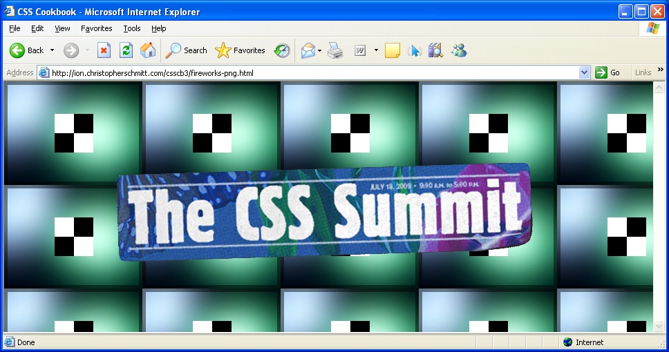
Creating Transparent PNG Images for IE6 and Later
Problem
You want to create backward-compatible PNG images with transparency for Internet Explorer 6 without JavaScript.
Solution
Use the Adobe Fireworks digital imaging application to make blended PNG8 images.
For an image with transparency, such as a drop shadow, set the image type to PNG8, dither to 100%, and transparency to alpha transparency, as shown in Figure 4-19.
Discussion
The PNG24 file format’s alpha transparency doesn’t work in IE6, often showing transparency as a white block, as seen in Figure 4-20. Adobe Fireworks exports PNG8 with its semitransparency intact and visible in Internet Explorer 7 and later.
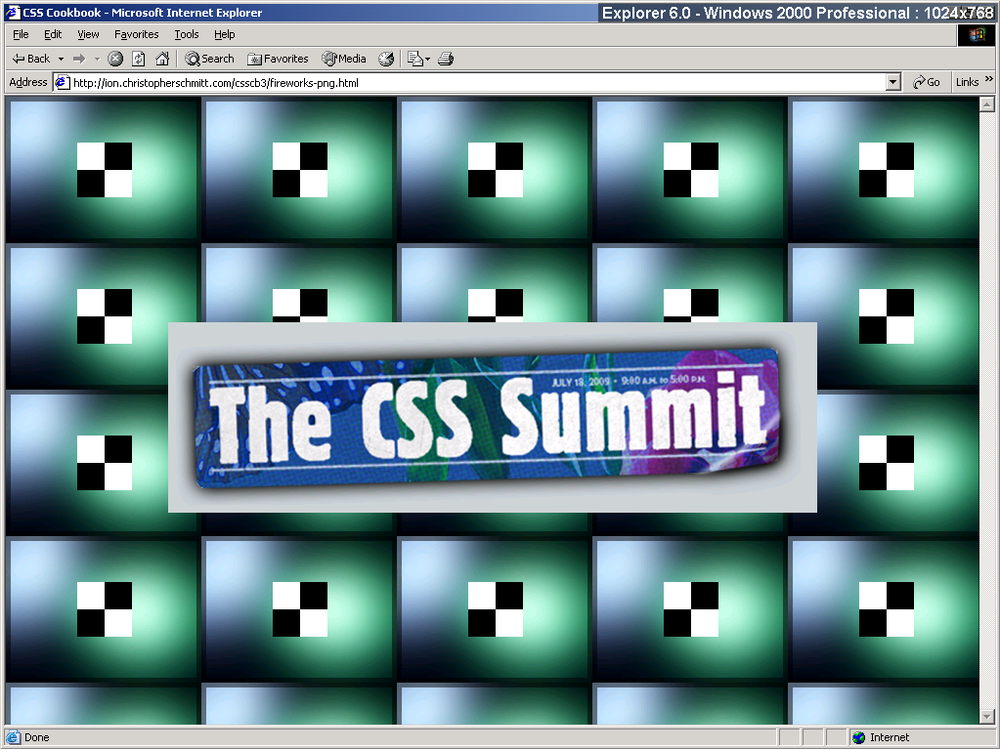
Currently, Adobe Fireworks is the only commercial application that provides this type of blended PNG8 export functionality.
Note
Other applications that perform this type of special export include pngquant (see http://www.libpng.org/pub/png/apps/pngquant.html) and pngnq (see http://pngnq.sourceforge.net/index.html).
See Also
The SitePoint article “PNG8—The Clear Winner” at http://www.sitepoint.com/blogs/2007/09/18/png8-the-clear-winner/
Using Transparent PNG Images with JavaScript
Problem
You want to use multiple PNGs with alpha transparency.
Solution
Use Drew McLellan’s updated Sleight script for triggering alpha transparency in Internet Explorer versions 5.5 through 6.
Either write the code in a separate JavaScript file or download the code from McLellan’s website at http://allinthehead.com/code/samples/bgsleight.js:
if (navigator.platform == "Win32" &&
 navigator.appName == "Microsoft Internet Explorer" &&
 window.attachEvent) {
  window.attachEvent("onload", fnLoadPngs);
}

function fnLoadPngs() {
 var rslt = navigator.appVersion.match(/MSIE (\d+\.\d+)/, '');
 var itsAllGood = (rslt != null && Number(rslt[1]) >= 5.5);
 for (var i = document.all.length - 1, obj = null;
  (obj = document.all[i]); i--) {
   if (itsAllGood &&
 obj.currentStyle.backgroundImage.match(/\.png/i) != null) {
  this.fnFixPng(obj);
  obj.attachEvent("onpropertychange",
 this.fnPropertyChanged);
  }
 }
}

function fnPropertyChanged() {
 if (window.event.propertyName == "style.backgroundImage") {
  var el = window.event.srcElement;
  if (!el.currentStyle.backgroundImage.match(/x\.gif/i)) {
    var bg = el.currentStyle.backgroundImage;
    var src = bg.substring(5,bg.length-2);
    el.filters.item(0).src = src;
    el.style.backgroundImage = "url(x.gif)";
  }
 }
}

function fnFixPng(obj) {
 var bg = obj.currentStyle.backgroundImage;
 var src = bg.substring(5,bg.length-2);
 obj.style.filter =
"progid:DXImageTransform.Microsoft.AlphaImageLoader(src='"
 + src + "', sizingMethod='scale')";
 obj.style.backgroundImage = "url(x.gif)";
}
Attach the JavaScript file to the web page by placing the following code in between the head elements:
<script src="/_assets/js/bgsleight.js" type="text/javascript"></script>
Be sure to upload the single-pixel transparent GIF (listed as x.gif in the script) to the web server and update the file location reference in the script for your needs.
Discussion
Support for alpha transparency in modern browsers is almost commonplace. Browsers that include native support for PNGs include Chrome, Opera, Safari, and Internet Explorer for Windows 7. However, this list does not include Internet Explorer for Windows 6.
To work around this, Aaron Boodman created a piece of JavaScript that uses Microsoft’s proprietary filter property to activate Internet Explorer for Windows versions 5.5 through 6 support for inline PNGs with alpha transparency, without interfering with the other browsers that support PNGs natively.
Drew McLellan built off of Boodman’s work and modified the JavaScript used in the Solution to make the script work not only for inline images, but also for background images (see http://allinthehead.com/retro/69/sleight-of-hand).
Note
If you use jQuery, a plug-in based on this solution is readily available at http://jquery.andreaseberhard.de/pngFix/.
How the script works
As a page is loaded, McLellan’s JavaScript is executed. The script goes through the HTML markup looking for img elements that point to images with the png extension.
Once it finds such img code, the script dynamically rewrites the HTML on the fly. The first part of the revision is to replace the PNG image with a single-pixel GIF that is transparent.
Next, the PNG file is set in Internet Explorer’s filter property to trigger the alpha transparency in that browser. Since this is the only way this can be done, the PNG gets set in the background.
Note
To deliver proprietary CSS properties to only Internet Explorer, use conditional comments (see Using Conditional Comments to Deliver Styles to Different Versions of Internet Explorer).
Thus, the PNG is shown in the background behind the transparent GIF.
Note
PNG24 images, those with full alpha transparency, tend to have rather large file sizes. To help with that issue, an optimizer called Pngcrush (see http://pmt.sourceforge.net/pngcrush/) is available that you can execute from the MS-DOS window or Unix command line. PNGThing, a small, easy-to-use Mac application based on this code, is available at http://mac.softpedia.com/get/Graphics/PNGThing.shtml.
See Also
The original posting of the Sleight script at http://www.youngpup.net/2001/sleight; more information about Microsoft’s filter property at http://msdn.microsoft.com/en-us/library/ms532967(VS.85,classic).aspx
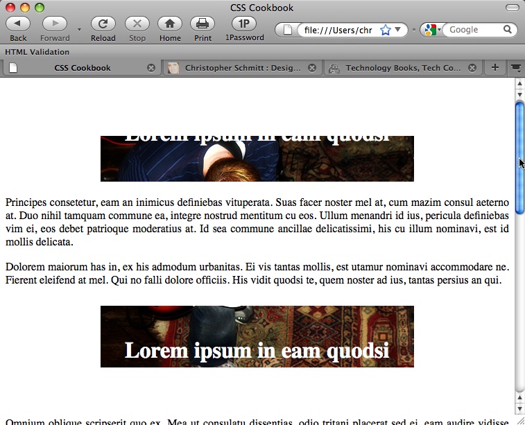
Overlaying HTML Text on an Image
Problem
You want to position HTML text over an image.
Solution
Set the image within the background and then position and style the HTML text accordingly.
First, wrap the text around a div element with an id attribute:
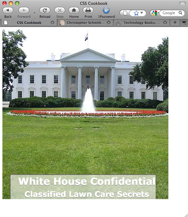
<div id="frame">
 <div id="banner">
  <h1>White House Confidential <br /><span>
Classified Lawn Care Secrets</span></h1>
 </div><!-- end #banner -->
 <p>...</p>
</div>
Insert the image through the background-image property, making sure to set the width and height:
#banner {
 width: 550px;
 height: 561px;
 overflow: hidden;
 background-image: url(whitehouse.jpg);
 background-position: 0;
 background-repeat: no-repeat;
 position: relative
}
Then adjust the type to the desired style, as shown in Figure 4-21:
h1 {
 margin: 0;
 padding: 0;
 font-family: Verdana, Arial, sans-serif;
 margin-top: 325px;
 margin-left: 25px;
 position: absolute;
 bottom: 0;
 color: white;
 text-shadow: 0 1px 0 #666;
 text-align: center;
 border-left: 2px solid #666;
 border-right: 2px solid #666;
 border-top: 2px solid #666;

 /* room around text */
 padding-left: 25px;

 /* bring in the translucent background image */
 background-image: url(white-banner.png);
 background-position: bottom;
 background-repeat: no-repeat;
}
h1 span {
 font-size: .8em;
}
Discussion
Instead of bringing in an image and having it be inline or part of the content of a web page when its purpose is strictly decorative, use the background-image property to display the image. This method makes the page more accessible, but still maintains the intended visual.
See Also
Replacing HTML Text with an Image for replacing HTML text with an image
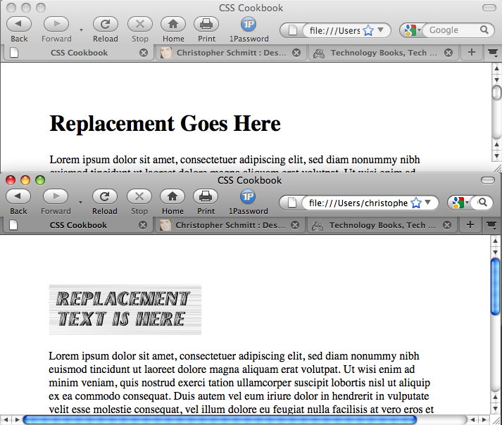
Replacing HTML Text with an Image
Problem
You want to replace HTML text, such as a heading, with an image that contains visually rich imagery or typography.
Solution
Use the Gilder/Levin image replacement technique.
First, introduce a span element before the HTML text:
<h1>
 <span></span>
 Replacement Text Is Here
</h1>
Then set the width and height for the replacement image on the h1 selector as well as setting the positioning of the element to relative:
h1 {
 width: 216px;
 height: 72px;
 position: relative:
}
Next, set the positioning of the span element to absolute and adjust the width and height of the span inside the h1 element; the span element now overlaps the HTML text. The last step is to bring in the replacement image through the background property, as shown in Figure 4-22:
h1 span {
 background: url(replacementimage.jpg) no-repeat;
 position: absolute;
 width: 100%;
 height: 100%;
}
Discussion
There are several image replacement techniques in web development, and all seem to have their own benefits and drawbacks.
Fahrner Image Replacement method
Todd Fahrner is one of the people credited with the original concept of an image replacement technique.
The markup for the Fahrner Image Replacement (FIR) technique also introduces a nonsemantic span element, except that the span element is wrapped around the content:
<h1>
 <span>
  Replacement Text Is Here
 </span>
</h1>
Then the CSS rules bring in the replacement image through the selector for the h1 element while hiding the text:
h1 {
 background: url(replacementimage.jpg) no-repeat;
 width: 216px;
 height: 72px;
}
h1 span {
 display: none;
}
Problem with the FIR method
Its easy implementation made the FIR technique quite popular
in web development. However, screen readers used by people with
disabilities would often skip reading the HTML text because the
span element set the text to be hidden from view.
Thus, important text would be lost to those members of a site’s
audience.
Phark image replacement method
Both the FIR and the Gilder/Levin image replacement methods use a nonsemantic span tag to achieve their results. Another image replacement technique, created by Mike Rundle from Phark.net, removes the need for the span tag.
First, adjust the HTML by removing the span tag:
<h1>
 Replacement Text Is Here
</h1>
For the CSS rules, use a negative value for the text-indent property instead of using the display property to hide the text:
h1 {
 text-indent: −9000em;
 background: url(replacementimage.jpg) no-repeat;
 width: 216px;
 height: 72px;
}
Problem with the Phark method
Like the other methods, the Phark image replacement method works very well. Its main drawback is that the HTML text does not appear if a site visitor has turned off images from being viewed in his browser.
CSS3 approach to image replacement
The CSS3 specification provides an easy method for image replacement, if browsers were to implement it. For example, to replace text within an h1 element, all you would require is one declaration block:
h1 {
 content: url(logo.gif);
}
The specification also makes no limits on what kinds of multimedia can be supported with the content property. In theory, a web developer could place a QuickTime movie instead of an animated GIF:
h1 {
 content: url(logo.mov);
}
Note
At the time of this writing, support for this part of the CSS3 specification is not provided in modern browsers.
See Also
Information on inserting content with CSS3 at http://www.w3.org/TR/css3-content/#inserting3 and http://my.opera.com/ODIN/blog/css-3-image-replacement
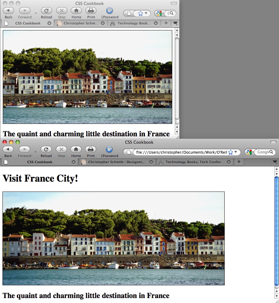
Building a Panoramic Image Presentation
Problem
You want the width of an image to increase or decrease as a user resizes his browser window, as shown in Figure 4-23.
Solution
Place an image element that refers to a panoramic image into the background of a block-level element:
<h1>Visit France City!</h1>
 <div><img src="frenchtown.jpg" alt=" " /></div>
<h2>The quaint and charming little destination in France</h2>
Position the image element in the upper-right corner of the block-level element and then hide the image by setting the display to none:
div {
 background-image: url(frenchtown.jpg);
 background-repeat: no-repeat;
 background-position: top right;
 height: 300px;
 border: 1px solid black;
 max-width: 714px;
}
div img {
 display: none;
}
When the image is placed as a background image, it will be resized based on the size of the browser window.
Discussion
To create a panoramic presentation, you need a wide photograph. You then need to position the image element in the upper-right corner of the block-level element so that the image will grow or shrink depending on the size of the browser window. The use of the max-width property constrains the width of the div element from expanding beyond the width of the image itself.
In this Solution, the same image is used in both the HTML and the CSS. The rationale behind this approach is to make sure the image (or content) displays, even if the user agent rendering the page doesn’t understand CSS.
See Also
The CSS 2.1 specification for max-width at http://www.w3.org/TR/CSS21/visudet.html#propdef-max-width
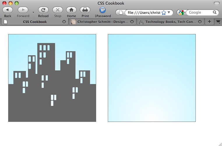
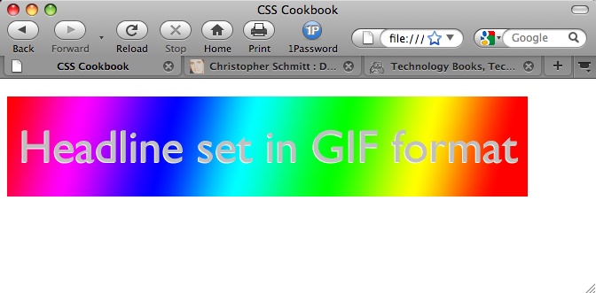
Combining Different Image Formats
Problem
You want to combine two different image formats into one presentation. For example, you want to combine GIF and JPEG images into one graphical presentation, as shown in Figure 4-24.
Solution
Place an image inside a block-level element, such as a div or h2:
<h2><img src="headline_text.gif" alt="Headline image set in
GIF format" /></h2>
Using an image-editing program, separate the elements of the image into separate file formats (see Figure 4-25).

Name one of the images the same as the image referred to in the src attribute for the img element. Place the other image in the background of the block-level element to merge both images into one presentation:
h2 {
 background-image: url(headline_bkgd.jpg);
 background-repeat: none;
 width: 587px;
 height: 113px;
}
Discussion
The two prevailing image formats on the Web are GIF and JPEG (and PNGs making a strong triad). Both compress images in different ways. Typically, images with flat areas of color compress better in the GIF format, whereas JPEG images are better for photos or images that contain fine color gradations.
In the example shown in Figures Figure 4-24 and Figure 4-25, the file size of the two separate images added together is actually less than the file size of the final, combined image. This occurs because part of the image would work against the compression scheme of one file format. If you saved the presentation as one GIF, the photographic portions of the image would create an inflated file size. And if you saved the image as a JPEG, the areas of flat color would inflate the size. By splitting up the images into different formats that leverage their respective compression schemes, you reduce file sizes overall.
Although the method in this Solution uses background properties in CSS, you can accomplish the same effect by positioning block elements that contain inline images. For example, in Figure 4-26 you can see that the line art of the boat was overlaid on the photograph of the two children.
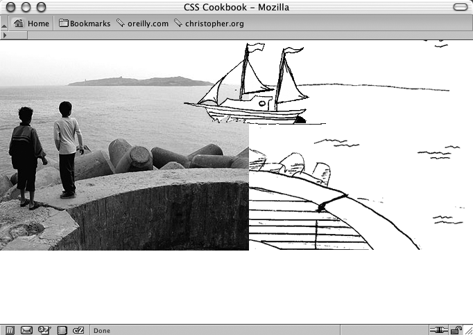
To make this method work, wrap the image elements in block-level div elements, as shown in the following HTML code:
<!DOCTYPE html PUBLIC "-//W3C//DTD XHTML 1.0 Transitional//EN"
    "http://www.w3.org/TR/xhtml1/DTD/xhtml1-transitional.dtd">
<html xmlns="http://www.w3.org/1999/xhtml">
 <head>
  <title>CSS Cookbook</title>
 </head>
 <body>
  <img src="kids.jpg" width="360" height="304"  alt="kids
playing" />
  <div id="boat"><img src="boat.gif" width="207" height="123"
   alt="boat" /></div>
  <div id="water"><img src="landscape.gif" width="315"
height="323"
   alt="landscape" /></div>
 </body>
</html>
Then, through CSS, set the position of the elements to absolute. By setting the position to absolute, you take the elements out of the normal flow of the web page, and instead you assign values to the left, top, and z-index properties to determine their new placements:
#boat {
 position:absolute;
 width:207px;
 height:123px;
 z-index:2;
 left: 264px;
 top: 0;
}
#water {
 position:absolute;
 width:315px;
 height:323px;
 z-index:1;
 left: 359px;
 top: −20px;
}
The left and top properties indicate the placement of the images within their nearest positioned ancestor element or the initial containing block. In this case, it’s the initial containing block to the div elements. Furthermore, the body element’s margin has a value of 0, meaning that the origin point is in the upper-left corner of the browser’s viewport.
body {
 margin: 0;
}
Even though this method works, if the web document is later modified, exact positioning becomes a design liability. For example, adding a simple headline above the images in the HTML results in the anomaly shown in Figure 4-27:
<h2>Kids Welcome New Boat!</h2>
 <img src="kids.jpg" width="360" height="304"  alt="kids
playing" />
 <div id="boat"><img src="boat.gif" width="207" height="123"
   alt="boat" /></div>
 <div id="water"><img src="landscape.gif" width="315" height="323"
alt="landscape" /></div>
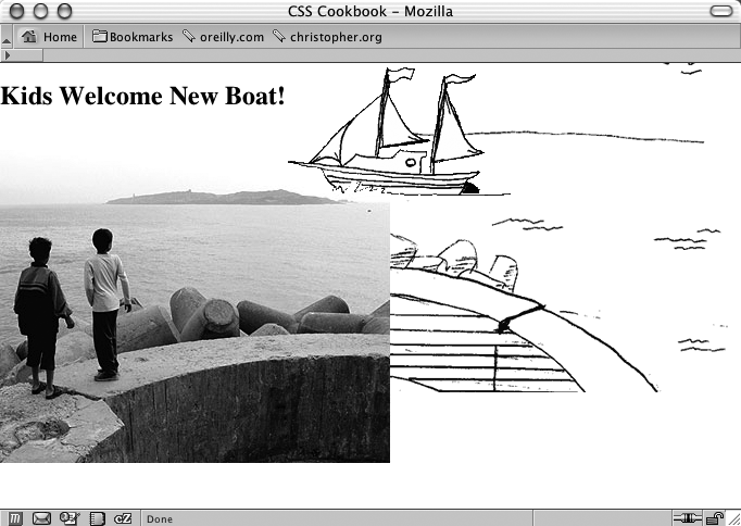
Because the image of the children has not been positioned with absolute, it moves down the flow of the document. The other image stays in place because it has been positioned within the initial containing block and is still in the same place it was before the headline was added.
By using the background-positioning method within block-level elements, you can create a self-contained module. Then, when content is added to and removed from the web page, the presentation remains whole, as seen in Figure 4-28 and shown in the following code:
<!DOCTYPE html PUBLIC "-//W3C//DTD XHTML 1.0 Transitional//EN"
    "http://www.w3.org/TR/xhtml1/DTD/xhtml1-transitional.dtd">
<html xmlns="http://www.w3.org/1999/xhtml">
 <head>
 <title>CSS Cookbook</title>
<style type="text/css">
body {
 margin: 5% 10% 0 10%;
}
#content {
 background-image: url(landscape.gif);
 background-repeat: no-repeat;
 background-position: bottom right;
 height: 400px;
 width: 674px;
}
h2 {
 margin: 0;
 padding: 0;
 background-image: url(kids.jpg);
 background-repeat: no-repeat;
 background-position: bottom left;
 height: 400px;
 width: 600px;
}
#boat {
 background-image: url(boat.gif);
 background-repeat: no-repeat;
 display: block;
 width: 207px;
 height: 123px;
 margin-left: 250px;
 margin-top: 75px;
}
</style>
 </head>
 <body>
  <div id="content">
   <h2>Kids Welcome New Boat!
    <span id="boat">
    </span>
   </h2>
  </div>
 </body>
</html>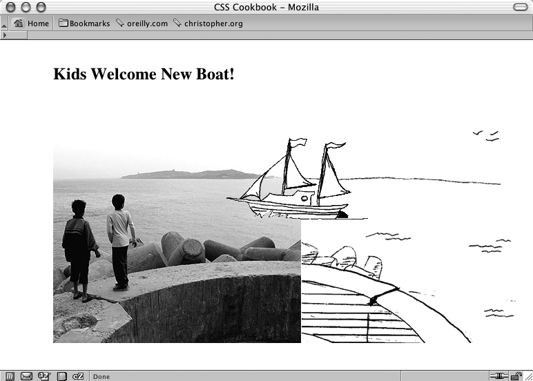
See Also
Creating Unexpected Incongruity for creating unexpected incongruity between two elements; Combining Unlike Elements to Create Contrast for combining unlike elements
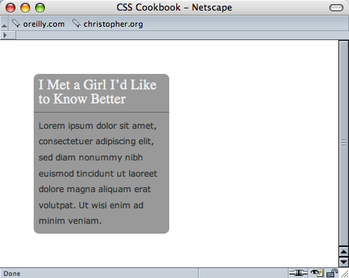
Rounding Corners with Fixed-Width Columns
Problem
You want to create rounded corners on fixed-width columns.
Solution
Create two background images, with one image containing the top corners and the other image containing the bottom corners, as shown in Figure 4-29.
Wrap a div element around the content that’s within the column:
<div id="box"> <h2> I Met a Girl I’d Like to Know Better </h2> <p>Lorem ipsum dolor sit amet, consectetuer adipiscing elit, sed diam nonummy nibh euismod tincidunt ut laoreet dolore magna aliquam erat volutpat. Ut wisi enim ad minim veniam.</p> </div>
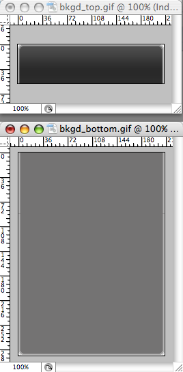
Place the bottom background image in the div element:
#box {
 width: 214px;
 background-image: url(bkgd_bottom.gif);
 background-position: bottom;
 background-repeat: no-repeat;
}
Then place the top background image in the h2 element, as shown in Figure 4-30:
h2 {
 background-image: url(bkgd_top.gif);
 backgroung-position: left top;
 background-repeat: no-repeat;
 padding: 7px 7px 3px 7px;
 margin: 0;
 border-bottom: 1px solid #999;
 font-size: 1.3em;
 font-weight: normal;
 color: #eee;
}
Discussion
To compensate for different text sizes, make the background images extend for longer than just the space specified in the design. For example, the images used in this Solution are 600 pixels tall; however, it’s not unheard of to have graphics that are more than 1,000 pixels tall to ensure that a page’s design maintains its integrity with extreme font sizing.
Flexible widths
By fixing the width of the column to a length unit such as pixels, it’s possible to place an image containing two corners in one image. With column widths that change when the user resizes the browser, however, the fixed-width solution falls apart.
See Also
Recipes Clarifying Specificity, Setting Up Different Types of Stylesheets, and Adding Comments Within Stylesheets for rounding corners with flexible widths
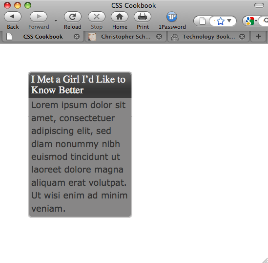
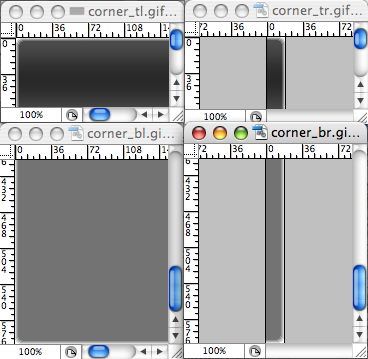
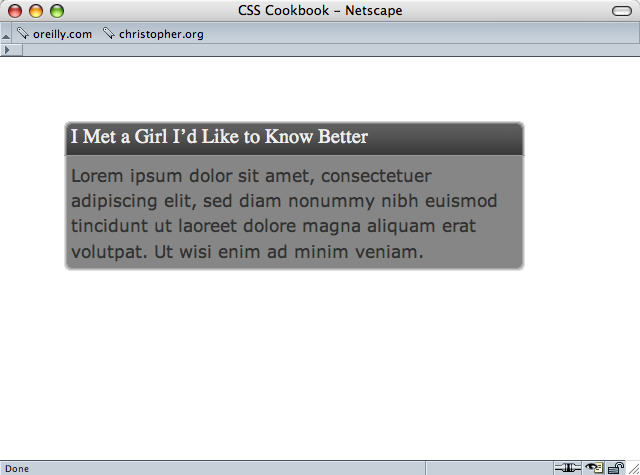
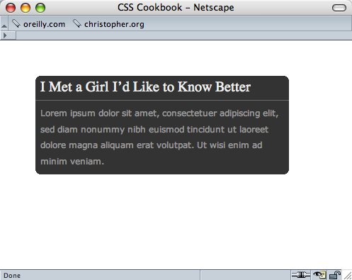
Rounding Corners (Sliding Doors Technique)
Problem
You want to round corners in columns that have flexible widths.
Solution
Use the Sliding Doors technique that was made popular by web designer Douglas Bowman.
Create the design of the rounded corners, as shown in Figure 4-31.

Then create separate graphics for the four corners, as shown in Figure 4-32.
Wrap the content that is in the column with additional div elements:
<div id="box"> <div id="innerhead"> <h2> I Met a Girl I’d Like to Know Better </h2> </div> <div id="content"> <div id="innercontent"> <p>Lorem ipsum dolor sit amet, consectetuer adipiscing elit, sed diam nonummy nibh euismod tincidunt ut laoreet dolore magna aliquam erat volutpat. Ut wisi enim ad minim veniam.</p> </div> </div> </div>
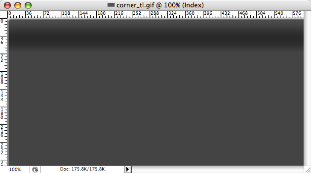
Then place the background images through CSS, as shown in Figure 4-33. The top-left corner goes in the innerhead id selector, the top-right corner slides into the preexisting h2 element, the content id selector gets the bottom-left selector, and the innercontent id selector houses the bottom-right graphic:
#innerhead {
 background-image: url(corner_tl.gif);
 background-position: top left;
background-repeat: no-repeat;
}
h2 {
 background-image: url(corner_tr.gif);
 background-position: top right;
 background-repeat: no-repeat;
 margin: 0;
 padding: 7px;
 border-bottom: 1px solid #999;
 font-size: 1.3em;
 font-weight: normal;
 color: #eee;
}
#content {
 background-image: url(corner_bl.gif);
 background-position: bottom left;
 background-repeat: no-repeat;
}
#innercontent {
 background-image: url(corner_br.gif);
 background-position: bottom right;
 background-repeat: no-repeat;
}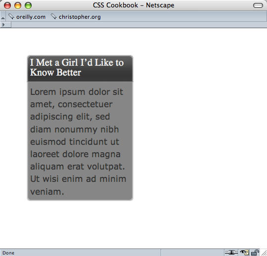
Discussion
The div and h2 elements act as hooks to add background images to all four corners of the column. As the browser resizes, the background images stay in their respective corners, as shown in Figure 4-34.
To make sure the design integrity is maintained as the column expands, further digital image editing is required. Manipulate one side, either the left or the right, and expand the two graphics both vertically and horizontally. For example, the bottom-right and bottom-left graphics (see Figures Figure 4-35 and Figure 4-36) were expanded for this Solution.
See Also
Setting Up Different Types of Stylesheets for a simple solution to rounding corners of a column
Rounding Corners (Mountaintop Technique)
Problem
You want to create one set of graphics for rounded graphics while being able to display many background colors within the column.
Solution
Use the Mountaintop technique that was popularized by web designer Dan Cederholm.
Create a small graphic that will act as the basis for the rounded corners, as shown in Figure 4-37.
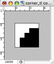
Note
The black color in Figure 4-37 will be set to transparent when the image is exported as a GIF.
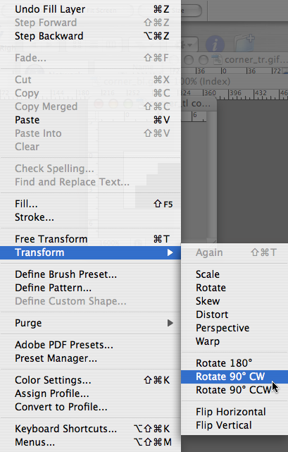
Export the image as a GIF with the filename corner_tl.gif.
Then rotate the image 90 degrees (see Figure 4-38) and export it as a GIF image, naming it corner_tr.gif. Repeat the last two steps to create the bottom corners, corner_br.gif and corner_bl.gif.
Add additional div elements around the column content:
<div id="box">
<div id="head_outer">
<div id="head_inner">
<h2>
I Met a Girl I’d Like to Know Better
</h2>
</div>
</div>
<p>Lorem ipsum dolor sit amet, consectetuer adipiscing elit, sed diam
nonummy nibh euismod tincidunt ut laoreet dolore magna aliquam erat
volutpat. Ut wisi enim ad minim veniam.</p>
</div>Then place the four corner graphics within the id and p selectors, as shown in Figure 4-39:
div#box {
 width: 55%;
 background-color: #999999;
 background-image: url(corner_bl.gif);
 background-repeat: no-repeat;
 background-position: bottom left;
}
#head_outer {
 background-image: url(corner_tl.gif);
 background-repeat: no-repeat;
}
#head_inner {
 background-image: url(corner_tr.gif);
 background-repeat: no-repeat;
 background-position: top right;
}
div p {
 margin: 0;
 padding: 7px;
 font-family: Verdana, Arial, Helvetica, sans-serif;
 font-size: 1.1em;
 background-image: url(corner_br.gif);
 background-position: bottom right;
 background-repeat: no-repeat;
 color: #333333;
 font-size: .8em;
 line-height: 1.5;
}
Discussion
The beauty of the Mountaintop technique rests in its simplicity. Four small graphics made with low file sizes thanks to the GIF compression algorithm are placed in the background of four block-level elements.
Also, there is no need to expand a couple of images to make sure the design integrity is maintained as the column resizes, as you do with the Solution for Creating a Pull Quote with Images.
Plus, the Mountaintop technique allows you to quickly change the column’s background color without revising the corner graphics, as shown in Figure 4-40. However, you will need to change the corner graphics if the background color of the web page or column’s parent element changes.
See Also
Rounding Corners (Sliding Doors Technique) for automatically adding corners on columns without custom-made images
Rounding Corners with JavaScript
Problem
You want to include rounded corners on elements without the hassle of introducing new markup or images manually.
Solution
Use the Nifty Corners Cube code by Alessandro Fulciniti.
First download the components of the Nifty Corners Cube solution, which include one CSS and one JavaScript file, from http://www.html.it/articoli/niftycube/index.html.
Upload both the JavaScript and CSS files associated with the Nifty Corners Cube solution. Then link the JavaScript to the web page by using the src attribute in the script element:
<script type="text/javascript" src="/_assets/js/niftycube.js"></script>
Note
You won’t link directly to the CSS file, as the JavaScript file does that.
Next, modify the markup that will have rounded corners by giving it a unique value in the id attribute:
<div id="box">
<h2>Marquee selectus</h2>
<p>...<p>
</div>
Then make a separate JavaScript call to the browser indicating which element gets the rounded corners, and define the size of the rounded corners, as shown in Figure 4-41:
<script type="text/javascript" src="niftycube.js"></script>
<script type="text/javascript">
 window.onload=function() {
  Nifty("div#box","big");
}
</script>
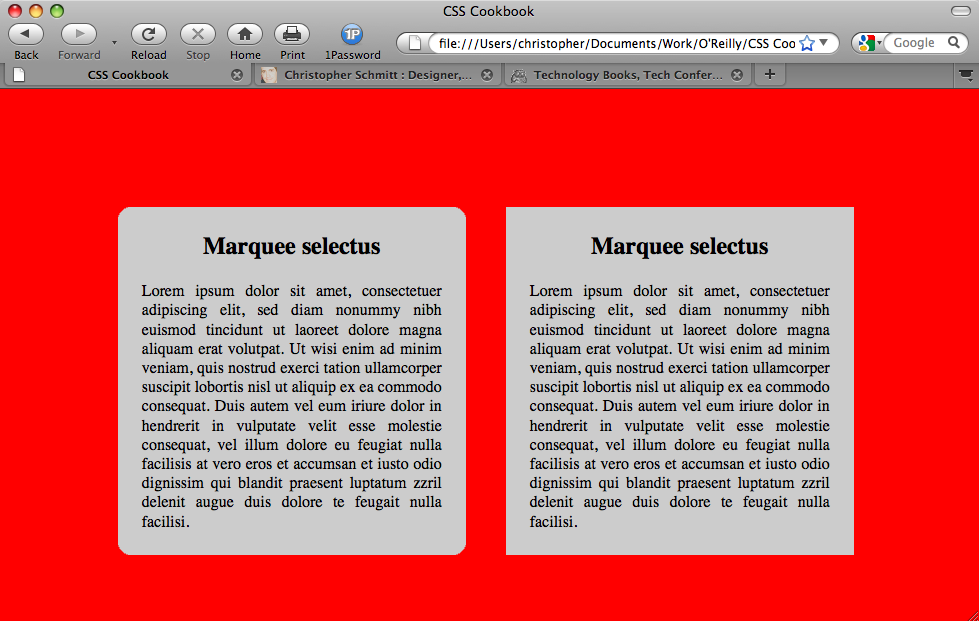
Discussion
Since it’s almost a completely worry-free method for creating rounded corners, the Nifty Corners Cube solution has been called more of a tool than a technique.
Note
This Solution is based on JavaScript. If the user does not have JavaScript in his browser or it is turned off, the rounded corners do not appear.
Different colors
Colors are detected automatically. The JavaScript automatically changes the colors to match the background color within the element as well as its parent element (usually the body of the web page). This means a developer only has to worry about setting which element gets the curves and the size.
Different sizes
Four keyword sizes are written into the Nifty Corners Cube JavaScript: none, small, normal (default), and big. small is equal to the value of 2 pixels, normal is 5 pixels, and big is 10 pixels.
For example, to adjust the corners so that they are small, the JavaScript call would look like this:
<script type="text/javascript">
 window.onload=function() {
  Nifty("div#box","small");
}
</script>
Different elements
Nifty Corners Cube accepts numerous selectors, making it easier to dictate which elements should receive rounded corners, as shown in Table 4-3.
| Selector | Example |
Type |
|
|
|
|
|
Descendant with |
|
Descendant with |
|
Grouping |
|
For example, to apply rounded corners to multiple elements, the JavaScript function might look like the following:
<script type="text/javascript">
 window.onload=function() {
  Nifty("div, h3.main div, p","small");
}
</script>
Specific corners
The Nifty Corners Cube solution also makes allowances that developers might not want to apply rounded edges to all the corners. Table 4-4 lists the keywords that allow developers to single out which corner or corners to round.
| Keyword | Meaning |
| Top-left corner |
| Top-right corner |
| Bottom-left corner |
| Bottom-right corner |
| Upper corners |
| Lower corners |
| Left corners |
| Right corners |
| All the corners |
For example, to apply rounded corners to the top corners of multiple elements within a web page, the JavaScript function might look like the following:
<script type="text/javascript">
 window.onload=function() {
  Nifty("div, h3.main div, p","small top");
}
</script>
Note
Variations of this Solution for the numerous JavaScript frameworks are available today. You can find one such solution for jQuery at http://www.malsup.com/jquery/corner/.
See Also
http://www.html.it/articoli/niftycube/index.html for more information about Nifty Corners Cube
Setting a Shadow on an Element with CSS
Problem
You want to place a box shadow on an element with CSS.
Solution
Use the box-shadow property with proprietary browser vendor CSS properties, as shown in Figure 4-42:
#header {
 min-width: 250px;
 text-shadow: 0 −1px 0 rgba(0,0,0,.8);
 box-shadow: 3px 3px 19px rgba(0,0,0,.8);
 -webkit-box-shadow: 3px 3px 19px rgba(0,0,0,.8);
 -moz-box-shadow: 3px 3px 19px rgba(0,0,0,.8);
 background-image: -webkit-gradient(linear, left top, left bottom, from(#930),
 to(#6b3703), color-stop(0.5, #903000));
 background-image: -moz-linear-gradient(left top, left bottom,
 from(rgba(153,51,0,.3)), to(#6b3703), color-stop(0.5, #903000));
 margin: 7px;
 padding: 14px;
}
Discussion
Box shadows work in a similar way to text shadows (see Placing a Shadow Behind Text).
The first value represents the distance on the x-axis, and the second value is the value for the y-axis. A positive value means the shadow is placed down and to the right, respectively. Negative values place the shadow up and to the left.
The third value defines the radius or glow of the shadow.
The fourth value sets the color of the shadow. In the Solution, the color is set with RGBA, allowing for opacity. This approach to color (although not supported by all browsers) allows for a smoother transition to the tiling background.
See Also
Placing a Drop Shadow Behind an Image for a cross-browser method for placing an image; the CSS3 specification for box-shadow at http://www.w3.org/TR/css3-background/#the-box-shadow
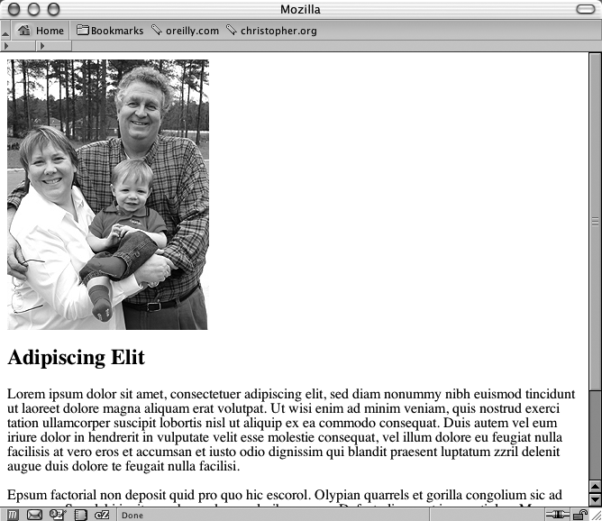
Placing a Drop Shadow Behind an Image
Problem
You want to place a drop shadow behind an image, as shown in Figure 4-43.
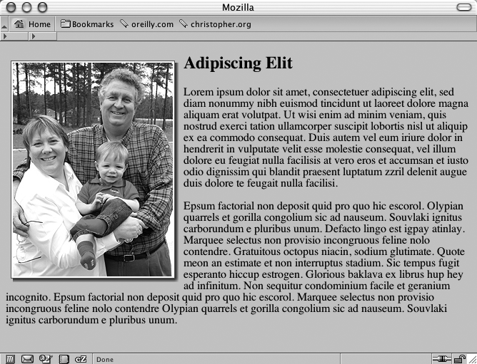
Solution
Place the image element (as shown in Figure 4-44) inside a div element with the class attribute set to imgholder:
<div class="imgholder">
 <img src="dadsaranick2.jpg" alt="Photo of Dad, Sara, Nick" />
 </div>
Set the image alignment of the div element to the left so that the text wraps around the image. Next, set the background image of the drop shadow in two background properties. In the first background property, use an image with an alpha transparency such as PNG:
div.imgholder {
 float:left;
 background: url(dropshadow.png) no-repeat bottom
  right !important;
 background: url(dropshadow.gif) no-repeat bottom right;
 margin: 10px 7px 0 10px !important;
 margin: 10px 0 0 5px;
}
As for the image itself, set the margin-right and margin-bottom properties to define how much of the drop shadow image shows through. Also set a border property as well as padding to create a more dramatic effect:
div.imgholder img {
 display: block;
 position: relative;
 background-color: #fff;
 border: 1px solid #666;
 margin: −3px 5px 5px −3px;
 padding: 2px;
}
Discussion
The first step is to create a drop shadow image in an image-editing program such as Adobe Photoshop. It’s best to create a background image of 600 × 600 pixels or larger, as shown in Figure 4-45. With the image that large, this technique can accommodate almost any image used in a web page.
The first image background property uses the !important rule to display the PNG file as the drop shadow. By using the PNG file, you can change the background color or image of the web document without affecting the drop shadow. For the other browsers that don’t support this rule, such as Internet Explorer for Windows, go to the next background property and use the GIF image as the drop shadow instead.
The margin-left and margin-bottom properties in the image element control how far away the drop shadow image appears from the image. If your drop shadow distance on the right or left side is more than 5 pixels (as is the one used in this Solution), change the value accordingly.
See Also
Placing a Smooth Drop Shadow Behind an Image for creating smooth drop shadows behind an image
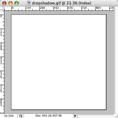
Placing a Smooth Drop Shadow Behind an Image
Problem
You want to have soft edges for an image’s drop shadow.
Solution
Adding another nonsemantic div wrapper around another background image allows for the creation of soft edges on drop shadows.
First, create a new image in Adobe Photoshop that will act as a mask to soften the drop shadow image. Using the same dimensions as the drop shadow, delete the entire image content in the file, leaving only a transparent background.
Note
If you don’t have access to Photoshop, try an online version at https://www.photoshop.com/, or download a free digital imaging application such as GIMP (see http://www.gimp.org/).
Then, using the gradient tool, pick the gradient option that creates a fade from Background Color to Transparent, as shown in Figure 4-46.
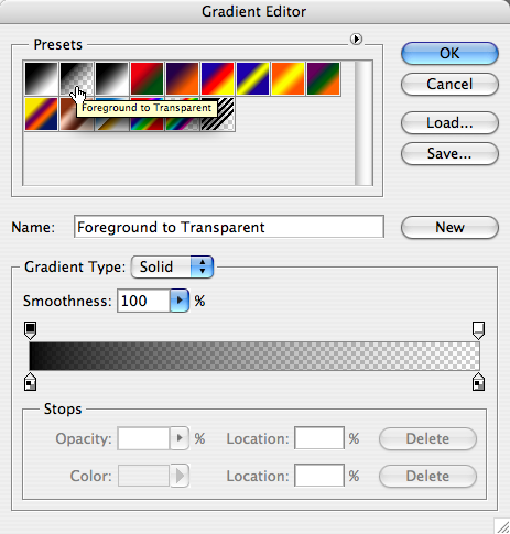
Making sure that the background color in the Toolbar matches the background color used in the website, create a 6-pixel fade from the left edge of the canvas toward the right side of the image.
Then repeat the creation of the fade, but this time create the fade from the top of the canvas to the bottom.
Next, save the image as a PNG-24 image with transparency, as shown in Figure 4-47.
With the images set up, adjust the HTML to include a new div wrapper:
<div class="imgholder">
 <div>
  <img src="dadsaranick2.jpg" alt="Photo of Dad, Sara, Nick" />
 </div>
</div>
Adjusting the first CSS image wrapper, float the image to the left, apply the drop shadow, and set some spacing between the image and the HTML content:
div.imgholder {
 float: left;
 background: url(dropshadow.gif) no-repeat bottom right;
 margin: 0 7px 7px 0;
}
Next, bring in the mask that will soften the drop shadow background as well as make room to display both the drop shadow and the mask, as shown in Figure 4-48:
div.imgholder div {
 background: url(shadowmask.png) no-repeat;
 padding: 0 6px 6px 0;
}
Finally, add some padding and a border to the image, as shown in Figure 4-49:
div.imgholder img {
    display: block;
    position: relative;
    background-color: #fff;
    border: 1px solid #666;
    padding: 2px;
}
Discussion
The hard part of this Solution is creating a PNG with alpha transparency that works with the drop shadow and matches the background of the website.
Since Internet Explorer for Windows versions 5.5 through 6 do not natively support PNGs with alpha transparency, use the Solution from Using Transparent PNG Images with JavaScript.
See Also
Setting a Shadow on an Element with CSS for creating a simple drop shadow on an image
Making Word Balloons
Problem
You want to create a word-balloon effect, as shown in Figure 4-50.
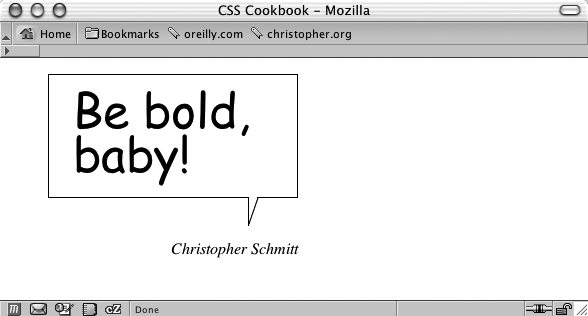
Solution
Mark up the content for a word balloon, and include both the text to appear in the word balloon as well as the name of the person cited as the source (see Figure 4-51):
<blockquote>
 <p>
  <span>
   Be bold, baby!
  </span>
 </p>
 <cite>
  Christopher Schmitt
 </cite>
</blockquote>
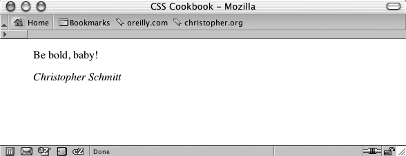
Form the word balloon using the CSS border and background properties. Then align the cited text so that it falls underneath the balloon tail image:
blockquote {
 width: 250px;
}
blockquote p {
 background: url(balloontip.gif);
 background-repeat: no-repeat;
 background-position: bottom;
 padding-bottom: 28px;
}
blockquote p span {
 display: block;
 padding:  0.25em 0.25em 0.5em 0.5em;
 border: 1pt solid black;
 border-bottom-width: 0;
 font-size: 3em;
 font-family: "Comic Sans MS", Verdana, Helvetica, sans-serif;
 line-height: 0.9em;
}
cite {
 text-align: right;
 display: block;
 width: 250px;
}
Discussion
To create a word balloon you need at least one image, which includes a balloon tail and one border of the balloon (see Figure 4-52). The image is available for download at this book’s site, http://csscookbook.com/. You create the other three sides of the word balloon by setting the border in the span tag.
For a comic book look and feel, be sure to set the font family to Comic Sans MS, a free font from Microsoft, or use a font-embedding technique as shown in Embedding Font Files for another font:
font-family: "Comic Sans MS", Verdana, Helvetica, sans-serif;
If you have a computer running the Windows OS, the Comic Sans MS font might be installed on your computer already. Although this is a common font, some users might not have it installed on their systems. If that is the case, the browser will look for the next font, in the order listed in the value, until it finds a font available to render the page.
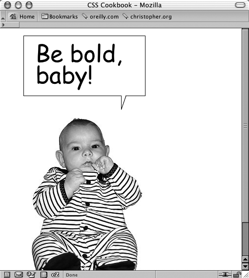
You can create a more whimsical presentation using the word-balloon technique by adjusting the markup and CSS slightly. First, place a span element with a class attribute set to no around the name in the cite element:
<blockquote>
 <p>
  <span>
   Be bold, baby!
  </span>
 </p>
 <cite>
  <span class="no">
   Christopher Schmitt
  </span>
 </cite>
</blockquote>
Next, in CSS, add the following rule, which keeps the text from being displayed in the browser:
.no {
 display: none;
}
Place a photograph in the cite element through the background-position property to finish the effect (see Figure 4-53):
cite {
 margin: 0;
 padding: 0;
 background-image: url(baby.jpg);
 background-position: 0 0;
 height: 386px;
 text-align: right;
 display: block;
 width: 250px;
}
See Also
Background information about Comic Sans MS at http://www.microsoft.com/typography/web/fonts/comicsns/default.htm; propaganda on why not to use Comic Sans MS at http://www.bancomicsans.com
Hindering People from Stealing Your Images
Problem
You want to make it difficult for people to copy your images from your web page.
Solution
Using a single-pixel transparent GIF as a place marker, wrap a div element around the img tag:
<div class="slide">
 <img src="singlepixel.gif" alt="" />
</div>
Then bring the image into the web page by using the background-image property, making sure to set the width and height of the image in both the div and img elements:
div.slide {
 width: 500px;
 height: 468px;
 background-image: url(face.jpg);
 background-repeat: no-repeat;
}
.slide img {
 width: 500px;
 height: 468px;
}
Discussion
Having the single-pixel GIF as a placeholder is not necessary for the intended to be displayed; in fact, you could do away with the img element altogether and still have the source image be displayed:
<div class="slide">
</div>
The purpose of the transparent image is to be used as a feint. The users will think they are downloading the image they desire, when in fact they are downloading an innocuous image.
Microsoft’s Image Toolbar
In Internet Explorer 6 for Windows, Microsoft started to include a feature called the Image Toolbar.
With this feature, a visitor to your site can easily email, download, or print your image with merely a click of the mouse. To keep the Image Toolbar from appearing on your web pages, add the following meta tags in between the head elements:
<meta http-equiv="imagetoolbar" content="no" />
<meta http-equiv="imagetoolbar" content="false" / >
It’s a bit of a pain for developers to add code to their web page to keep someone else’s product from stealing your images, but there is not much a developer can do, as Microsoft produces the most popular browser.
No images are safe
Even with the Solution and Image Toolbar workaround implemented in your web page, no image is safe from being copied from your website to a user’s computer.
First, images are automatically stored by the visitor’s browser and kept in a temporary folder for quick reloading of web pages. These cached images are routinely deleted after a fixed amount of time or whenever a user clears his browser’s cache.
However, the browser often renames these images automatically and most visitors don’t even know where the cached files are located on their computer.
The most direct route a user can take is to simply take a screen capture of his desktop with your image displayed on a browser. The user could then import the screenshot into his favorite digital imaging software application and crop the image.
So, these hindering methods might block out some visitors, but they are not solutions that will work all the time.
See Also
More information on the Image Toolbar at http://www.microsoft.com/windows/ie/ie6/using/howto/customizing/imgtoolbar.mspx#EXE; a JavaScript-powered technique to hinder people from stealing images at http://javascript.internet.com/page-details/no-right-click.html
Inserting Reflections on Images Automatically
Problem
You want to place a reflection of a header graphic automatically.
Solution
Download the JavaScript that powers the effect from http://cow.neondragon.net/stuff/reflection/.
After uploading it to the web server, link the JavaScript file into the web page between the head element:
<script type="text/javascript" src="scripts/reflection.js">
</script>
Insert into the web page the image to which you want to apply the reflection, as shown in Figure 4-54:
<img src="christinaleaf.png" alt="christina m. huggins" />
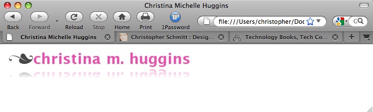
To activate the reflection as shown in Figure 4-54, insert a class attribute with a value of reflect:
<img src="christinaleaf.png" alt="christina m. huggins" class="reflect" />Discussion
As a page is rendered in the site visitor’s browser, the JavaScript reflection goes through the image elements of your web page looking for class attributes with the reflect value. Then the script uses the source of the image you want to reflect and creates a new image.
If the script finds any image elements that meet those criteria, the script copies the image, flips it, and then applies the default value of 50% for both the opacity and the height to this new reflected image.
Customization features
The reflection script allows you to customize the height and the opacity of the reflection.
To adjust the height of the reflection, add a new value, rheightXX, to the image’s class attribute where XX is the percentage of the image’s height that should be duplicated in the reflection:
<img src="christinaleaf.png" alt="christina m. huggins"
class="reflect rheight99" />
As the percentage value increases, the size of the reflection increases. For example, the value of rheight99 means that 99% of the original image’s height will be used in the reflection.
To adjust the opacity of the reflection, add a new value, ropacityXX, to the image’s class attribute where XX is the percentage of the transparency of the reflected image:
<img src="christinaleaf.png" alt="christina m. huggins"
class="reflect ropacity33" />
As the opacity value decreases, the reflection becomes less visible. For example, the value of ropacity33 means that 33% of the original image’s height will be used in the reflection.
You can use both the height and the opacity features at the same time to create subtler effects:
 <img src="christinaleaf.png" alt="christina m. huggins"
class="reflect rheight99 ropacity33" />
Known browser issues
Internet Explorer for Windows 5.5 and later, Firefox 1.5 and later, Chrome, Opera 9 and later, and Safari support the reflection script. Animated images in browsers do not work with the reflection script, except for Internet Explorer for Windows. Also, scaled images appear distorted in Internet Explorer for Windows.
See Also
The blog post announcing the reflection effect at http://cow.neondragon.net/stuff/reflection/
Using Image Sprites
Problem
You want to save on bandwidth by placing all or most of your icons onto one image.
Solution
Place the most often used images into one master image, making sure there is plenty of space around each image.
Create enough space for each icon’s own space as well as set the background image and keep it from repeating.
For this example, one icon is placed next to a heading:
h2 {
 margin: 0;
 font-family: Verdana, Arial, Helvetica, sans-serif;
 padding: 0 0 0 24px;
 font-weight: normal;
 background-image: url(sprite-source.gif);
 background-repeat: no-repeat;
}
Using id selectors, bring in each icon to the appropriate heading by using the background-position property, as shown in Figure 4-55:
h2#warning {
 background-position: −16px −15px;
}
h2#questions {
 background-position: −16px −51px;
}
h2#comment {
 background-position: −16px −87px;
}
h2#document {
 background-position: −16px −123px;
}
h2#print {
 background-position: −16px −159px;
}
h2#search {
 background-position: −16px −195px;
}
Discussion
In much the same way developers use the same image over and over again to make use of a browser’s ability to cache an image, using sprites helps to push that idea a bit further. By placing the separate graphic elements onto one image, web developers can reduce the number of server calls to their machines from a browser. This solution would be more apt for sites receiving medium to large amounts of traffic.
See Also
The “CSS Sprites” article at http://www.alistapart.com/articles/sprites
Clipping Background Images
Problem
You want to use only a portion of a background image in an HTML element.
Solution
Use the proprietary Firefox CSS value -mox-image-rect to isolate part of a background image, as shown in Figure 4-56:
div {
 background-image: -moz-image-rect(url(bkgd.jpg), 0, 100, 100%, 0);
 background-repeat: no-repeat;
 width: 200px;
 height: 200px;
 border:1px solid #666;
 float: left;
 margin-right: 20px;
}
div + div {
 background-image: -moz-image-rect(url(bkgd.jpg), 0, 100, 100%, 0);
 background-repeat: repeat;
}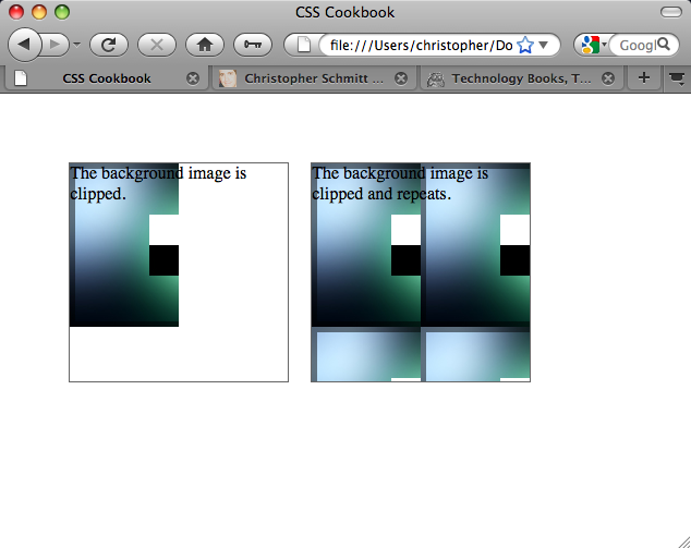
Discussion
Similar to background clipping through Firefox, -moz-image-rect requires two sets of information. The first is what image is clipped:
background-image: -moz-image-rect(url(bkgd.jpg));
Next, using pixels or percentages, dictate what portion of the image is visible through a series of four comma-separated values.
These values represent the same sides of an image as the margin or padding shorthand property—top, right, bottom, and left:
background-image: -moz-image-rect(url(bkgd.jpg), 0, 100, 100%, 0);Note
I did not use px after the integer, even though the browser understands this to be in pixels. Using px is not allowed and keeps the image from displaying. This might change in future releases of the browser, but it is something to look out for when implementing this feature.
The ability to clip background images is only in Firefox nightly builds at the time of this writing. The next major release of the browser after Firefox 3.5 should include support for this feature.
To have a background image show in other browsers that do not support background clipping, include the background-image property with standard CSS values in the CSS rule. Other browsers ignore the Firefox background clipping:
div {
 background-image: url(bkgd.jpg);
 background-image: -moz-image-rect(url(bkgd.jpg), 0, 1, 100%, 0);
 background-repeat: no-repeat;
 width: 200px;
 height: 200px;
 border:1px solid #666;
 float: left;
 margin-right: 20px;
}
See Also
The CSS3.info blog post about Firefox 3.6 support of background clipping at http://www.css3.info/firefox-3-6-adds-background-clipping/
Applying Masks to Images and Borders
Problem
You want to apply a mask to an image and its borders.
Solution
First, create a PNG image with alpha transparency, as shown in Figure 4-57.
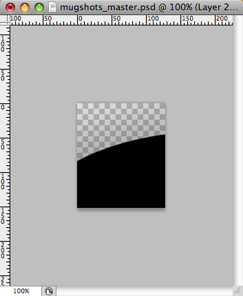
Then apply the mask through a CSS rule, as shown in Figure 4-58:
img {
 display: block;
 float: left;
 margin-right:20px;
 border: 10px solid #ccc;
 padding: 2px;
 background-color: #666;
 -webkit-mask-box-image: url(mask.png);
}
Discussion
When creating a mask, every part of the image that is transparent becomes the mask or the part that hides a portion of the background image. This approach is somewhat hard to understand, since typically, alpha transparency is, well, transparent.
In addition to PNG images, you can also use SVG images as masks as well as gradients (see Setting Gradients with CSS), as shown in Figure 4-59:
img {
 display: block;
 float: left;
 margin-right:20px;
 border: 10px solid #ccc;
 padding: 2px;
 background-color: #666;
 -webkit-mask-box-image: -webkit-gradient(linear, left bottom, left top,
from(rgba(0,0,0,1)), to(rgba(0,0,0,0)));
}
As of this writing, the only browser that supports CSS masking is Safari.
See Also
The Surfin’ Safari blog post on CSS masks at http://webkit.org/blog/181/css-masks/
Get CSS Cookbook, 3rd Edition now with the O’Reilly learning platform.
O’Reilly members experience books, live events, courses curated by job role, and more from O’Reilly and nearly 200 top publishers.

