Chapter 11. Page Layouts
Introduction
One of the last frontiers in CSS-enabled design was creation of the page layout.
For a long time, web developers used HTML tables to create their layouts, often nesting tables to create multicolumn, multilevel layouts.
However, this new approach of letting CSS do the heavy lifting brings many advantages. Meaningful content that was once trapped under so many nested tables and images is now placed within meaningful heading and paragraph tags, allowing for improved search engine ranking.
Also, file sizes and maintenance headaches are noticeably diminished. As a result, launching a complete redesign of a website is a snap, when it used to take hours and sometimes days with HTML tables.
This chapter discusses the many ways in which you can create column layouts—including simple one-column layouts, four-column layouts, and everything in between.
Building a One-Column Layout
Problem
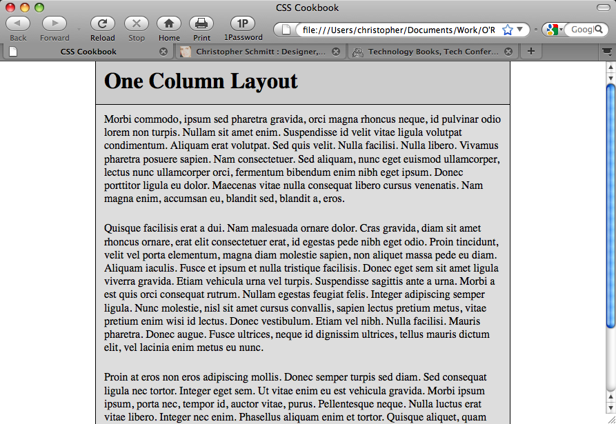
You want to build a layout that consists of one main column, as shown in Figure 11-1.
Solution
Apply a percentage value to the left and right margins of the web document’s body element:
body {
 margin-left: 15%;
 margin-right: 15%;
}
Discussion
When you apply a percentage value to the left and right margins of the body, the column width becomes flexible. This allows the content to stretch to the width of the user’s browser. ...
Get CSS Cookbook, 3rd Edition now with the O’Reilly learning platform.
O’Reilly members experience books, live events, courses curated by job role, and more from O’Reilly and nearly 200 top publishers.

