236 Digital Lighting and Rendering
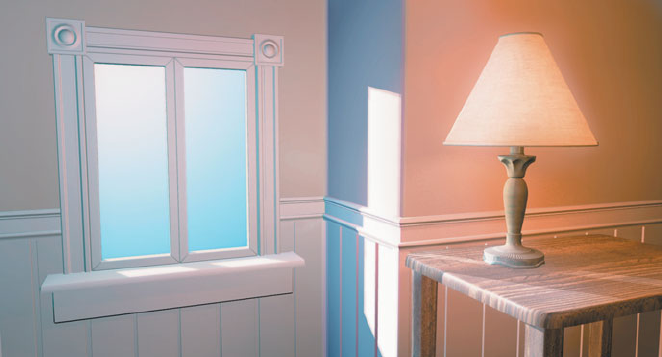
Perhaps the only constant rule that you can determine from studying color
temperatures is that a source listed as having a lower color temperature
should always appear more red than a source with a higher color tempera-
ture. For example, in Figure 8.19, the light coming in from the window
appears to be more blue in color than the light from the lamp. In a real pho-
tograph, how much more red the lamp light appears than the daylight would
vary according to the settings on the camera, the type of bulb, and other
factors, but the fact that an interior bulb appears more red than daylight is a
constant factor.
[Figure 8.19]
In a mixed lighting situation,
daylight naturally appears
to be more blue than inte-
rior lamps.
Some 3D graphics programs include menus of color temperature settings for
lights, but not a setting for the color balance of the camera. They may have
chosen to always simulate 5500K outdoor fi lm or some other color balance,
but be cautious when using these presets, as they might not be based on the
color balance most appropriate to your scene. Using a color from one of the
tables above, or picking a color from your background plate, could give you
a more appropriate color for your lights.
Picking Colors from Pictures
Color temperatures may be your only resource if you are starting from
scratch in lighting an all-CG scene. However, if you have an image avail-
able to you as a starting point, you should take advantage of it.
Get Digital Lighting & Rendering, Second Edition now with the O’Reilly learning platform.
O’Reilly members experience books, live events, courses curated by job role, and more from O’Reilly and nearly 200 top publishers.

