June 2025
Beginner to intermediate
912 pages
30h 4m
English
Chapter 18. Grid Layout
In this chapter
How CSS Grid Layout works
Working with implicit grids
Placing items in the grid
Implicit grid features
Grid item alignment
We humans (well, a lot of us anyway) like to line things up in rows and columns, so it’s surprising that it took the W3C and browsers over a quarter of a century to provide a reliable way to lay out elements and pages in a grid. Sure, we managed fancy layouts with tables and floats, but those were essentially hacks. The CSS Grid Layout Module provides a true system for laying out elements in rows and columns (remember that Flexbox lays out elements on one axis only). Grids can remain completely flexible to fit a variety of screen sizes, or they can be rigid, to mimic a printed page layout. You can use them for page components that organize a number of individual items (like a photo gallery) or for creating sophisticated, whole-page layouts such as those designed by Jen Simmons in her Lab demos (Figure 18-1).
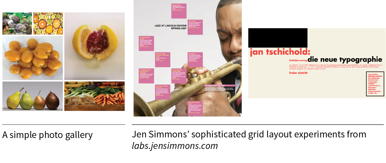
CSS Grid Layout Module Level 2 (w3.org/TR/css-grid-2/) is one of the more complex modules in CSS, so we have a lot of ground to cover in this chapter. Here’s the plan:
Read now
Unlock full access


 O’Reilly covers everything we've got, with content to help us build a world-class technology community, upgrade the capabilities and competencies of our teams, and improve overall team performance as well as their engagement.I wanted to learn C and C++, but it didn't click for me until I picked up an O'Reilly book. When I went on the O’Reilly platform, I was astonished to find all the books there, plus live events and sandboxes so you could play around with the technology.I’ve been on the O’Reilly platform for more than eight years. I use a couple of learning platforms, but I'm on O'Reilly more than anybody else. When you're there, you start learning. I'm never disappointed.I'm always learning. So when I got on to O'Reilly, I was like a kid in a candy store. There are playlists. There are answers. There's on-demand training. It's worth its weight in gold, in terms of what it allows me to do.