June 2025
Beginner to intermediate
912 pages
30h 4m
English
Chapter 19. Responsive Web Design
In this chapter
What RWD is and why it’s important
Fluid layouts
Media queries
Container queries
Design strategies and patterns
Testing options
I first introduced you to the concept of responsive web design way back in Chapter 3, Some Big Concepts You Need to Know, and I’ve been addressing ways to keep all screen sizes in mind throughout this book. In this chapter, I’ll go into more detail on responsive strategies and techniques.
Just to recap, responsive web design (RWD) is a design and production approach that allows a website to be comfortably viewed and used on all manner of devices. The core principle is that all devices get the same HTML source, located at the same URL, but different styles are applied based on the viewport size and other viewing environment factors to rearrange components and optimize usability. Figure 19-1 shows examples of responsive sites as they might appear on a smartphone, tablet, and desktop, but it is important to keep in mind that these sites are designed to work well on the continuum of every screen width in between.
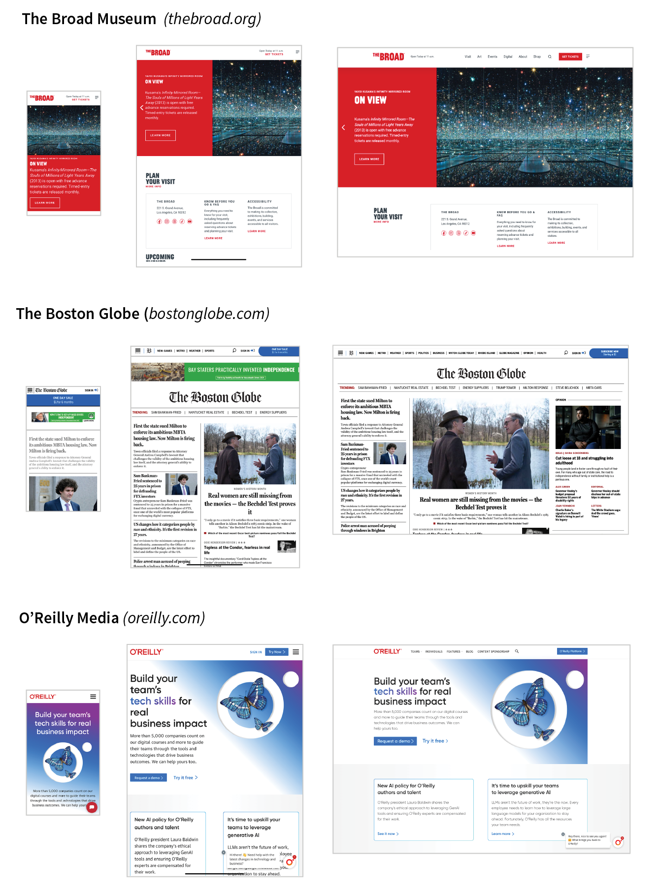
Each site inFigure 19-11has one morphing design, not three distinct layouts. Some sites do have separate static layouts aimed at specific ...
Read now
Unlock full access


 O’Reilly covers everything we've got, with content to help us build a world-class technology community, upgrade the capabilities and competencies of our teams, and improve overall team performance as well as their engagement.I wanted to learn C and C++, but it didn't click for me until I picked up an O'Reilly book. When I went on the O’Reilly platform, I was astonished to find all the books there, plus live events and sandboxes so you could play around with the technology.I’ve been on the O’Reilly platform for more than eight years. I use a couple of learning platforms, but I'm on O'Reilly more than anybody else. When you're there, you start learning. I'm never disappointed.I'm always learning. So when I got on to O'Reilly, I was like a kid in a candy store. There are playlists. There are answers. There's on-demand training. It's worth its weight in gold, in terms of what it allows me to do.