August 2017
Beginner to intermediate
220 pages
4h 50m
English
Master/Detail UIs are found frequently on mobile devices, as they maximize the use of space very nicely by displaying a list and each of its items separately or side by side depending on the current width of the screen. This results in phone in a portrait orientation displaying two single panes; however, but in landscape mode or on a larger device, such as a tablet, two panes will be displayed side by side:
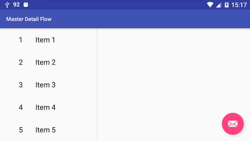
The preceding screenshot is taken from the unmodified Master/Detail Flow project template viewed on a device in landscape mode so that both panes are displayed. We said previously that the ...
Read now
Unlock full access


 O’Reilly covers everything we've got, with content to help us build a world-class technology community, upgrade the capabilities and competencies of our teams, and improve overall team performance as well as their engagement.I wanted to learn C and C++, but it didn't click for me until I picked up an O'Reilly book. When I went on the O’Reilly platform, I was astonished to find all the books there, plus live events and sandboxes so you could play around with the technology.I’ve been on the O’Reilly platform for more than eight years. I use a couple of learning platforms, but I'm on O'Reilly more than anybody else. When you're there, you start learning. I'm never disappointed.I'm always learning. So when I got on to O'Reilly, I was like a kid in a candy store. There are playlists. There are answers. There's on-demand training. It's worth its weight in gold, in terms of what it allows me to do.