Chapter 8. FINESSING YOUR TYPE
Some designs call for a particular typographic style or treatment to make a point effectively and to drive that point home. This can be something as seemingly subtle as selecting the right style of numeral to improve the aesthetics and increase readability or as powerful and dramatic as using a highly designed initial letter treatment to pull it all together. No matter what typographic elements you incorporate into your design, the key to their success is in the details.
Here are some guidelines for finessing some of the often overlooked typographic details that can make all the difference in a well-designed and well-executed piece.
FIGURES
Figures, or numerals as they are often referred to, are a very common element in design. They are used to indicate quantities, prices, dates and years, measurments, and a lot more. Figures come in several flavors, all of which are more commonly available in OpenType fonts.
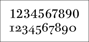
There are two styles of figures: lining, also called aligning, ranging, or cap figures; and oldstyle, also called lowercase figures. Lining figures are all the same height and align (thus the name, aligning) on the baseline and cap height. Oldstyle figures are a style of numeral that approximates lowercase letterforms by having an x-height as well as fixed-arrangement ascenders and descenders.

Lining (or aligning) figures imitate caps in that they all ...
Get Type Rules!: The Designer's Guide to Professional Typography, Third Edition now with the O’Reilly learning platform.
O’Reilly members experience books, live events, courses curated by job role, and more from O’Reilly and nearly 200 top publishers.

