August 2024
Beginner to intermediate
416 pages
9h 31m
English
A great visual metaphor for representing structure is the pie chart. We divide it into slices and examine who got the largest piece, or, for example, how market players split half of the market between them. The emphasis is not on quantitative comparison (bigger or smaller), as with bar charts, but on the part of the whole (percentages).
A donut chart serves the same purpose as a pie chart, built with the same parameters, with the only difference being the hole (or properly termed, the “donut hole”) in the center (Figure 4-1, right). In this chapter, we will provide you with a guide for a pie chart, but you can configure a donut chart in the same way.
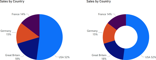
What purpose does the hole serve? Nothing special. We can put the total value there, but there is no such standard option. We can get this result combining two visuals: donut chart and card with total value (Figure 4-2). But let’s not complicate things for now and instead understand the basic setting.

We remind you that the practice dataset is utilized for all the chapters in this part, allowing you to build the final dashboard. You can continue practicing with your file from the previous chapter. ...
Read now
Unlock full access


 O’Reilly covers everything we've got, with content to help us build a world-class technology community, upgrade the capabilities and competencies of our teams, and improve overall team performance as well as their engagement.I wanted to learn C and C++, but it didn't click for me until I picked up an O'Reilly book. When I went on the O’Reilly platform, I was astonished to find all the books there, plus live events and sandboxes so you could play around with the technology.I’ve been on the O’Reilly platform for more than eight years. I use a couple of learning platforms, but I'm on O'Reilly more than anybody else. When you're there, you start learning. I'm never disappointed.I'm always learning. So when I got on to O'Reilly, I was like a kid in a candy store. There are playlists. There are answers. There's on-demand training. It's worth its weight in gold, in terms of what it allows me to do.