August 2024
Beginner to intermediate
416 pages
9h 31m
English
While dashboards are often associated only with colorful charts and graphs, it’s important not to forget about tables—a highly effective tool for presenting data. When you have dozens of categories and multiple indicators with varying ranges, tables come to the rescue.
Technically, we are talking about two elements in Power BI—tables and matrices. They are externally similar and sometimes may look the same, but they differ in the settings of the data fields.
And if we skillfully work out all the details, it won’t just look like a table; it will resemble a combo visual! In Figure 7-1, you can see sales by managers for various metrics (quantity, average price, and actual sales).
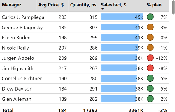
Note that in the Sales Fact column header, there is a downward arrow. This indicates that the rows are sorted in descending order based on this field. Users can choose their sorting field in the table, but we recommend defaulting to sorting not by the alphabetical order of categories but by the ranking of one of the metrics.
If you’ve used pivot tables in Microsoft Excel, you’re familiar with a hierarchical way of presenting data. It’s like when you click on the plus sign in rows to see more details. In Power BI, this is a separate visual called a matrix, but it operates similarly to a table.
The matrix enables a more compact ...
Read now
Unlock full access


 O’Reilly covers everything we've got, with content to help us build a world-class technology community, upgrade the capabilities and competencies of our teams, and improve overall team performance as well as their engagement.I wanted to learn C and C++, but it didn't click for me until I picked up an O'Reilly book. When I went on the O’Reilly platform, I was astonished to find all the books there, plus live events and sandboxes so you could play around with the technology.I’ve been on the O’Reilly platform for more than eight years. I use a couple of learning platforms, but I'm on O'Reilly more than anybody else. When you're there, you start learning. I'm never disappointed.I'm always learning. So when I got on to O'Reilly, I was like a kid in a candy store. There are playlists. There are answers. There's on-demand training. It's worth its weight in gold, in terms of what it allows me to do.