Appendix A. Leftovers: The Top Ten Things (we didn’t cover)

Even after all that, there’s still a bit more.
There are just a few more things we think you need to know. We wouldn’t feel right about ignoring them, even though they only need a brief mention, and we really wanted to give you a book you’d be able to lift without extensive training at the local gym. So before you put the book down, take a read through these tidbits.
#1. Other ways of presenting data
We showed you a number of charts in the first chapter, but here are a couple more that might come in useful.
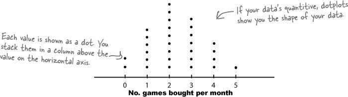
Dotplots
A dotplot shows your data on a chart by representing each value as a dot. You put each dot in a stacked column above the corresponding value on the horizontal axis like this:
Stemplots
A stemplot is used for quantitive data, usually when your data set is fairly small. Stemplots show each exact value in your data set in such a way that you can easily see the shape of your data. Here’s an example:
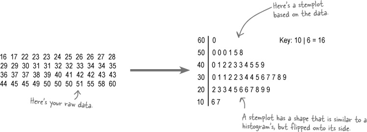
The entries on the left are called stems, and the entries on the right are called leaves. In this stemplot, the stem shows tens, and the leaves show units. To find each value in the raw data, you take each leaf and add it to its stem. ...
Get Head First Statistics now with the O’Reilly learning platform.
O’Reilly members experience books, live events, courses curated by job role, and more from O’Reilly and nearly 200 top publishers.

