Dialog boxes are interesting solutions for presenting information on an HTML page. You can use dialog boxes, for example, to pose a question to the user. HTML dialog boxes have the traditional behavior of other application dialog boxes—you can move, resize, and of course, close them.
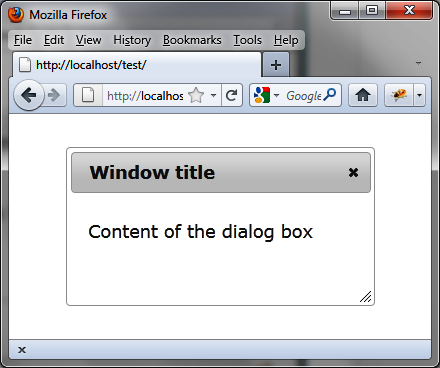
Suppose we want to write the HTML code to display the dialog box shown in Figure 4-1.
This dialog box includes text content and a title bar that contains a close button. Users can move the box on the page and resize it. jQuery UI requires us to use the following conventions:
A global
<div>block surrounds the whole with a title attribute that specifies the window title.The
<div>content includes the content of the window.
<!DOCTYPE html>
<script src = jquery.js></script>
<script src = jqueryui/js/jquery-ui-1.8.16.custom.min.js></script>

<link rel=stylesheet type=text/css
      href=jqueryui/css/smoothness/jquery-ui-1.8.16.custom.css />

<div id="dialog" title="Window title">
  <p> Content of the dialog box </p>
</div>

<script>

$("#dialog").dialog();

</script>
The dialog () method transforms
the HTML code written on the page into HTML code to display a dialog
box.
Notice the <! DOCTYPE html>
header in HTML. If this statement is not present, window management is
done poorly in Internet Explorer.
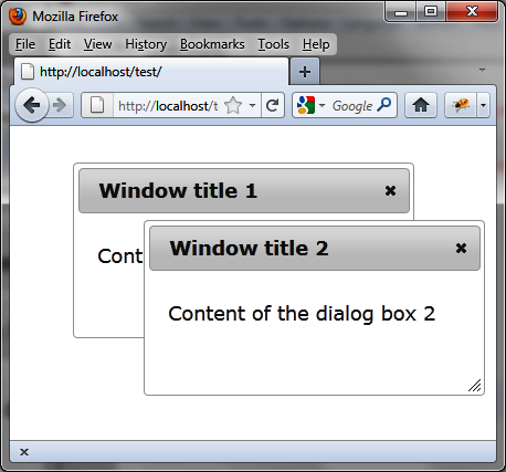
To display multiple dialog boxes simultaneously, as shown in Figure 4-2, we include the following (shown in bold):
<!DOCTYPE html>
<script src = jquery.js></script>
<script src = jqueryui/js/jquery-ui-1.8.16.custom.min.js></script>

<link rel=stylesheet type=text/css
      href=jqueryui/css/smoothness/jquery-ui-1.8.16.custom.css />

<div id="dialog1" title="Window title 1">
  <p> Content of the dialog box 1</p>
</div>

<div id="dialog2" title="Window title 2">
  <p> Content of the dialog box 2</p>
</div>

<script>

$("#dialog1, #dialog2").dialog();

</script>The dialog () method uses each
element of the list corresponding to the selector (in this case, the two
<div> elements) and displays the
corresponding dialog boxes. They are stacked at first, and users can move
and position them simply by clicking or dragging them.
Using the dialog () method
drastically changes the appearance of HTML elements on the rendered page.
Indeed, this method scans the HTML and adds new CSS classes to the
elements concerned (here, the dialog boxes) to give them the appropriate
style.
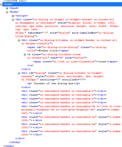
Here, for example, the HTML code that appears after the dialog () instruction has been changed (Figure 4-3). This code was
retrieved using the Firebug extension in Firefox.
These CSS classes can customize the display of elements. For
example, if we change the ui-dialog-titlebar CSS class associated with
<div> elements, we get a new
aspect for the window title. Similarly, if we change the ui-dialog-content CSS class associated with
<div> elements, we get a new
appearance for the content of the windows.
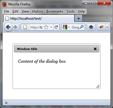
Modify these elements (shown in bold) in the HTML by adding a
<style> tag to obtain the layout
shown in Figure 4-4:
<!DOCTYPE html>
<script src = jquery.js></script>
<script src = jqueryui/js/jquery-ui-1.8.16.custom.min.js></script>

<link rel=stylesheet type=text/css
      href=jqueryui/css/smoothness/jquery-ui-1.8.16.custom.css />

<style type=text/css>
  div.ui-dialog-titlebar {
    font-size : 10px;
  }
  div.ui-dialog-content {
    font-size : 15px;
    font-family : georgia;
    font-style : italic;
  }
</style>

<div id="dialog" title="Window title">
  <p> Content of the dialog box</p>
</div>

<script>

$("#dialog").dialog();

</script>This HTML code is identical to the previous, except that we added
the <style> tag after the
inclusion of the jQuery UI styles. The addition of our own styles must be
done after those of jQuery UI, otherwise our changes will be
ignored.
The dialog () method can be used
in two forms:
$(selector, context).dialog
        (options)
$(selector, context).dialog ("action", params)
The dialog (options) method
declares that an HTML element (and its contents) should be administered
in the form of a dialog box. The options parameter is an object that specifies
the appearance and behavior of that window. The available options manage
the appearance, position, and size of the window, as well as the
behavior of visual effects.
Table 4-1 describes the option for managing the appearance of the dialog box.
Table 4-1. Options for managing dialog box appearance
Options | Function |
|---|---|
| Give a title to the window. |
| Add buttons in the dialog box. These are listed as objects, and each property is the text on the button. The value is a callback function called when the user clicks the button. |
Table 4-2 describes the options for managing the position of the dialog box.
Table 4-2. Options for managing dialog box position in the page
Options | Function |
|---|---|
| The position of the window is specified as coordinates [left, top] or a string such as:
By default, the window is centered in
the width and height ( |
Table 4-3 describes the options for managing the size of the dialog box.
Table 4-3. Options for managing dialog box size
Options | Function |
|---|---|
| The initial height (in
pixels) of the dialog box. The default value is |
| The initial width (in pixels) of the dialog box. The default is 300. |
| Maximum height (in pixels) to which the dialog box can be resized. |
| Maximum width (in pixels) to which the dialog box can be resized. |
| Minimum height (in pixels) to which the dialog box can be resized. The default value is 150. |
| Minimum height (in pixels) to which the dialog box can be resized. The default value is 150. |
It is also possible, thanks to jQuery UI, to specify an effect
for the appearance and disappearance of the dialog box with the
options.show and options.hide options (described in Table 4-4).
Table 4-4. Options for managing visual effects
Options | Function |
|---|---|
| Visual effect to occur
at the appearance of the dialog box (the effects are listed in
Table 4-5). When set to
|
| Visual effect to occur
at the disappearance of the dialog box (listed in the table
below). When set to |
Table 4-5. Effects provided by jQuery UI
Effect name | Function |
|---|---|
| The element appears or disappears from the top. |
| The element appears or disappears fitfully, in a vertical movement. |
| The element appears or disappears vertically from the center. |
| The element appears or disappears from the left, with a change of opacity. |
| The element appears or disappears from the top left corner. |
| The element appears or disappears with variations of opacity and background color. |
| The element is scaled from its center. It appears by “shrinking” and disappears by “growing.” |
| The element appears or disappears by flashing. |
| The element is scaled from its center. It disappears by shrinking and appears by growing. |
| The element appears or disappears from its right side. |
Table 4-6 describes the options for managing the behavior of the dialog box when it is opened, moved, stacked, and resized.
Table 4-6. Options for managing dialog box behavior
Options | Function |
|---|---|
| If If |
| If |
| If |
| If The default value is |
| If If |
Dialog box event methods (described in Table 4-7) allow you to
perform treatments at different stages of the dialog box. They
correspond to callback functions called at these different stages. The
value in the callback function is the <div> element associated with the
contents of the dialog box.
Table 4-7. Options for managing dialog box events
Options | Function |
|---|---|
| The |
| The |
| The |
| The |
| The |
| The |
| The |
| The |
| The |
| The |
The dialog ("action", params)
method can perform an action on the dialog box, such as opening or
closing it. The action is specified as a string in the first "action" argument (e.g., "open" to open a window).
Table 4-8 describes the actions you can perform using this method.
Table 4-8. The dialog (“action”, params) method actions
Method | Function |
|---|---|
| Open the dialog box. |
| Close the dialog box. It
is then hidden and may be reopened by |
| Remove dialog box management. Dialog boxes are reverted to simple HTML without CSS class or event management, and are hidden in the page. |
| Make the dialog box appear disabled, without actually disabling it. The dialog box elements (title bar, content, borders) remain available. |
| Restore the normal appearance to the elements of the dialog box. |
| Returns |
| Position the corresponding dialog boxes to the foreground (on top of the others). |
| Get the value of the
specified |
| Changes the value of the
|
In addition to event methods in the options of the dialog (options) method, it is possible to
manage these events using the bind ()
method.
These events allow you to perform treatments using the callback method provided by the bind (eventName, callback). Table 4-9 describes the
options for managing dialog boxes with bind
().
Table 4-9. jQuery UI events for managing dialog boxes with bind()
Event | Function |
|---|---|
| Same meaning as |
| Same meaning as |
| Same meaning as |
| Same meaning as |
| Same meaning as |
| Same meaning as |
| Same meaning as |
| Same meaning as |
| Same meaning as |
| Same meaning as |
Let’s put some dialog boxes in our script and manage them using the information in this chapter.
Here, we’ll use the dialog
("open") and dialog
("close") methods (shown in bold) to add two Open and Close buttons to the page for opening and
closing the dialog box:
<!DOCTYPE html>
<script src = jquery.js></script>
<script src = jqueryui/js/jquery-ui-1.8.16.custom.min.js></script>

<link rel=stylesheet type=text/css
      href=jqueryui/css/smoothness/jquery-ui-1.8.16.custom.css />

<div id="dialog" title="Window title">
  <p> Content of the dialog box</p>
</div>

<input id=open type=button value=Open>
<input id=close type=button value=Close>

<script>

$("div#dialog").dialog ({
  autoOpen : false
});

$("#open").click (function (event)    // Open button Treatment
{
  if ($("#dialog").dialog ("isOpen")) alert ("Already open !");
  else $("#dialog").dialog ("open");
});

$("#close").click (function (event)   // Close button Treatment
{
  if (!$("#dialog").dialog ("isOpen")) alert ("Already closed !");
  else $("#dialog").dialog ("close");
});

</script>
Initially, the dialog box is created but is not open (options.autoOpen set to false). Before opening the dialog box, we test
whether it is already open with dialog
("isOpen"). We do the same for closing it.
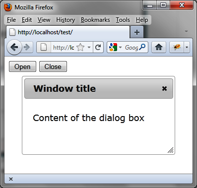
Figure 4-5 shows the window after it is opened.
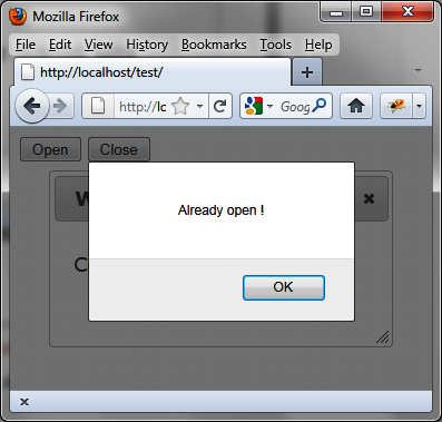
If you try to open the dialog box a second time, you will receive an alert message that says, “Already open!” (Figure 4-6).
By default, no effect is used when opening or closing a dialog
box. We can apply an effect using the show and hide options (shown in bold). In this example,
the dialog box will appear by sliding from the left side of the page
(slide effect) and will disappear by
enlarging and reducing its opacity (puff effect):
<!DOCTYPE html>
<script src = jquery.js></script>
<script src = jqueryui/js/jquery-ui-1.8.16.custom.min.js></script>

<link rel=stylesheet type=text/css
      href=jqueryui/css/smoothness/jquery-ui-1.8.16.custom.css />

<div id="dialog" title="Window title">
  <p> Content of the dialog box</p>
</div>

<script>

$("div#dialog").dialog ({
  show : "slide",
  hide : "puff"
});

</script>It is possible to verify the closure of a dialog box with the
options.beforeclose option. This
option corresponds to a method that is activated when the dialog box
closes. If the method returns false,
the dialog box does not close.
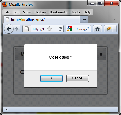
In this example, a confirmation message appears when the user tries to close the dialog box (Figure 4-7). The dialog box will be closed when the user clicks the OK button:
<!DOCTYPE html>
<script src = jquery.js></script>
<script src = jqueryui/js/jquery-ui-1.8.16.custom.min.js></script>

<link rel=stylesheet type=text/css
      href=jqueryui/css/smoothness/jquery-ui-1.8.16.custom.css />

<div id="dialog" title="Window title">
  <p> Content of the dialog box</p>
</div>

<script>

$("div#dialog").dialog ({
  beforeclose : function (event)
  {
    if (!confirm ("Close dialog ?")) return false;
  }
});

</script>Another way to prevent the closure of the dialog box is to remove the close button. This case is treated in the next section.
We can prevent the closure of the dialog box by removing (hiding) the close button.
The close button is associated with an <a> link with the ui-dialog-titlebar-close CSS class. This link
can be easily identified in the HTML generated by the call for dialog (options) (e.g., with Firebug). It is
located in the sibling element before the contents of the dialog box
(shown in bold):
<!DOCTYPE html>
<script src = jquery.js></script>
<script src = jqueryui/js/jquery-ui-1.8.16.custom.min.js></script>

<link rel=stylesheet type=text/css
      href=jqueryui/css/smoothness/jquery-ui-1.8.16.custom.css />

<div id="dialog" title="Window title">
  <p> Content of the dialog box</p>
</div>

<script>

$("div#dialog").dialog ().prev ().find (".ui-dialog-titlebar-close").hide ();

</script>
This statement includes the following:
We call
dialog ()to convert the HTML dialog box.We get the previous sibling of content with
prev ().In this relationship, we look for the element with the
ui-dialog-titlebar-closeCSS class.We hide this element using
hide
          ()
.
This must be done in the listed order. If, for example, we do not
call dialog () first, the prev () instruction will not find the link in
the previous element, because the HTML has not been turned into a dialog
box!
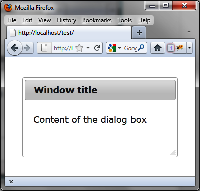
As shown in Figure 4-8, the close button is not visible.
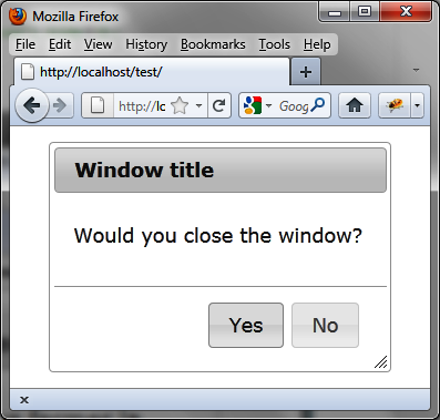
We now want to insert buttons in the dialog box, such as Yes and
No buttons in a window asking, “Would you like to close the window?”
(see Figure 4-9). We
can use options.buttons (shown in
bold) for this.
Users can close the window only by clicking the Yes button—the standard close button has been removed:
<!DOCTYPE html>
<script src = jquery.js></script>
<script src = jqueryui/js/jquery-ui-1.8.16.custom.min.js></script>

<link rel=stylesheet type=text/css
      href=jqueryui/css/smoothness/jquery-ui-1.8.16.custom.css />

<div id="dialog" title="Window title">
  <p> Would you like to close the dialog box?</p>
</div>

<script>

$("div#dialog").dialog ({
  buttons : {
    "Yes" : function ()
    {
      $("div#dialog").dialog ("close");
    },
    "No" : function ()
    {
    }
  }
}).prev().find(".ui-dialog-titlebar-close").hide ();

</script>Now let’s insert content retrieved dynamically from the server
into the dialog box before opening. This is done using the options.open option (shown in bold). This
method is called before the dialog box is displayed:
<!DOCTYPE html>
<script src = jquery.js></script>
<script src = jqueryui/js/jquery-ui-1.8.16.custom.min.js></script>

<link rel=stylesheet type=text/css
      href=jqueryui/css/smoothness/jquery-ui-1.8.16.custom.css />

<div id="dialog" title="Window title">
  <p> Content of the dialog box</p>
</div>

<script>

$("div#dialog").dialog ({
  open : function (event)
  {
    $(this).load ("action.php");
  }
});

</script>
Recall that in the event methods (defined here by options.open), the this value represents the HTML element
corresponding to the contents of the dialog box. $(this) is a jQuery class object associated
with this element of the DOM. The action.php file is as follows:
<?
  $txt = "<span> Response sent by the server </span>";
  $txt = utf8_encode($txt);
  echo ($txt);
?>
The URL of the page displayed in the browser must begin with http://, otherwise the Ajax call cannot be performed.
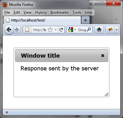
The content of the dialog box is retrieved by Ajax and the window is displayed with its new content (Figure 4-10).
We have seen that the options used when creating the dialog box
can be modified by the dialog ("option", param,
value) method. The param
parameter is the name of the option, while the value corresponds to its new value.
To illustrate this, let’s change the effect for the opening and
closing of the window. We’ll display two lists for which we can select
the desired effect ("puff", "slide", etc.). When creating the dialog box,
no effect is associated with it:
<!DOCTYPE html>
<script src = jquery.js></script>
<script src = jqueryui/js/jquery-ui-1.8.16.custom.min.js></script>

<link rel=stylesheet type=text/css
      href=jqueryui/css/smoothness/jquery-ui-1.8.16.custom.css />

<div id="dialog" title="Window title">
  <p> Content of the dialog box</p>
</div>

Open effect
<select id=effectopen>
  <option>No effect</option>
  <option>blind</option>
  <option>bounce</option>
  <option>clip</option>
  <option>drop</option>
  <option>fold</option>
  <option>highlight</option>
  <option>puff</option>
  <option>pulsate</option>
  <option>scale</option>
  <option>slide</option>
</select>

<br />

Close effect
<select id=effectclose>
  <option>No effect</option>
  <option>blind</option>
  <option>bounce</option>
  <option>clip</option>
  <option>drop</option>
  <option>fold</option>
  <option>highlight</option>
  <option>puff</option>
  <option>pulsate</option>
  <option>scale</option>
  <option>slide</option>
</select>

<br />

<input id=open type=button value=Open>

<script>

$("div#dialog").dialog ({
  autoOpen : false
});

$("#effectopen").change (function (event)
{
  var effect = $(this).val ();
  if (effect == "No effect") effect = false;
  $("div#dialog").dialog ("option", "show", effect);
});

$("#effectclose").change (function (event)
{
  var effect = $(this).val ();
  if (effect == "No effect") effect = false;
  $("div#dialog").dialog ("option", "hide", effect);
});

$("#open").click (function (event)
{
  $("#dialog").dialog ("open");
});

</script>
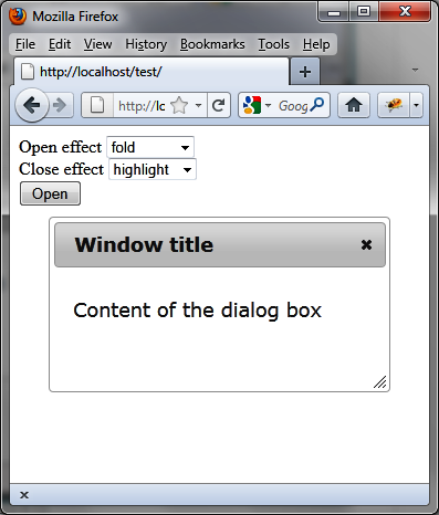
Figure 4-11 shows the result with the fold and highlight effects selected.
Get jQuery UI now with the O’Reilly learning platform.
O’Reilly members experience books, live events, courses curated by job role, and more from O’Reilly and nearly 200 top publishers.
