Chapter 6. Summarized Data Distributions
This chapter explores how to visualize summarized distributions of data.
6.1 Making a Basic Histogram
Problem
You want to make a histogram.
Solution
Use geom_histogram() and map a continuous variable to x (Figure 6-1):
ggplot(faithful,aes(x=waiting))+geom_histogram()
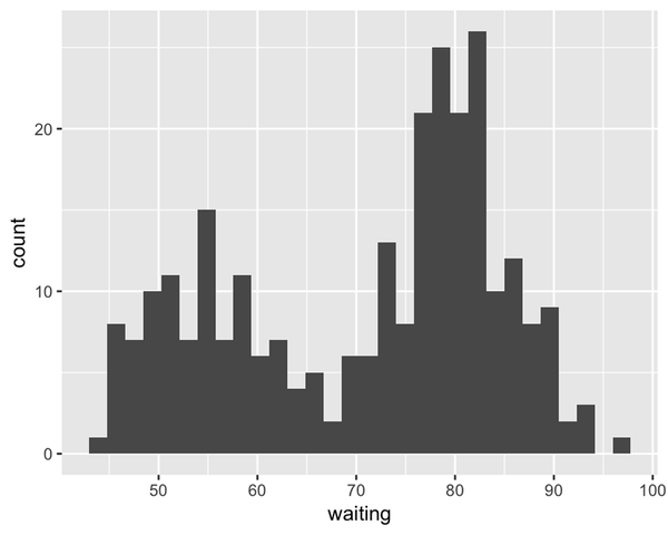
Figure 6-1. A basic histogram
Discussion
All geom_histogram() requires is one column from a data frame or a
single vector of data. For this example we’ll use the faithful data
set, which contains two columns with data about the Old Faithful geyser:
eruptions, which is the length of each eruption, and waiting, which
is the length of time to the next eruption. We’ll only use the waiting
variable in this example:
faithful#> eruptions waiting#> 1 3.600 79#> 2 1.800 54#> 3 3.333 74#> ...<266 more rows>...#> 270 4.417 90#> 271 1.817 46#> 272 4.467 74
If you just want to get a quick look at some data that isn’t in a data
frame, you can get the same result by passing in NULL for the data
frame and giving ggplot() a vector of values. This would have the same
result as the previous code:
# Store the values in a simple vectorw<-faithful$waitingggplot(NULL,aes(x=w))+geom_histogram()
By default, the data is grouped into 30 bins. This number of bins is an arbitrary default value, and may be too fine or too coarse for your data. You can change the size of the ...
Get R Graphics Cookbook, 2nd Edition now with the O’Reilly learning platform.
O’Reilly members experience books, live events, courses curated by job role, and more from O’Reilly and nearly 200 top publishers.

