Chapter 9. Controlling the Overall Appearance of Graphs
In this chapter I’ll discuss how to control the overall appearance of graphics made by ggplot2. The grammar of graphics that underlies ggplot2 is concerned with how data is processed and displayed—it’s not concerned with things like fonts, background colors, and so on. When it comes to presenting your data, there’s a good chance that you’ll want to tune the appearance of these things. ggplot2’s theming system provides control over the appearance of nondata elements. I touched on the theme system in the previous chapter, and here I’ll explain a bit more about how it works.
9.1 Setting the Title of a Graph
Problem
You want to add a title to your plot.
Solution
Use ggtitle() to add a title, as shown in Figure 9-1:
library(gcookbook)# Load gcookbook for the heightweight data sethw_plot<-ggplot(heightweight,aes(x=ageYear,y=heightIn))+geom_point()hw_plot+ggtitle("Age and Height of Schoolchildren")# Use \n for a newlinehw_plot+ggtitle("Age and Height\nof Schoolchildren")
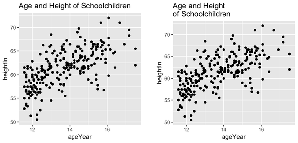
Figure 9-1. Scatter plot with a title added (left); With a \n for a newline (right)
Discussion
ggtitle() is equivalent to using labs(title = "Title text").
You can add a subtitle by providing a string as the second argument of
ggtitle(). By default it will display with slightly smaller text than
the main title (Figure 9-2):
hw_plot+
Get R Graphics Cookbook, 2nd Edition now with the O’Reilly learning platform.
O’Reilly members experience books, live events, courses curated by job role, and more from O’Reilly and nearly 200 top publishers.

