Chapter 11. Facets
One of the most useful techniques in data visualization is rendering
groups of data alongside each other, making it easy to compare the
groups. With ggplot2, one way to do this is by mapping a discrete
variable to an aesthetic, like x position, colour, or shape. Another way of doing this is to create a subplot for each group and draw
the subplots side by side.
These kinds of plots are known as Trellis displays. They’re implemented in the lattice package as well as in the ggplot2 package. In ggplot2, they’re called facets. In this chapter I’ll explain how to use them.
11.1 Splitting Data into Subplots with Facets
Problem
You want to plot subsets of your data in separate panels.
Solution
Use facet_grid() or facet_wrap(), and specify the variables on which
to split.
With facet_grid(), you can specify a variable to split the data into
vertical subpanels, and another variable to split it into horizontal
subpanels (Figure 11-1):
# Create the base plotmpg_plot<-ggplot(mpg,aes(x=displ,y=hwy))+geom_point()# Faceted by drv, in vertically arranged subpanelsmpg_plot+facet_grid(drv~.)# Faceted by cyl, in horizontally arranged subpanelsmpg_plot+facet_grid(.~cyl)# Split by drv (vertical) and cyl (horizontal)mpg_plot+facet_grid(drv~cyl)
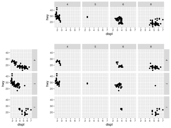
Figure 11-1. Faceting horizontally by cyl (top); faceting vertically by dev (left); faceting in both directions, ...
Get R Graphics Cookbook, 2nd Edition now with the O’Reilly learning platform.
O’Reilly members experience books, live events, courses curated by job role, and more from O’Reilly and nearly 200 top publishers.

