The Presidential Term Cycle
How changes in yield curve spread impact the growth versus value trade-off is easy to see with data and makes sense. No advanced degree in finance or statistics required—just publicly available data and an Excel spreadsheet, or even some graph paper. As we learned in Chapter 1, if you need fancy engineered equations, your hypothesis is probably wrong.
But what if you discover a pattern that is tough to prove with data though it makes tremendous sense? And what if the pattern is fairly predictable? Here’s an example. Table 2.1 shows presidents going back to 1925 and the subsequent annual returns on the S&P 500 (which go back to 1926). By splitting the first two years of the presidential term from the last two years, you can see, for the most part, the last two years of the presidential cycle tend to be positive.
Table 2.1 Presidential Term Anomaly
Sources: Global Financial Data, Inc., S&P 500 Total Return Index from 12/31/1925 to 12/31/2011.
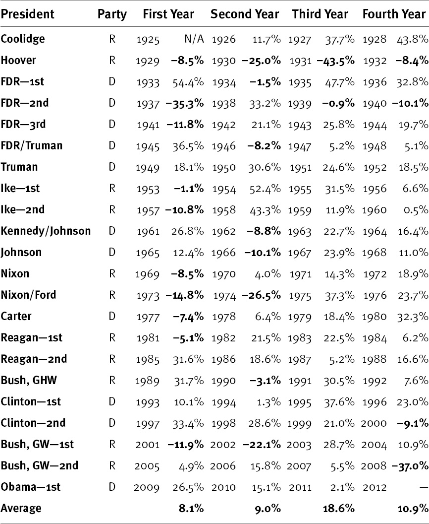
Take a pencil and draw a line through 1929 to 1932. You will remember these years as the beginning of the Great Depression, a period unlikely to be repeated anytime soon due to extensive banking and market reform and much knowledge we didn’t have back then about how economies and central banking work. Otherwise, you get only four other negative years in the back halves of presidents’ terms. Negative a scant 0.4%, 1939 ...
Get The Only Three Questions That Still Count: Investing By Knowing What Others Don't, 2nd Edition now with the O’Reilly learning platform.
O’Reilly members experience books, live events, courses curated by job role, and more from O’Reilly and nearly 200 top publishers.

