December 2022
Beginner to intermediate
588 pages
13h 43m
English
Another commonly used plot type is the simple scatter plot, a close cousin of the line plot. Instead of points being joined by line segments, here the points are represented individually with a dot, circle, or other shape. We’ll start by setting up the notebook for plotting and importing the packages we will use:
In[1]:%matplotlibinlineimportmatplotlib.pyplotaspltplt.style.use('seaborn-whitegrid')importnumpyasnp
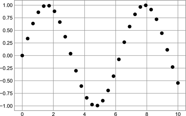
In the previous chapter we looked at using plt.plot/ax.plot to
produce line plots. It turns out that this same function can produce
scatter plots as well (see Figure 27-1).
In[2]:x=np.linspace(0,10,30)y=np.sin(x)plt.plot(x,y,'o',color='black');
The third argument in the function call is a character that represents
the type of symbol used for the plotting. Just as you can specify
options such as '-' or
'--' to control the line style, the marker
style has its own set of short string codes. The full list of available
symbols can be seen in the documentation of plt.plot, or in
Matplotlib’s
online
documentation. Most of the possibilities are fairly intuitive, and a
number of the more common ones are demonstrated here (see Figure 27-2).
In[3]:rng=np.random.default_rng(0)formarkerin['o','.',',','x','+','v','^','<','>','s','d']:plt.plot