December 2022
Beginner to intermediate
588 pages
13h 43m
English
While many of the topics covered in previous chapters involve adjusting the style of plot elements one by one, Matplotlib also offers mechanisms to adjust the overall style of a chart all at once. In this chapter we’ll walk through some of Matplotlib’s runtime configuration (rc) options, and take a look at the stylesheets feature, which contains some nice sets of default configurations.
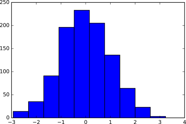
Throughout this part of the book, you’ve seen how it is possible to tweak individual plot settings to end up with something that looks a little nicer than the default. It’s also possible to do these customizations for each individual plot. For example, here is a fairly drab default histogram, shown in Figure 34-1.
In[1]:importmatplotlib.pyplotaspltplt.style.use('classic')importnumpyasnp%matplotlibinline
In[2]:x=np.random.randn(1000)plt.hist(x);
We can adjust this by hand to make it a much more visually pleasing plot, as you can see in Figure 34-2.
In[3]:# use a gray backgroundfig=plt.figure(facecolor='white')ax=plt.axes(facecolor='#E6E6E6')ax.set_axisbelow(True)# draw solid white gridlinesplt.grid(color='w',linestyle='solid')# hide axis spinesforspineinax.spines.values():spine.set_visible(False)# hide top and right ...