Interface Builder is a WYSIWYG tool that lets you lay out user interfaces in a simple, intuitive manner. The interfaces you create are stored in a file called a nib file, which your application can then access to create its windows, menus, and other elements. Interface Builder provides you with:
Palettes to add interface elements
Menus that help you align and lay out the interface
Info windows to set up the behavior of interface elements
You can do so much with Interface Builder that it will take a couple of chapters to explore its features. In this chapter you’ll:
Look at the components of a nib file
Check out what you can do with Info windows
Take a look at the types of windows you can create in Interface Builder
Use Interface Builder to modify a window
Then, you’ll look at palettes and layout tools in Chapter 5 where you’ll add controls to a window. In Chapter 7 you’ll take a close look at the default menu bar provided by Interface Builder.
In the last chapter you saw that when Project Builder creates a Carbon (nib based) application, it provides a file named main.nib and puts it in the Resources group of the project. As you recall, the nib file contains the application’s interface-based resources.
It’s an Interface Builder file (the “ib” in “nib” stands for Interface Builder) that contains descriptions of the interface elements in your application. These descriptions use Extensible Markup Language (XML).
Note
In earlier versions of the Mac OS, developers created resources using either a resource compiler (such as Rez) or a utility program called a resource editor (such as Apple’s ResEdit). The resources contained in a nib file are not the same as those contained in these old-style resources. In other words, you can’t use Interface Builder to create old-style resources.
Example 4.1 shows what’s needed to create a File menu using old-style resources that rely on text-based descriptions. Interface Builder automatically provides the File menu for you and lets you customize this and other menus it provides using WYSIWYG tools. You don’t need to know anything about old-style resources to create a Carbon application; we’ve provided the listing just so you can see how this style of resource compares to Interface Builder.
Example 4-1. Defining a Menu Using Text-Based Resources
resource 'MENU' (kFileMenuID, "File menu")
   {
      kFileMenuID,               // Menu ID
      textMenuProc,              // Menu definition procedure
      0x7FFFFFFF,                // Enable/disable flags for menu items
      enabled,                   // Enable/disable flag for menu
      kMenuTitleFile,            // Menu title
      {
         kItemNameClose, noIcon,            // Close command
            kItemKeyClose, noMark, plain,

         "-", noIcon, noKey, noMark, plain, // Separator

         kItemNameQuit, noIcon,             // Quit command
            kItemKeyQuit, noMark, plain
      }
   };
You can open the main.nib file from Project Builder by double-clicking its icon in the project window. This will launch Interface Builder and open the file.
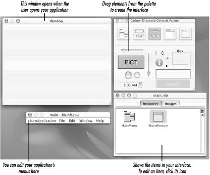
When you open the default main.nib file you get from Project Builder, you should see the four windows shown in Figure 4.1:
Window. This is the window that opens when your application runs.
Carbon Palette. All the controls, menu items, and windows that you can drag into the interface are in the palette. You’ll learn more about them in Chapter 5.
Main Menu. This contains the items that appear in your application’s menu bar. You’ll take a closer look at what’s included automatically in Chapter 7.
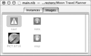
main.nib. There are two panes in the main.nib: Instance and Images. The Instances pane displays icons of the interface objects in your nib file. The Images pane shows image resources available for you to use in the interface.
The default Instances pane contains icons that represent the menu bar and the main window. If you want to edit an item, double-click its icon. In Figure 4.1 the main menu and main window are already open. As you add other windows to your application, their icons appear in the Instances pane.
Any image in the Images pane is available for use in the interface. The Images pane in Figure 4.2 shows three default images: caution, note, and stop. It also contains one image added to the application’s Project Builder project. When you add a PICT resource to Project Builder, Interface Builder is informed automatically by Project Builder and the image appears in the Images pane.
You can use the default images in the appropriate dialogs along with your application’s icon. (You’ll read more about application icons in Chapter 13.) This will help users identify the severity of the message in the dialog and make sure they associate the message with your application.
Info windows are likely to be the Interface Builder tool you’ll use the most. An Info window provides information about an interface object (such as a window or menu) and lets you set attributes and other information that controls how the object behaves and appears to the user. You can even use an Info window to create a help tag for an object. (You’ll do that in Chapter 12.)
The Info window and other Interface Builder tools are accessible from the Tools menu, shown in Figure 4.3. (You’ll explore the Palettes and Alignment tools in the next chapter.) To display an Info window, click the interface object (window, menu, control, image, and so forth) whose attributes you want to inspect or modify, then choose Show Info from the Tools menu.
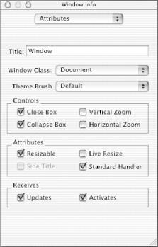
After you choose Show Info, an Info window opens for that object. If an Info window is already open for another object, the Info window contents change to reflect the object you selected. Figure 4.4 shows an Info window for a window.
The Info window has a pop-up menu for accessing other information about the object. The menu items are Attributes (shown in the figure), Control, Size, and Help. Control information is available only for controls; that is, items that can issue commands or from which settings can be read by your application. You’ll read more about these in Chapter 5. You can set a window’s size in the Size pane and define a help tag for the window in the Help pane.
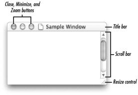
The Window Info Attributes pane is the one you’ll use the most for setting up windows. The Title attribute specifies the text that shows in the title bar when the window is open (see Figure 4.6). In the next few sections we’ll go over settings for Window Class, Theme Brush, Controls, Attributes, and Receives.
When you create a window in Interface Builder, you’ll need to choose its class. The Window Class is an important attribute for any window, because it defines:
How a window looks, such as whether it will have controls at the top and a title bar, and the font size of the title
Whether the window is movable
How the window behaves with respect to other windows (floats, takes over control of the screen, and so forth)
Table 4.1 provides a list of the window classes you can set in Interface Builder, along with guidelines for using them. The classes represent both windows and dialogs. Dialogs are windows that elicit a response from a user. Some dialogs are modeless; others are modal. You can find in-depth information about the use of windows and dialogs in Inside Mac OS X: Aqua Human Interface Guidelines (listed in Appendix A).
A modeless dialog accepts user input and does not inhibit user activity. That is, the user is not required to make a response before doing anything else in a document or the application. A modeless dialog looks like a document window, but it can’t be resized, zoomed, or scrolled. The user can make the dialog inactive and active, move it, and minimize it or close it like any document window. You can create a modeless dialog that doesn’t close if you are displaying the status of an ongoing process. The title is generally the same as the name of the menu item that activates the dialog.
A modal dialog requires a response from the user. It can be application-modal or document-modal. An application-modal dialog prevents the user from doing anything else within a particular application until the user provides a response. However, the user can switch to other applications. A document-modal dialog prevents the user from doing anything else within a particular document until the user provides a response. The user can switch to other documents within the application, or to another application.
Table 4-1. Window Classes
The Theme Brush setting lets you coordinate the colors and patterns used in a window with the current theme. A theme is a user-editable combination of a given appearance with a system font, desktop picture or pattern, and highlight color.
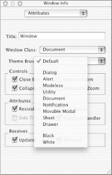
A theme brush can be an RGB color or a pixel pattern, depending on the theme. When you use a Theme Brush setting, the operating system automatically applies the correct color or pattern for the interface object in the current theme. Interface Builder lets you choose from the list shown in Figure 4.5. The Black and White options provide a black or white background, respectively. All other options except Default result in a striped background, similar to the gray striped background you see in the window shown in Figure 4.5. The spacing between the stripes is determined by the option you choose (Dialog, Alert, and so forth). Default automatically picks the theme brush that’s appropriate for the window class. Unless you have a reason to override the default, that’s what you should normally choose.
The Controls section in the Window Info Attributes pane lets you define which window buttons are available to the user. They’re dependent on the window class, so some options in the Controls box are dimmed for some window classes.
Mac OS X provides three button controls for windows—close, minimize, and zoom. These are shown in Figure 4.6. When the user clicks the Close button the window closes. Clicking the Minimize button puts the window in the Dock. The Zoom button toggles the window size between the current size and the best size. (You can set the best size programmatically using the Window Manager.) The default “best size” is the full screen.
To set up window controls in Interface Builder do the following:
Window Attributes affect how the window moves and other window behavior. You can set four window Attributes options (see Figure 4.7):
Resizable. Users can drag the resize control (shown in Figure 4.6) to change the size of the window.
Side Title. The window title displays on the side of the window instead of the top. This is available only for the floating window class.
Live Resize. If you set this, the window and its contents are redrawn as the user resizes the window. If it’s not set, an outline of the window is drawn when the user resizes the window. Then the content is drawn when the user is done resizing the window.
Standard Handler. The operating system handles the window’s behavior in the standard manner if you select this option; your application doesn’t need any code to process closing, minimizing, zooming, and resizing a window.
Use the Receives options for a window (shown in Figure 4.8) to set whether you want the window to receive update and activate events. An activate event indicates that a window is becoming active or inactive. Each activate event specifies the window to be changed and the direction of the change (i.e., whether it’s becoming active or becoming inactive). An update event indicates that the contents of a window need updating. You’ll usually want a window to receive these events.
We’ll use the tools we’ve discussed in this chapter to continue building our Moon Travel Planner application.
Get Learning Carbon now with the O’Reilly learning platform.
O’Reilly members experience books, live events, courses curated by job role, and more from O’Reilly and nearly 200 top publishers.
