Most graduating design students create print
portfolios; they typically spend the last part of
their senior year assembling all their best proj-
ects into a presentation box of some kind. Often,
students will polish or rework old pieces and add
some extra promotional work. Boxes are made or
purchased to fit the material, both physically and
stylistically. Frequently, the portfolio has a theme,
as in the case of Rhode Island School of Design
student Michelle Kim’s white case with red string
(124–125). She titled it “Being Green” to signal
her newness in the field. Increasingly, student
portfolios take the form of printed books, organ-
ized around a central idea that expresses the
student’s best.
Student
Print Portfolios
Job no:70268 Title : RP- Building Design Portfolios Client : Pro-Vision
Scn :
#
175 Size : 171.45(w)254(h)mm Co : M1 C0 O/P: CTP
Dept : DTP D/O : 26.01.06 (Job no:000000 D/O : 00.00.01 Co: CM0)
p114
BlackText
Job no:7
Scn :
#
1
Dept : D
114
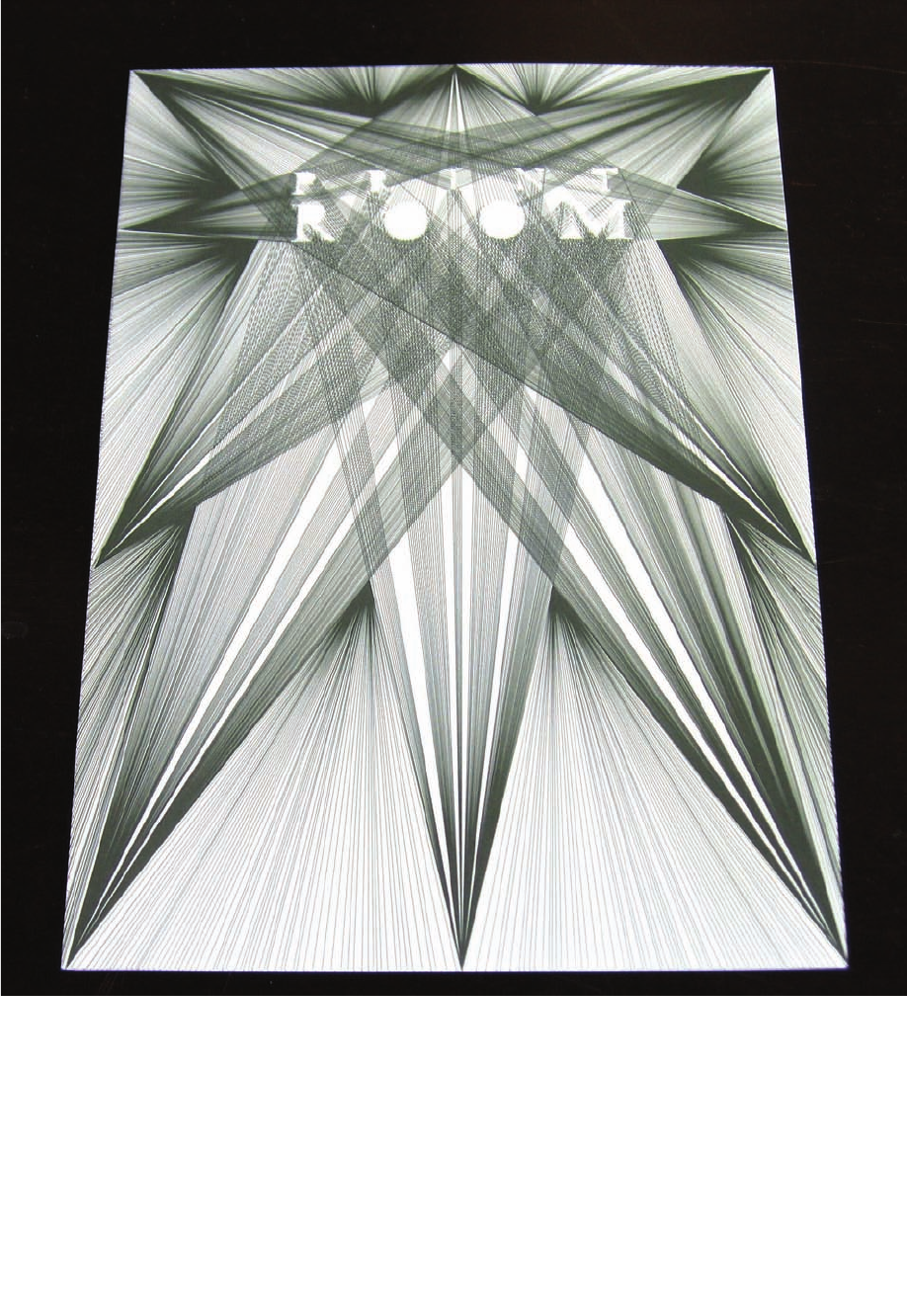
An invitation commissioned by Room investigates the
idea of available space. In Halem’s words, “This piece
works on the level of letter shapes instead of paper
edges. Within the vertical and diagonal lines, the letter
shapes are left blank.”
Hansje van Halem is a recent graduate of Gerrit
Rietveld Academy in Amsterdam. Her portfolio con-
sists of several jpegs displaying her design work.
These electronic files come to art directors accompa-
nied by a résumé that includes descriptions of the
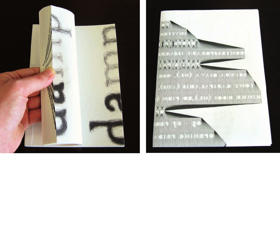
work. This page is from a flipbook called Damp. It’s a
conceptual exploration of the complexities of typography
and typographic design. The design is part of Halem’s
graduation project.
Portfolios_114_139_M1 25/1/06 02:23 PM Page 114

Job no:70268 Title : RP- Building Design Portfolios Client : Pro-Vision
Scn :
#
175 Size : 171.45(w)254(h)mm Co : M1 C0 O/P: CTP
Dept : DTP D/O : 26.01.06 (Job no:000000 D/O : 00.00.01 Co: CM0)
p115
BlackText
The image shown here is an invitation that was commissioned for an artist-run space
called Room; it promotes a growing collection of artist publications called Print Room.
The physical space of the Room is symbolized by lines that stop at the edges of the title.
Portfolios_114_139_M1 25/1/06 02:23 PM Page 115

p116
Job no:7
Scn :
#
1
Dept : D
BELOW
The Thinking Forward Festival, a European cultural
festival that celebrates the Dutch presidency, commis-
sioned these books. Halem created two pieces that
fold into an olive green cover. The pink booklet is a
catalog of participants; the blue booklet contains text
describing the festival. Halem’s dignified and under-
stated approach to the project shows art directors that
she understands how to enhance, not overshadow,
content with design.
LEFT
As part of her thesis, Halem created this annual report
for VPRO, a Dutch broadcasting company. It’s a book
inside a book, with random messages that pop up to
brighten the report.
LEFT
This design by Halem is called The Scratched Letter.
Here, she scratched or drew letterforms by hand; they
become denser and fully black as the book progresses.
Art directors might be drawn to this piece because of
its in-depth exploration of typography. The sample also
shows Halem’s extraordinary drawing skills.
Job no:70268 Title : RP- Building Design Portfolios Client : Pro-Vision
Scn :
#
175 Size : 171.45(w)254(h)mm Co : M1 C0 O/P: CTP
Dept : DTP D/O : 26.01.06 (Job no:000000 D/O : 00.00.01 Co: CM0)
BlackText
Portfolios_114_139_M1 25/1/06 02:23 PM Page 116

Job no:70268 Title : RP- Building Design Portfolios Client : Pro-Vision
Scn :
#
175 Size : 171.45(w)254(h)mm Co : M1 C0 O/P: CTP
Dept : DTP D/O : 26.01.06 (Job no:70268.C1 D/O : 08.02.06 Co: CM8)
p117
BlackText
/ Student Print Portfolios117
BELOW
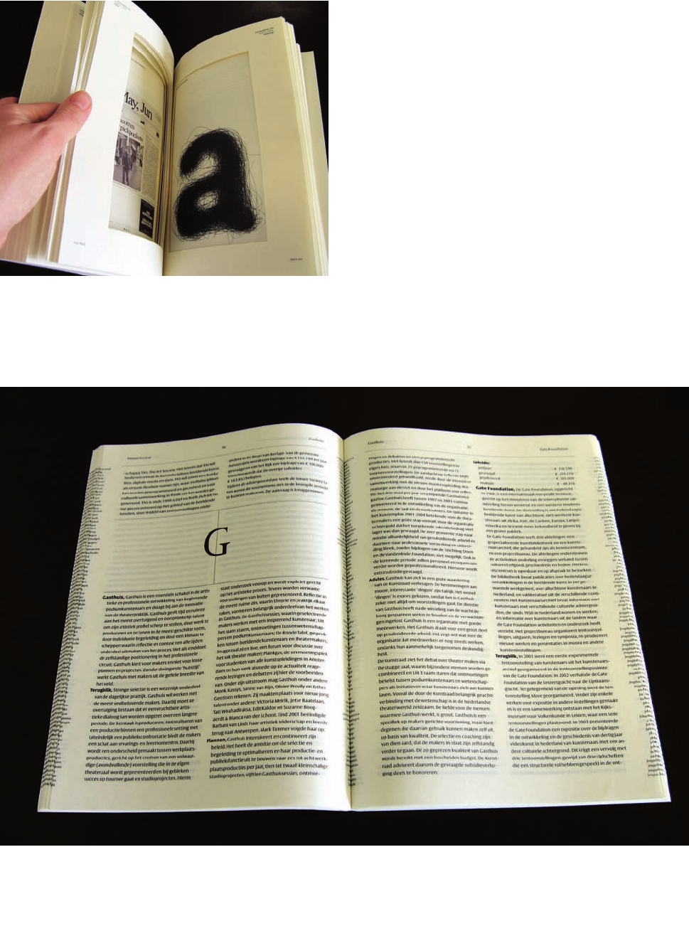
Designed by Halem in cooperation with Gerard Unger
for the City Council of Amsterdam, this report consists
of information on Amsterdam Cultural Art Initiatives. It
is a simple, elegant typographic report that’s printed
exceedingly well on thin paper. There’s a subtle echo of
text running down the outer and inner edges of each
page for emphasis. The fact that Halem collaborated
with such a well-known designer is one of the reasons
this is such a strong portfolio piece.
LEFT
Commissioned by the Stedelijk Museum in Amsterdam
in 2004, this catalog is called Municipal Art Acquisitions
Graphic Design. It has spots for eighty-four designs, but
the sixty-four that didn’t make the cut are represented
by punched-out windows, leaving only the twenty final
selections in place.
Portfolios_114_139_M1 7/2/06 11:01 AM Page 117
Get Building Design Portfolios now with the O’Reilly learning platform.
O’Reilly members experience books, live events, courses curated by job role, and more from O’Reilly and nearly 200 top publishers.

