February 2010
Intermediate to advanced
352 pages
11h 4m
English
When you create site layouts depending upon CSS, your first and
greatest challenge is to put the various pieces of your layout
exactly where you want them. CSS offers three basic
tools for creating layouts: positioning, float, and width/margin.
Unfortunately, the models underlying the use of those techniques are
notoriously hard to master.
When the browser renders block elements, such as div or p,
each element has four telescoping components: content, padding, borders, and margins (from the inside
out), as shown in Figure 6-1. In current
implementations, the dimensions of such boxes are computed by
adding three of those four components, so that if a
width or height value is applied to an element, that
element’s borders and padding (as such) make it yet wider. Margins also
affect this process, but only after neighboring margins are taken into
consideration.
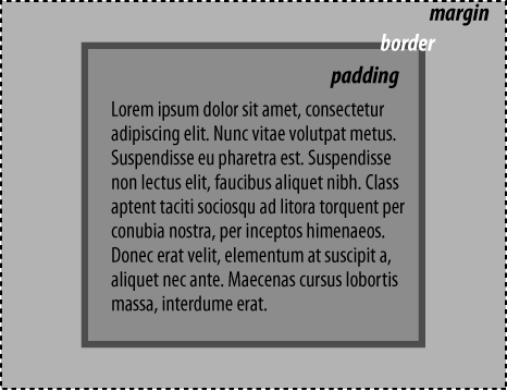
Figure 6-1. The computed width and height of an element are subdivided into four constituent parts: margins, borders, padding, and content
There are two exceptions to this definition of browsers’ layout
behavior: mode resets, and the use of auto values for content boxes.
Read now
Unlock full access


 O’Reilly covers everything we've got, with content to help us build a world-class technology community, upgrade the capabilities and competencies of our teams, and improve overall team performance as well as their engagement.I wanted to learn C and C++, but it didn't click for me until I picked up an O'Reilly book. When I went on the O’Reilly platform, I was astonished to find all the books there, plus live events and sandboxes so you could play around with the technology.I’ve been on the O’Reilly platform for more than eight years. I use a couple of learning platforms, but I'm on O'Reilly more than anybody else. When you're there, you start learning. I'm never disappointed.I'm always learning. So when I got on to O'Reilly, I was like a kid in a candy store. There are playlists. There are answers. There's on-demand training. It's worth its weight in gold, in terms of what it allows me to do.