This section explains how an array is plotted as a scatterplot:
- The matplotlib library is imported into the Jupyter notebook and the matplotlib library is configured to plot visualizations inline in the cells of the Jupyter notebook
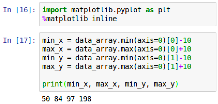
- The minimum and maximum values of the x and y-axes are determined to size up our plot and give us an optimal looking graph. The output of the script can be seen in the following screenshot:
- A 10-point pixel buffer has been added to each axis to ensure all data points are captured without being cut off.
-
A loop is created to iterate through each row of values and plot the weight versus the