You've collected all the feedback, and feel good about the list of features that you want for version 2. Time to whip out the pencils and start designing the user interface!
The main view for the app is straightforward. The light source is predominant, and you'll need control mechanisms at the bottom of the screen for the various modes and settings access, as shown in Figure 4-5.
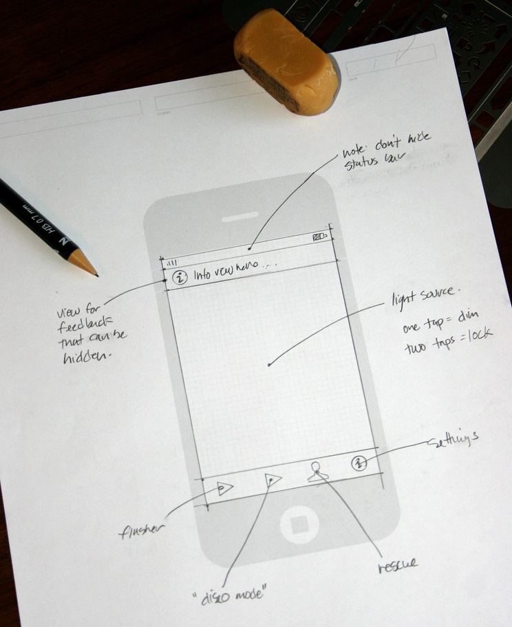
Figure 4-5. A paper prototype for the main screen of your new flashlight application. The screen is broken into three areas: an information view, a light source, and a control area for switching modes.
The control area lets the user start the flasher, "disco mode," and the SOS rescue signal. The settings icon will flip the view, much like the built-in Weather and Stocks applications.
You're leaning toward using a toolbar to hold these controls at the bottom of the screen. A tab bar control is better suited to switching between views in an application—the app has only one view. The toolbar also has the advantage in that you can make it translucent, letting part of the underlying light source shine through.
Note
UITabBar is best used in applications that need to switch between views with different operational modes. Apple's use of the tab bar in the iPod and YouTube apps lets users pick different views of music and video collections. Users can also reconfigure tab bars to display preferred sets of information.
On the other hand, UIToolbar is appropriate for actions that work within a single context. A toolbar button lets the user act on the information in the view.
When designing your UI, think carefully about which of these control mechanisms is right for your application.
When switching modes, it's a good idea to give the user some feedback, so you decide to put an information view at the top of the screen. It would be nice to hide the information when possible, since it reduces the illumination produced by the light source.
So now you're feeling pretty good about the main view, but things are about to get more difficult with the settings interface. You have more controls to deal with, and they introduce some subtle interaction problems.
Luckily, you've learned to use paper prototypes as a way to work through these issues. Sketching your screens, as shown in Figure 4-6 helps you identify trouble spots.
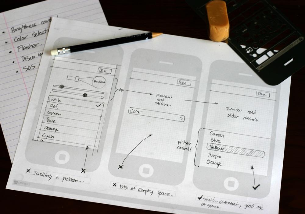
Figure 4-6. A photograph of three prototypes for your settings screen. From left to right you see a grouped table view for color selection, a single button for choosing a color, and a picker control.
Your first decision is to include a small preview of the current settings. The reason for this preview is that without it, your users would constantly be flipping back and forth between the settings and the main view.
You've also decided that slider controls are necessary to control the brightness of the light and the speed for the flasher. It makes sense to put them under the preview since they're so closely related.
The first idea you have for picking the right color is a grouped table view. This makes sense, since it's similar to picking a ringtone in the sounds section of the Settings app. As you start drawing the interface, you quickly discover a problem: The UI gets cramped when you get more than four or five colors.
You'd like to give the user a selection of about eight colors to choose from. When you play around with the one you have on paper, it becomes obvious that the preview will scroll out of view when you move toward the bottom of the list.
So your next thought is to just have a single button that shows another list when you press it. But as you imagine the interaction on paper, this solution actually makes the problem worse; the preview gets hidden and there's a lot of wasted space.
As you think about other possible controls for selecting the color, you remember UIPickerView. It would be perfect: It has a fixed size and can display an arbitrary number of items. The height of the picker view also gives you more room for the preview and sliders.
A few minutes with paper saved you from writing a lot of code that would have been thrown away. And you now have two documents that you can use when discussing the interface with both your designer and marketing. Well done!
This flashlight is an admittedly simple application; the interface has only two screens. In more complex projects, you'll have many more. Go back and look at the number of screens in Christian's drawing at the beginning of the chapter, and you'll have a new appreciation for the complexity in an application like Things. In spite of these intricacies, a methodical approach to the problem lets you come up with a solution that fits the users' needs with consistency and without undo complexity.
It's important to keep in mind at this point that the design process is never complete. As you continue to talk to designers, marketing people, beta testers, and customers, the diagrams you just produced will change. Don't be afraid to pull out the eraser and improve your design. Iteration isn't just for coding!
Get iPhone App Development: The Missing Manual now with the O’Reilly learning platform.
O’Reilly members experience books, live events, courses curated by job role, and more from O’Reilly and nearly 200 top publishers.

