March 2014
Beginner to intermediate
222 pages
4h 7m
English
One of the reasons we plot curves is to compare those curves. Are they matching? Where do they match? Where do they not match? Are they correlated? A graph can help to form a quick judgment for more thorough investigations.
Let's show both sin(x) and cos(x) in the [0, 2pi] interval as follows:
import numpy as np
import matplotlib.pyplot as plt

X = np.linspace(0, 2 * np.pi, 100)
Ya = np.sin(X)
Yb = np.cos(X)

plt.plot(X, Ya)
plt.plot(X, Yb)
plt.show()
The preceding script will give us the result shown in the following graph:
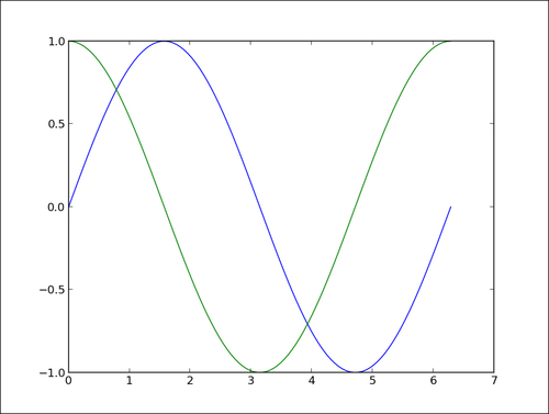
The two curves show up with a different color automatically picked up by ...
Read now
Unlock full access


