February 2012
Beginner to intermediate
220 pages
5h 8m
English
Rather than stacking the histograms, you can plot them side by side. The following figure shows the same data as in the previous plot, but has two separate sets of histograms plotted beside each other:
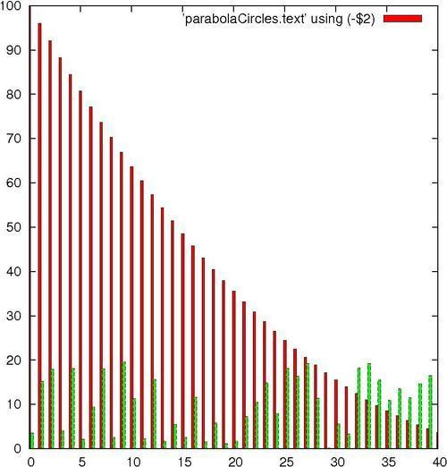
To make room, the histogram boxes are automatically drawn thinner. The different data sets are distinguished by different fill colors or patterns, depending on terminal, and/or different styles for the lines delineating the histogram boxes.
We are going to continue to wear out our datafile parabolaCircles.text.
Following are the commands used to produce a multiple histogram plot:
set style fill solid ...
Read now
Unlock full access


