Skip to Content
100 Things Every Designer Needs to Know About People, 2nd Edition
book

100 Things Every Designer Needs to Know About People, 2nd Edition

by Susan M. Weinschenk
June 2020
Beginner
256 pages
5h 38m
English
New Riders
Content preview from 100 Things Every Designer Needs to Know About People, 2nd Edition

10 Red and Blue Together are Hard on the Eyes

When lines or text of different colors are projected or printed, the depths of the lines may appear to be different. One color may jump out while another color appears recessed. This effect is called chromostereopsis. The effect is strongest with red and blue, but it can also happen with other colors (for example, red and green). These color combinations can be hard and tiring to look at or read. Figure 10.1 shows some examples of chromostereopsis.

images

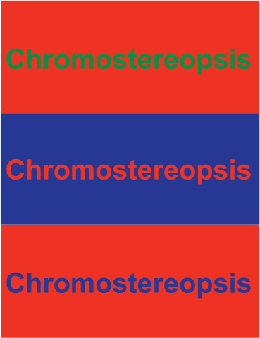
Figure 10.1 Chromostereopsis can be hard on the eyes

Takeaways

  • Avoid putting blue and red or green and red near each other on a page or screen.

Become an O’Reilly member and get unlimited access to this title plus top books and audiobooks from O’Reilly and nearly 200 top publishers, thousands of courses curated by job role, 150+ live events each month,
and much more.
Start your free trial

You might also like

100 Things: Every Designer Needs to Know About People

100 Things: Every Designer Needs to Know About People

Ph.D. Susan Weinschenk,

Publisher Resources

ISBN: 9780136746959