December 2014
Intermediate to advanced
512 pages
17h 4m
English
Slider is a bit more complicated than ProgressBar because it enables users to change the current value by moving its thumb through the range, with any number of optional ticks. The default appearance of Slider (with no ticks) is shown in Figure 14.3. The ToolTip shown while dragging or hovering can be disabled by setting IsThumbToolTipEnabled to false. Slider, like some controls from previous chapters, exposes a Header property that is typically set to a simple label.
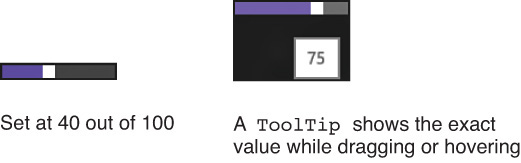
FIGURE 14.3 Slider looks like a ProgressBar, but it has a draggable thumb.
Users can also tap on the slider to make the thumb jump to the tapped location, or use the up ...
Read now
Unlock full access


 O’Reilly covers everything we've got, with content to help us build a world-class technology community, upgrade the capabilities and competencies of our teams, and improve overall team performance as well as their engagement.I wanted to learn C and C++, but it didn't click for me until I picked up an O'Reilly book. When I went on the O’Reilly platform, I was astonished to find all the books there, plus live events and sandboxes so you could play around with the technology.I’ve been on the O’Reilly platform for more than eight years. I use a couple of learning platforms, but I'm on O'Reilly more than anybody else. When you're there, you start learning. I'm never disappointed.I'm always learning. So when I got on to O'Reilly, I was like a kid in a candy store. There are playlists. There are answers. There's on-demand training. It's worth its weight in gold, in terms of what it allows me to do.