September 2003
Intermediate to advanced
1056 pages
30h 58m
English
When you chart statistical or experimental data, it's often helpful to indicate the confidence level of your data. Excel's error bar feature makes this easy. To add error bars to a data series in an area, bar, column, line, or xy (scatter) chart, select the series, choose Format, Selected Data Series, and then click the Y Error Bars tab, shown in Figure 26-13.
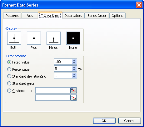
Figure 26-13. Using the Format Data Series dialog box, you can customize error bars to illustrate the potential error for each data point in a series.
You can set error bars to show the actual data point value plus some number, minus some number, or both plus and minus some ...
Read now
Unlock full access


