CHAPTER 8
WHAT MAKES A GOOD INFOGRAPHIC?
In order to answer this question, we must apply a critical framework through which we can understand and measure quality. When you look at a good infographic, everything about it makes sense. A good infographic, to borrow again from Horace’s thoughts on the role of a poet, leaves you feeling informed or delighted.
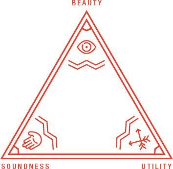
In Chapter 1 (Importance and Efficacy), we discussed the value of infographics as visual solutions to communication problems. Vitruvius’ principles of good design serve as three components by which we attempt to measure quality of these solutions (Figure 8.1). A good infographic has all three:
Figure 8.1: Vitruvian Principles.

- Utility
- Soundness
- Beauty

Get Infographics: The Power of Visual Storytelling now with the O’Reilly learning platform.
O’Reilly members experience books, live events, courses curated by job role, and more from O’Reilly and nearly 200 top publishers.

