Chapter 30 Want to Engage People? Make Your Dashboards Personal
Here are some thoughts on making dashboards more engaging to the users. The answer isn't to resort to making things “flashy” or “beautiful” but to create a personal connection between the data and the user.
Overview
A few years ago, a client was updating a collection of survey data dashboards and wanted to revisit the way demographic data was presented. They thought that the collection of bar charts comprising the demographics dashboard was boring and wanted to replace them with something that was more visually arresting. In particular, they wanted to take something that looked like what is in Figure 30.1 and replace it with something flashy.
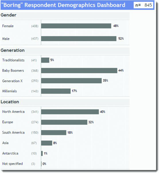
Figure 30.1 A “boring” demographics dashboard with boring bar charts.
Something with pizzazz! Something with treemaps and bubbles and pie charts! Something like what is in Figure 30.2.
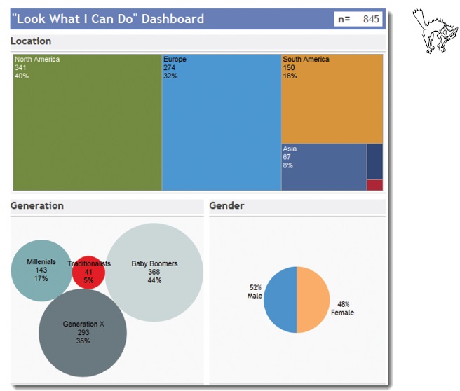
Figure 30.2 Flashy demographics dashboard.
Yikes. This is certainly a colorful montage, but it takes hard work to make sense of it. Instead of taking seconds to grasp, it will take several minutes to understand the demographics of the survey takers.
Get The Big Book of Dashboards now with the O’Reilly learning platform.
O’Reilly members experience books, live events, courses curated by job role, and more from O’Reilly and nearly 200 top publishers.

