September 2005
Intermediate to advanced
240 pages
5h 56m
English
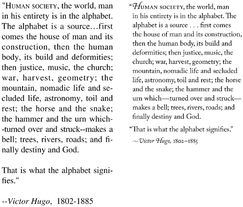
Glance quickly at the two quotations set below, and be conscious of your instant reaction as to which one has a more sophisticated appearance Then look more closely at the one on the left, and see how many details you can pinpoint that contribute to its unprofessional appearance Then look carefully at the quotation on the right, and see how many differences you can spot Each of those differences helps to create the cleaner and more sophisticated appeal of the second quotation setting.
| Wrong | Better |
|---|---|
| The 12-point type is large and clunky. | The 10-point type is easier to read because you can see entire phrases, plus it has a more sophisticated ... |
Read now
Unlock full access


