March 2019
Beginner
504 pages
11h 17m
English
Circle charts are one way to visualize a distribution. Consider the following view, which shows how each doctor compares to other doctors within the same type of department in terms of the average number of minutes it takes to start treating a patient:
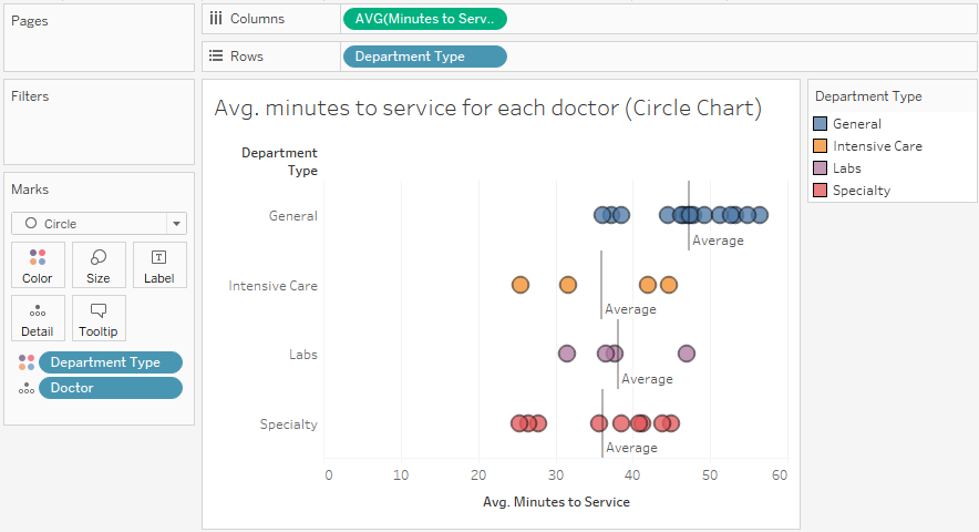
Here, you can easily see that certain doctors do better or worse on average than others in terms of the time it takes to start treating a patient. It is also interesting to note that certain types of departments take more or less time on average. This makes sense as each type of department has different constraints and operating procedures. There are also certain departments where ...
Read now
Unlock full access


