March 2019
Beginner
504 pages
11h 17m
English
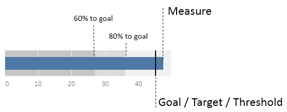
A bullet graph (sometimes also called a bullet chart) is a great way to visually compare a measure with a goal, target, or threshold. The bar indicates the measure value, while the line indicates the target. Tableau also defaults to shading to indicate 60% and 80% of the distance to the goal or threshold. The line and the shading are reference lines that can be adjusted (we'll explore how in detail in future chapters):
Let's say that hospital administration has set some goals regarding the time to service, that is, the number of minutes between the time a patient arrives at the hospital ...
Read now
Unlock full access


