Chapter 52. Color
Real life is full of sunlight, artificial light, heat, cold, clothing, brands, fashion, and a million other things that affect the way we perceive colors. As a UX designer, we might not care about Pantones and brand guidelines, but we definitely have to learn about color.

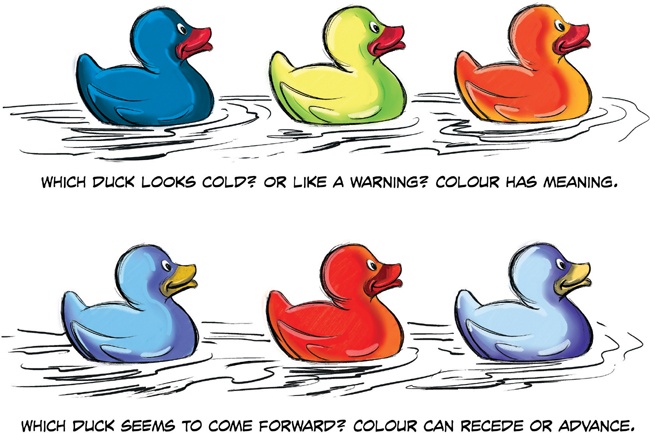
There are a few things we can learn about color from the Technicolor rubber duckies on the preceding page. As UX designers, we usually rock the wireframes in black and white. And that’s a good thing! We focus on the function, while the UI designers can focus on the look, feel, and style. However, sometimes color is function. Like traffic lights, or making the color of a popsicle match the flavor. You know, important shit.
Meaning
In the first illustration in this lesson, we see three ducks in different colors: blue, yellow, and red. They’re so handsome. Immediately, these ducks seem to have different tonality, and it is easy to imagine how the colors can change what each duck “means.”
If the ducks were buttons, they might be “confirm,” “cancel,” and “delete.” If they were indicators on a fuel tank, they might represent “full,” “half,” and “empty.” Or if they were on a stove: “cold,” “warm,” and “hot.”
You get the idea: the ducks are identical, but colors change the meaning. If you don’t need to indicate something like that, let the UI designer choose colors. But if you do, let your wireframes do the ...
Get UX for Beginners now with the O’Reilly learning platform.
O’Reilly members experience books, live events, courses curated by job role, and more from O’Reilly and nearly 200 top publishers.

