To achieve the second goal, we can use layout="responsive" again, so that the thumbnails will scale for larger screens. The HTML for each item in the list now looks like this:
<li> <figure class="related-thumb"> <amp-img src="img/penguin.jpg" width="125" height="75" layout="responsive"></amp-img> <figcaption> If a penguin can find a soul mate, I'm sure I can too <span class="author">Rebekah Crane</span> </figcaption> </figure></li>
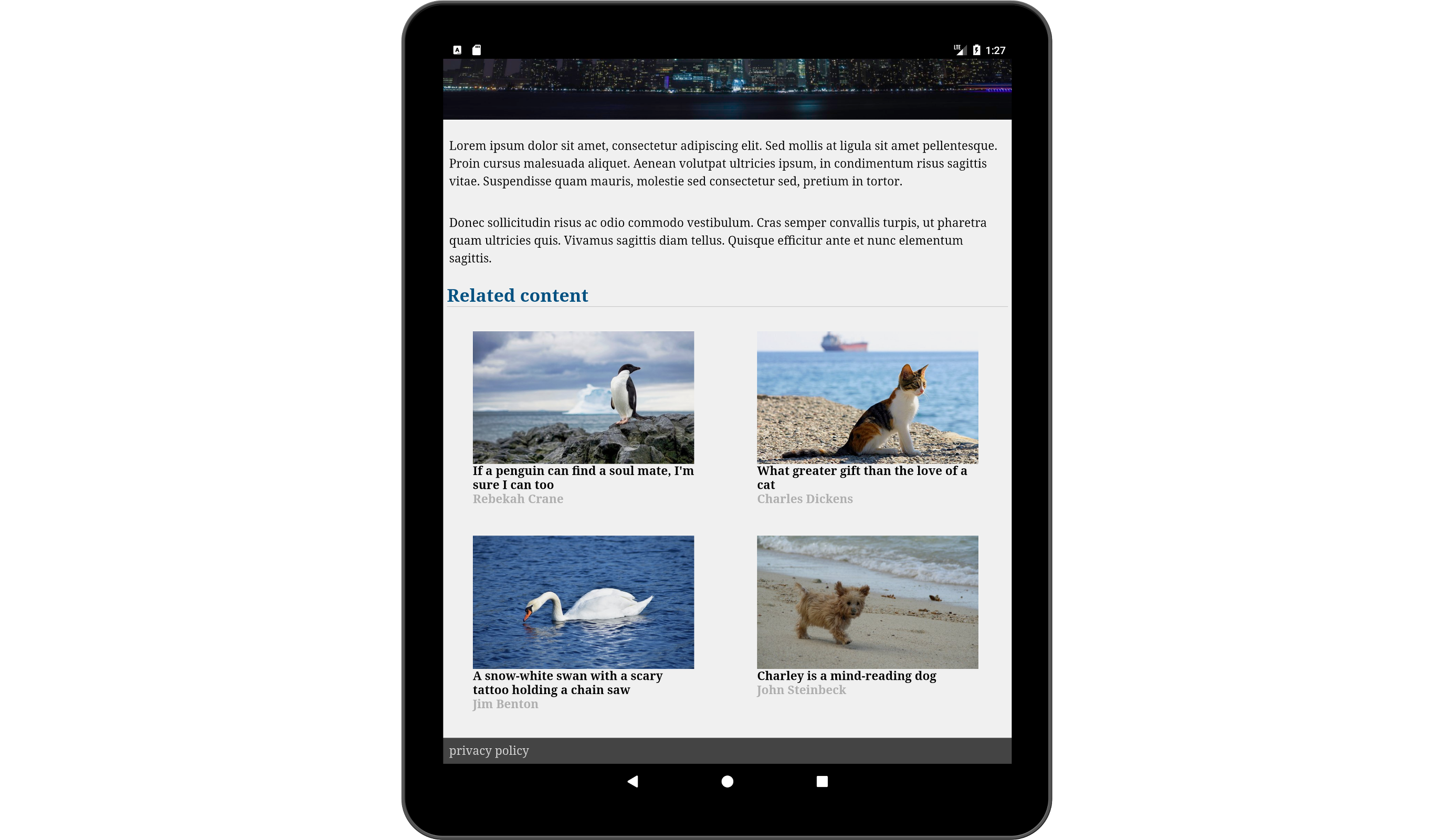
Thumbnails in 2x2 grid and with layout="responsive" scaling up on a larger screen (tablet device in portrait orientation)
There ...

