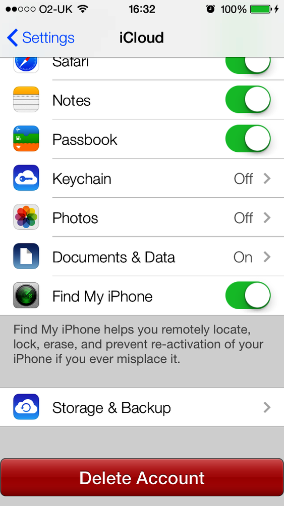
Buttons allow users to initiate an action in your apps. For instance, the iCloud Settings bundle in the Settings app presents a Delete Account button in Figure 1-57. If you press this button, the iCloud app will take action. The action depends on the app. Not all apps act the same when a Delete button is pressed by the user. Buttons can have images in them as well as text, as we will soon see.
A button can assign actions to different triggers. For instance, a button can fire one action when the user puts her finger down on the button and another action when she lifts her finger off the button. These become actions, and the objects implementing the actions become targets. Let’s go ahead and define a button in our view controller’s implementation file:
#import "ViewController.h"@interfaceViewController()@property(nonatomic,strong)UIButton*myButton;@end@implementationViewController
Note
The default height of UIButton is 44.0f points in iOS 7.
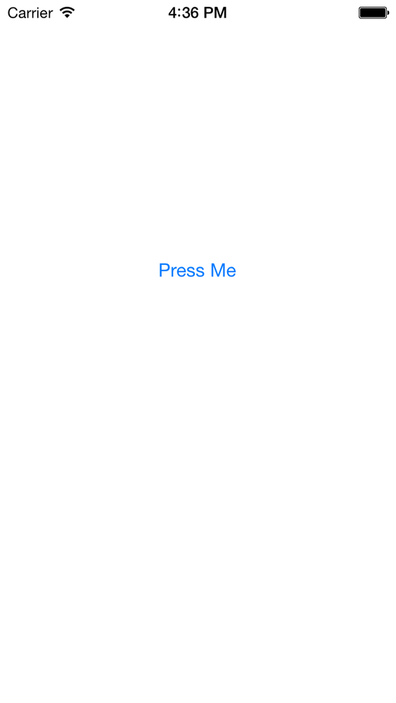
Next, we move on to the implementation of the button (Figure 1-58):
-(void)buttonIsPressed:(UIButton*)paramSender{NSLog(@"Button is pressed.");}-(void)buttonIsTapped:(UIButton*)paramSender{NSLog(@"Button is tapped.");}-(void)viewDidLoad{[superviewDidLoad];self.myButton=[UIButtonbuttonWithType:UIButtonTypeSystem];self.myButton.frame=CGRectMake(110.0f,200.0f,100.0f,44.0f);[self.myButtonsetTitle:@"Press Me"forState:UIControlStateNormal];[self.myButtonsetTitle:@"I'm Pressed"forState:UIControlStateHighlighted];[self.myButtonaddTarget:selfaction:@selector(buttonIsPressed:)forControlEvents:UIControlEventTouchDown];[self.myButtonaddTarget:selfaction:@selector(buttonIsTapped:)forControlEvents:UIControlEventTouchUpInside];[self.viewaddSubview:self.myButton];}
In this example code, we are using the setTitle:forState: method of our button to set
two different titles for the button. The title is the text that gets
displayed on the button. A button can be in different states at
different times—such as normal and highlighted (pressed down)—and can
display a different title in each state. So in this case, when the user
sees the button for the first time, he will read “Press Me.” Once he
presses the button, the title of the button will change to “I’m
Pressed.”
We did a similar thing with the actions that the button
fires. We used the addTarget:action:forControlEvents: method to
specify two actions for our button:
An action to be fired when the user presses the button down.
Another action to be fired when the user has pressed the button and has lifted his finger off the button. This completes a touch-up-inside action.
The other thing that you need to know about UIButton is that it must always be assigned a
type, which you do by initializing it with a call to the class method
buttonWithType, as shown in the
example code. As the parameter to this method, pass a value of type
UIButtonType:
typedefNS_ENUM(NSInteger,UIButtonType){UIButtonTypeCustom=0,UIButtonTypeSystemNS_ENUM_AVAILABLE_IOS(7_0),UIButtonTypeDetailDisclosure,UIButtonTypeInfoLight,UIButtonTypeInfoDark,UIButtonTypeContactAdd,UIButtonTypeRoundedRect=UIButtonTypeSystem,};
A button can also render an image. An image will replace the
default look and feel of the button. When you have an image or a series
of images that you want to assign to different states of a button, make
sure your button is of type UIButtonTypeCustom. I have prepared two images
here: one for the normal state of the button and the other for the
highlighted (pressed) state. I will now create my custom button and
assign the two images to it.
UIImage*normalImage=[UIImageimageNamed:@"NormalBlueButton"];UIImage*highlightedImage=[UIImageimageNamed:@"HighlightedBlueButton"];self.myButton=[UIButtonbuttonWithType:UIButtonTypeCustom];self.myButton.frame=CGRectMake(110.0f,200.0f,100.0f,44.0f);[self.myButtonsetBackgroundImage:normalImageforState:UIControlStateNormal];[self.myButtonsetTitle:@"Normal"forState:UIControlStateNormal];[self.myButtonsetBackgroundImage:highlightedImageforState:UIControlStateHighlighted];[self.myButtonsetTitle:@"Pressed"forState:UIControlStateHighlighted];
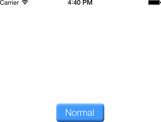
Figure 1-59 shows what the
app looks like when we run it in iOS Simulator. We are using the
setBackgroundImage:forState: method
of the button to set a background image. With a background image, we can
still use the setTitle:forState:
methods to render text on top of the background image. If your images
contain text and you don’t need the title for a button, you can instead
use the setImage:forState: method or
simply remove the titles from the button.
Get iOS 7 Programming Cookbook now with the O’Reilly learning platform.
O’Reilly members experience books, live events, courses curated by job role, and more from O’Reilly and nearly 200 top publishers.


