Adapting Content for the Third Screen
The first screen was the television, the second screen was the desktop, and the third screen is the tiny screen found on most portable and mobile devices. (Don’t ask me why this list doesn’t include the mother of all screens, the movie screen. I guess futurists like things in three.)
Simple, easily navigated, and compact are words to live by when creating content for mobile devices. The following sections show you how to adapt your web page for the tiny screen and how to meet the expectations of mobile users, which are different from how people view content on desktops, even laptops.
Thinking small
The average screen on a mobile device is just two to slightly more than four inches (measured diagonally). Think how small that is. Your index finger is probably only four inches long. Most screens are smaller (see Figure 4-1).
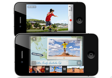
Figure 4-1: The screen on Apple’s iPhone, one of the most popular smartphones in the world, is just 3.5 inches.
Your mobile screen is probably smaller than most mailing labels, but it’s amazing what people try to squeeze on this little space, loading it up with nonessential things.
 Understanding how content should be viewed on mobile devices requires that you see content in a new way. Here are some ways to start thinking about ...
Get QR Codes For Dummies, Portable Edition now with the O’Reilly learning platform.
O’Reilly members experience books, live events, courses curated by job role, and more from O’Reilly and nearly 200 top publishers.

