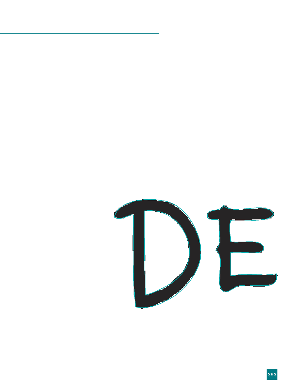
In Figure 11-10, transparent display of the fi ll is particularly visible
along the top part of the last D, where you can see that Illustrator fi lled
in the outline to smooth out the antialiased edges of the raster image
underneath.
The Outlines option is probably best for our purposes. Choose
it from the smooth pyramid icon’s pop-up menu.
8.
Change the preview settings for the original raster image. Click-
ing the chunky pyramid in the control panel will reveal the
options for the preview of the raster image. You can choose to
view the original, not view it, or set it to Transparent (which
is really “translucent” in this case). Each of these options has
some obvious uses depending on what you’d like to see behind
your trace. The other option, Adjusted Image, will be handy for
this exercise, but it requires a little bit of explaining.
When you’re creating a black-and-white trace, Illustrator consid-
ers every pixel to be either black or white, even when there are
shades of gray in the original. (Illustrator is very literal about
“black and white.”) So the adjusted image represents Illustrator’s
interpretation of our original, with every pixel being assigned
to either black or white. The result becomes the sole basis for
Illustrator’s tracing outline.
To see what I mean, choose Adjusted
Image from the black pyramid’s pop-
up menu. See the chunky black-and-
white interpreted ...


