510
|
Chapter 7: Typography
now exists a Japanese font that includes genuine proportional ideographs, specically that
the default metrics are proportional for both horizontal and vertical use. Additionally,
their shapes do not suggest that they are conned to the prototypical “square” design
space. is font in question is Adobe Systems’ Std L (KazurakiStd-Light), and
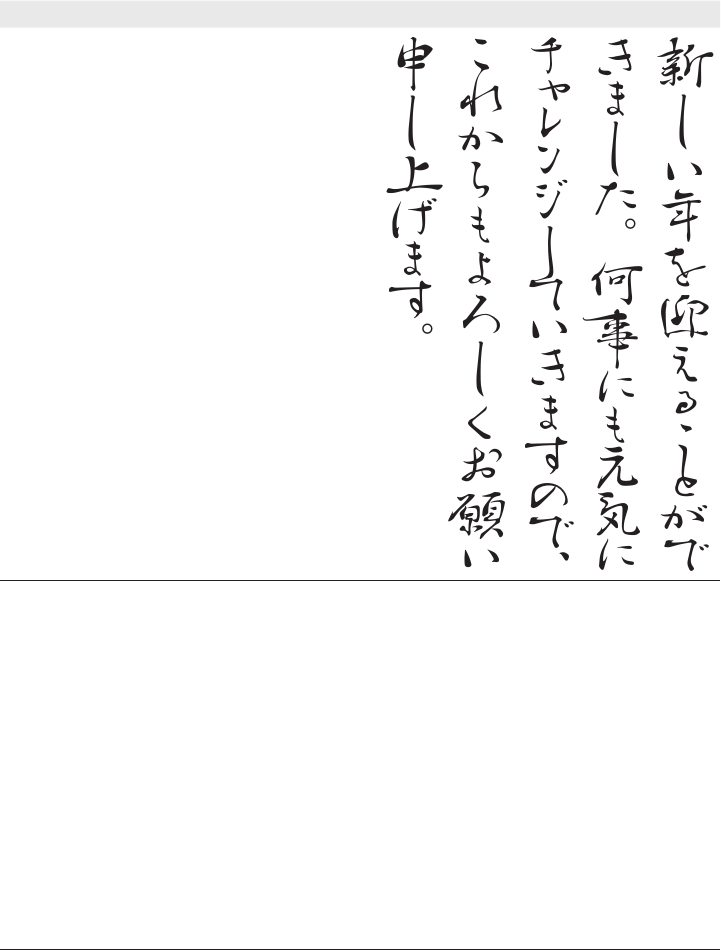
Table 7-36 provides some example text set with this font, in both writing directions.
Horizontal and vertical layout—proportional JapaneseTable 7-36.
Horizontal Vertical
新しい年を迎える
ことができました。
何事にも元気に
チャレンジしていき
ますので、 これか
らもよろしくお願い
申し上げます。
Believe it or not, there are times when applying proportional metrics to ideographs does
more harm than good. at is when kerning comes to the rescue….
*
Kerning
While alternate metrics provide a way to escape from the trap or mind set of using only
full-width characters, it sometimes introduces new problems. Luckily, such problems are
solved through the use of kerning, which is the process of adjusting inter-glyph spacing
* is is obviously dierent from Kern coming to the rescue. My brother’s name is Kern. It is quite unfortunate
that he knows absolutely nothing about kerning.


